
Start your FREE 15-day trial and embark on a design journey with powerful tools for vector illustration, layout, photo editing, typography, and collaboration.
What’s New in CorelDRAW Graphics Suite
By Joseph Diaz
In this written tutorial, Joe Diaz shows you how to use custom typesets and imagery to create a unique brand image for a women’s clothing store. As a designer, one of the most important parts of your work is developing a brand that works for your client. This tutorial shows you a few of the key tools you need to do that. It also gives you an unique perspective into CorelDRAW Master Joe Diaz’s creative process.
Starting with the typestyle
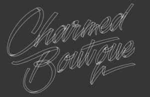
When designing a logo or brand, I sometimes start with imagery or an icon, and then create a typestyle that matches that graphic. Other times, such as in this design, I want the lettering to be the star of the show, so I focus on that first.
Knowing your client’s target audience and then creating something that is attractive to them is key. It’s actually more important than creating something pleasing to the business owner. In this case, the design is for a women’s clothing store, so I needed a typestyle that’s feminine, something “lacy. ” After doing some research and creating a few quick little sketches on paper, I had the idea to make the lettering look like ribbon, and to somehow incorporate a “charm” image or graphic.
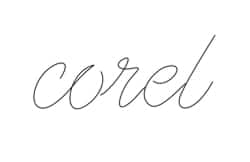
Understanding ribbon script
Before diving into this project, let’s look at a quick little trick for creating ribbon text. Ultimately, I won’t use this method to create this client’s brand, but it’ll help us get in the right mindset for creating a ribbon script.
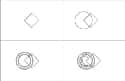
Start by creating a single-line cursive word. You could draw one by hand and scan it, or as in my case, use the Freehand tool (found in the Curve Tools flyout) and draw it directly in CorelDRAW.
The next step is to duplicate that script (Ctrl+D) and stagger the duplicate, in this case down and to the right. You may also want to give each script a unique outline color to help distinguish the two from each other as you work.

A fast way to change the color of outlines is to select the line or path you want to change, and then right-click a color in the color palette.
Now, find two points, one on each script, that will serve as the start and endpoints of a diagonal line that will be reused to help create the ribbon effect. In this case, I used the startpoint of both scripts.

I duplicated the gray diagonal line and positioned the duplicates where the ribbon would normally fold over (see Figure 4). For best results, keep the angle of that diagonal line consistent. It also helps to enable the Snap to Object command (Alt+Z). With this enabled, you can snap the gray lines to the edge of the two scripts. You don’t have to worry about combining the lines because CorelDRAW has a great tool that we will use to create the shapes that will make up the ribbon, the Smart Fill tool


At this point in the design process, I use color again to help me visualize this ribbon effect. I used two shades of blue, one for each side of the ribbon. I also used yellow on the intersecting portions, but just temporarily. Again, you can use the Smart Fill tool to achieve this.

Now, weld the yellow parts to either the dark blue shapes or the light blue shapes. Either will work. In this case, I chose to weld them to the light blue shapes (see Figure 7).

To weld two (or multiple) shapes together, just select all the shapes you want to weld, and click the Weld button on the property bar. Repeat this process for each letter in the design.

Combining the old with the new
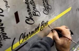
I wanted to create a custom hand-lettered look and feel for the ribbon lettering for this brand design. What better way to achieve that look than to ask my father, a longtime sign painter, to work his magic? Hand-painted lettering has a certain flow that can’t always be replicated with off-the-shelf fonts, plus I wanted to create something truly unique — something that looks handmade because it was handmade.
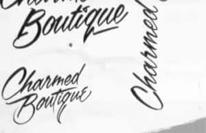
One thing to note: If I use the ribbon script that I have outlined in this particular design for a women’s clothing store, I’d wouldn’t get the thick and thin lettering you see in hand-painted work, and that’s one of the things that gives it its character. However, I can use what I have learned when constructing the Corel script to help guide me when creating script for my client’s design.
Creating the script
To start I’ll take the transparency film that my father painted on and place it in our scanner. Next go to File > Acquire Image > Acquire. I then select to scan the image as a grayscale image. Once the scan is complete the image will appear on my Drawing Page.
At this stage, I want to make the image dull or faded to make it easier to work over top of it. There’s a couple of things I can do. I could add a transparency to the scanned image using the Transparency button in the Object Properties docker. Alternatively, I could switch to a wireframe view by clicking View > Wireframe.

To prevent accidentally selecting the image when working on the shapes above it in the design, I lock the image by right-clicking it and clicking Lock Object.
I like to create guidelines to help create a consistent baseline for my script. Guidelines are easy to create — simply drag from a ruler onto workspace, and one is added where you release the mouse. You can move the guideline at any time by simply selecting it like you would any other shape. In fact, you can also rotate the guideline in the same way you would rotate a shape, by clicking it and clicking it again to display rotation handles. In this design, I need my guidelines to be at an angle, so I will first rotate the guideline, then duplicate it.
To get shapes and objects to snap to guidelines, click View > Snap to > Guidelines.
At this point, I treat this lettering like any other illustration I might create. So, just as though I were creating an illustration of a car or a person, I make good use of the Freehand tool and the Shape tool.
I like to start by roughing out my shapes. With the Freehand tool selected, clicking and holding creates a the line that follows the movement of your mouse. However, if you click once and don’t hold the mouse button down, you can create straight lines. The straight line is completed when you click a second time. So by creating a series of connecting straight lines that roughly follow the boundaries of this lettering, I make several shapes that will eventually make up this ribbon script.
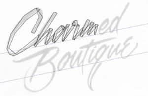
Next, I use the Shape tool to manipulate the straight lines that I just created. When you are using the Shape tool, the property bar displays commands specific to the tool. I first click the Select all nodes button, then click the Convert to curve button, which turns all my straight lines into curves. They will still look like straight lines, but now when I drag anywhere on that line, I can pull it into a curve. I also click the Smooth node button.
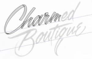
I work my way through each letter, taking what I’ve learned from creating the Corel script and applying it in this design. To save time, I duplicate letters that are used more than once, like e and u. I also change a few things that I wasn’t happy with in the hand lettering.
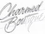
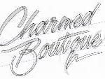
Figures 15-16
Adding some color
Now it’s time to add some color. I start by adding a background color to work over top of. The client requested grays and greens for this brand, so I’m going to start with a dark gray background. I then change the color of the outlines of my script to white for the time being so I can see what I’m doing.
Unlike the Corel script, I want this script to have more dimension to it, so I’m going use gradients to help give it the appearance of shading. I like to use the Interactive Fill tool to help me achieve this. I often create a simple reference image that helps me keep my gradients on every letter consistent. In this case, I’ll just make a ring.

If I was making an illustration of buildings and I wanted to make the angle of the light source and shading consistent, I might draw a cube as a reference.
The reference circle isn’t just used as a visual aid. You can also use the Attributes Eyedropper tool.

Figures 19-21
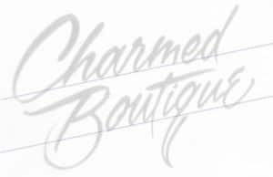
Before you know it, you’ve got a real nice, eye catching, custom ribbon script.
Adding some imagery
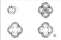
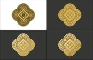
Now that we have our script finalized, it’s time to add the supporting imagery. For this job, the client wanted to use a design from one of her earrings to act as the “charm” in this brand. The shape of this charm was then to be used throughout the store.
First, we start by importing a photo we took.

Because I have multiple monitors, I open up the folder containing the photo on one screen, while CorelDRAW is open on the other. I simply drag the photo file from one screen to another and onto the CorelDRAW window. However, you can also click File > Import to import photos.
With the photo imported, I lock the photo and switch to wireframe view and draw directly over top of the photo. This charm design is a pretty basic when you break it all down into different shapes. I use basic squares created with the Rectangle tool and circles created with the Ellipse tool to rebuild this design from scratch.
Figures 23-25
When using the Ellipse and Rectangle tools, holding down the Ctrl key while you drag out the shape creates perfect circles and squares. When piecing these shapes together, I make sure Snap to Objects is enabled. This feature lets you choose from a variety of snapping points. For example, you can snap the center of the circles to the corner of the square. I then duplicate shapes and groups of shapes to keep things symmetrical, making good use of the Weld, Trim and Combine tools found on the property bar when you select a shape.
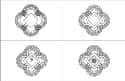
After the charm has been recreated, I can start adding colors.
I use the Interactive Fill tool to give this design gradient shading, keeping in mind how light might interact with something metallic like this, and the highlights and shadows created by that interaction. And I most definitely take advantage of my reference image.
You might try one time-saving trick I do with the Color Eyedropper tool to capture colors from my reference photo and apply it to the illustration. This tool can even be used to capture gradients. When theInteractive Fill tool is active, the colors used in a given gradient appear on the property bar. That dropdown picker also has a Color Eyedropper tool, which you can use to sample colors from your reference image.
Now, I simply finalize the charm image by adding a few extra little details.

Then, I combine both the script and illustration to finalize this logo.

After the logo is finished, I can use that design again to create other promotional and marketing materials, like signs, business cards, product labels, and more.
 CorelDRAW Graphics Suite
 Ultimate Vector Bundle Vol. 1
 CorelDRAW Standard 2021
 Ultimate Vector Bundle Vol. 2
 Corel Vector
Start your FREE 15-day trial and embark on a design journey with powerful tools for vector illustration, layout, photo editing, typography, and collaboration.

Reader Interactions