
Start your FREE 15-day trial and embark on a design journey with powerful tools for vector illustration, layout, photo editing, typography, and collaboration.
What’s New in CorelDRAW Graphics Suite
By Joseph Diaz
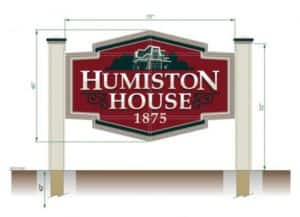
In this tutorial, I’ll walk you through my process of designing a sign for a local historic home and museum. After discussing the client’s needs and studying the building that they want the sign to match, I start in on my design.

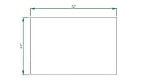
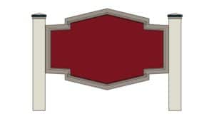
During my sit down with the client we discuss things like size and budget. For this project, we decided to go with a traditional-looking post and panel, freestanding sign. The sign face will be made from a 6’x4′ piece of aluminum substrate. I start by creating a 6’x4′ rectangle. One of the great things about using CorelDRAW for designing signs is that we can actually design at full scale, rather than an inch equals a foot.
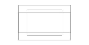
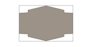
This sign won’t just be a rectangle though. We want to cut out an interesting shape that matches the design of the house, so I start by creating two rectangles within the first 6’x4′ rectangle. I align all three rectangles by using the commands at Arrange >Align and Distribute.
Next, I create a square. By using the Rectangle (F6) tool and holding down Ctrl, I can create a perfect square. I then select the square by using the Pick tool. I click on the square a second time to access the rotate and skew handles. I then rotate the square45 degrees. Holding down Ctrl while you rotate the shape will snap the shape at 15 degree increments.
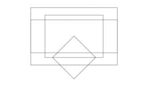
Now, with the Pick tool again, I will distort and scale the square into a diamond shape and snap the center of that new shape to middle of one of the sides of the taller rectangle. You can press Alt + Z to toggle Snap to Objects on and off. Once the diamond shape is where I want it, I duplicate that shape by pressing Ctrl + D, and then move the second diamond shape on the opposite side of that same rectangle.
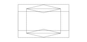
Now that I have the rough shape of the sign I want, I will select all the shapes except the original 6’x4′ rectangle. To select multiple shapes, hold down Shift and left click on all the elements of the design you want to select. Once the shapes are selected, I click the Weld button which will be available from the property bar when you have two or more different elements selected.
I then chose to give the sign a warm gray color.
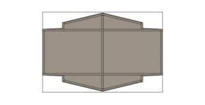
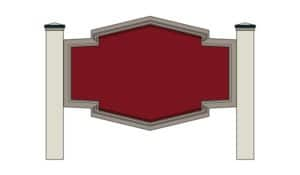
At this point, I could take this opportunity to plan out the aluminum skeletal structure of this sign. A sign maker could use a thicker aluminum/wood composite substrate; however, using a product like that means worrying about the longevity of the sign. Wood won’t last near as long as aluminum, and since the client wants it to last as long as possible, we will build the majority of this sign out of lightweight yet durable aluminum and avoid using wood wherever we can. So in this case, we will use a 1″ aluminum tubing frame sandwiched between two sheets of 0.080 gauge aluminum. A sheet of 0.080 gauge aluminum is a strong product but it will need a skeletal structure so that it is rigid enough between the two posts.
This sign will outlast the long-lasting automotive paint finish we will be applying to it. As time goes on, the painted graphics may need to be repainted, but the sign itself won’t need to be replaced for a long, long time. In CorelDRAW, I simply create a series of 1″ thick rectangles and place them accordingly to show how it will be constructed. Then I’ll duplicate the design I have created so far and set one of the copies to the side for later use. I then delete the 1″ thick rectangles so I can continue on designing the graphic part of the sign.
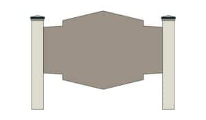
Now it’s time to design the posts. In this case, we want to create thick-looking posts. If the posts look too thin, they will give the illusion that the sign is flimsy, even if the thinner posts are more than strong enough to support the light weight aluminum. For this project, we could probably get away with using 4×4 treated posts, but just to be safe we will instead use 6×6 posts. To make the posts appear even thicker, we could create a sleeve to fit over top of the posts. The sleeve would be created out of durable PVC.
So I will create two 7 1/4″ wide rectangles, approximately 52″ tall. Then with the Rectangle tool, I create two short rectangles at the tops of each post, then a triangle above that to illustrate the very simple post caps for this sign. I then assign colors to the posts using colors found on the building’s paint job.
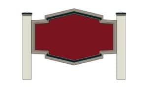
Next, I’ll use the Contour tool to select the sign face and type in the Contour offset box on the property bar. The first contour will be 2 1/4″ inside, then 2 more contours — each a further ½” offset inside. Once one of the contours is created, I need to right-click on that newly created contour with the Pick tool and click Arrange > Break Contour Group Apart before I can assign a different contour to that new shape.
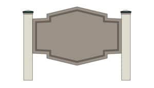
Next, I assign color to the newly created shapes (choosing colors found on the building). I then create 2 more shapes in a similar way as previously explained. These shapes are meant to mimic some of the architectural elements of the building, in this case the feature above the windows.
I then select those new shapes and apply a 1/2″ contour offset, this time towards the outside. Then I choose the Pick tool, right-click the contours, and click Arrange > Break Contour Group Apart.
Here, I select the broken apart contours, hold down Shift to select the shapes they sit on top of, and then click the Trim button on the property bar. Then I can delete those broken apart contours. After that, I assign a dark green color to those shapes.
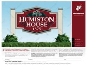
It’s now time to add some lettering. It is a sign after all. I went with a nice clean serif font. It’s easy to read and traditional looking, and will match the style of the house nicely. Simply select the Text (F8) tool, place your cursor where you want to start typing. Click once and then start typing. To change the font and size of the lettering, you can choose the preferred settings from the property bar. For this part, I like to select the text and the sign-face and use the align tools to make sure things are lined up just right. You can go to Arrange > Align and Distribute > Align Centers Vertically. Alternatively, you can click Windows >Dockers > Align and Distribute to access align and distribute commands from the Align and Distribute docker.=At this point, I also like to remove the outlines from all my shapes. You can do this by selecting everything on the screen (Ctrl + A), moving your mouse over to one of your color palettes, and then right-clicking the white swatch with the X through it (no color).

I’m not happy with the default kerning (space between the letters), so I will use the Shape (F10) tool to select the text this time. When you use the Shape tool to select text, you are given the kerning tools. They appear on each side of the selected text and look like a tiny square, three lines, and a triangle. On the right side of the selected text, drag the kerning tool to adjust the space between letters. The icon with downward facing triangle lets you adjust the spacing between lines of text. You can also select the small white nodes and manipulate individual letters.

Next, I will select the HUMISTON lettering on the top line and click Arrange > Break Artistic Text Apart. Now I’m going to slightly increase the size of the H and the N by using the Pick tool to select them (separately) and then dragging to scale the size of each letter.

At this point, I select both the HUMISTON text and the HOUSE text, right-click on the selected lettering and choose Convert to Curves from the drop-menu. With the lettering still selected, click the Weld button on the property bar. Now the lettering is one shape and it can’t be manipulated as text anymore, which means you can’t change the font, retype the lettering, or use the kerning options.
Note: If you are creating your own sign layout, make sure that you are happy with what you have before converting your text to curves; otherwise, you may have to recreate that lettering.
Now, I will create a yellow .3″ contour around the lettering. It can be any color. I chose yellow to make it easier to see what I’m doing in the next step. Then I right-click on the contour and choose Break Contour Group Apart.

Next, I select the off-white lettering (not the yellow contour), and duplicate it by pressing Ctrl + D. I’ll make that the same dark green I’ve been using and move it down and scale it down just a bit.

With the dark green lettering selected, I then click Arrange > Order > Behind. My cursor will change to a large black arrow. I use that to select the yellow contour shape, which moves the dark green lettering behind the yellow contour.
Note: You can also select an object and use the Page Up and Page Down buttons on your keyboard to move elements up or down a layer.

Now, I select the yellow contour, then the dark green lettering that is behind it, and then click the Trim button on the property bar. And then I can delete the yellow contour, which leaves us with a nice little drop-shadow effect.

Next, I will create a horizon line effect for the lettering by creating two rectangles overtop of the lettering. These rectangles need to cover only the top half of each line of lettering. I then quickly Weld the two rectangles together.

With the two rectangles still selected, I hold down Shift and select the lettering too. On the property bar, I then click theIntersect button. And then I change the newly created shape to white, and delete the two rectangles.

Now that the lettering is more or less finished, I will add some accent graphics to support this design. I’ll start by creating some simple scrolls to fit in the negative space on either side of the word ‘house’.
To create these scrolls, I use the Freehand (F5) tool and click once under the left corner of the H in ‘Humiston’. Then by moving the cursor to the right, I see a straight line. By holding down Shift, I can keep that line at exactly 180 degrees. Another simple click of the mouse completes the line.
With the Freehand tool still active, I can click and drag to draw the swirls. Then I can use the Shape (F10) tool to clean up the swirls by manipulating the lines and adding or removing nodes, if necessary.

With the scroll shape drawn, I can now add thickness to those lines by selecting them and pressing F12 to access the Outline Pendialog box. From the Width box, I choose something thicker than Hairline.

Now I take that shape with the thicker outline, and click Arrange > Convert Outline to Object. I then weld the scrollwork together, change it to the dark green color I’ve been using, and use the Shape tool to fine tune the scrolls. Once I’m satisfied, I duplicate that shape (Ctrl + D) and then click the Mirror text horizontally button on the property bar. I place that flipped shape under the N, on the other side of the word ‘House’.

Next, I’m going to create a pretty simple illustration of the actual house to put on the sign. This illustration can also be used for other projects for this client, such as brochures or flyers. I use a photo to create the illustration. This photo was taken before the house was repainted, but will work great for creating a small stylized graphic for this sign. To import the photo, I click File >Import, browse to where the photo is saved, and click Import.

I used the Freehand tool to create straight lines and basic vector shapes overtop the photo; paying close attention to shadows and lighting, yet still trying to keep the illustration simple and to the point. The key here is to be suggestive, as I don’t need to recreate all the lines and details of the house.

Once I’m happy with my trace job, I delete the photo. Then I’ll create a maroon background behind the house illustration, using the same color as the background of the text. By using the Freehand tool once more, I create some simple tree silhouettes and the background part of the house. I again used a dark green color for this part of the illustration. Then, I made the trim part of the house the off-white that I’d used for the lettering, while the walls will be that warm gray color that I’d used for the outer boarder of the sign.

Next, I select the entire house illustration excluding the maroon background, and drag it over to the sign for placement above the lettering. The layout for this sign is almost ready to present, but I need to do a few more things before contacting the client. At this point, I want to duplicate the sign so I can make two different sketch prints.

This first sketch is for the client. We have designed our own sketch template that we use for all of our projects. The template is a separate file, so I click File > Import and track down the sketch template CDR file. Once imported, I place it overtop the design. The sketch template includes watermarks to help protect our artwork, our terms, contact information, and a place for clients to sign-off approving the proposed design. By creating some grass and foliage illustrations and a simple gradient fade background, I can create a nice clean presentation for the client.
The other sketch is used during production of the sign. With the Parallel Dimension tool, I can click once to set the start point of a dimension line, drag to where I want the end point and release, and then move the cursor to position the dimension line and click to place it. CorelDRAW automatically displays the measurement. Depending on the size of the design, I may need to increase the line thickness and the font size of the measurements. It is important to note that if I were to scale this particular sketch down to print it on a desktop printer, I would first want to select all dimension lines and disable the Dynamic Dimensioning option in the Object Properties docker. Otherwise, when I scale the design down, the measurements will change to reflect the new size of scaled-down design.
Once the design has been approved by the client, we get to work producing the sign. We use this same CorelDRAW file to figure out what materials to order, to create patterns, and to plot out paint masks. We plot from CorelDRAW by using a plugin called CoCut.
As you can see, CorelDRAW is a fantastic design software suite for not only designing signs but for also helping in the production stages of sign making.
 CorelDRAW Graphics Suite
 Ultimate Vector Bundle Vol. 1
 CorelDRAW Standard 2021
 Ultimate Vector Bundle Vol. 2
 Corel Vector
Start your FREE 15-day trial and embark on a design journey with powerful tools for vector illustration, layout, photo editing, typography, and collaboration.

Reader Interactions