
This written tutorial provides clear instructions for preparing your CorelDRAW documents to be sent to a printer for a wide variety of different jobs.
You will learn about:
- Setting up the document
- Defining the margins
- Image quality
- Defining colors for print
- Creating Styles to save time and improve productivity
- Sending files and publishing to PDF
- Applying each of these steps to two practical examples, a business card and a magazine.
Start your FREE 15-day trial and embark on a design journey with powerful tools for vector illustration, layout, photo editing, typography, and collaboration.
What’s New in CorelDRAW
With CorelDRAW we can create files for a wide range of applications: print, web, signage, fashion, illustrations, etc. Each requires a different configuration. Now lets talk about how to prepare our jobs for pre-press and printing.
Of course, there are several types of jobs: magazines, business cards, brochures, etc. It’s almost impossible to talk about all, but most of the settings are common for all jobs. But remember: it’s very important to talk to the printing company before you start, because each company has its own rules and requirements. Cost is an important factor in any job, and any change (such as a change in the size or colors used), even minimal, can result in a change to the final price of the job.
The following rules for pre-press and printing are common to almost all jobs and businesses. We will speak in general terms and then we will perform two jobs as an example (a business card and a magazine).
Setting up the document
Let’s start from the beginning. Open CorelDRAW, and go to File > New (Ctrl+N).
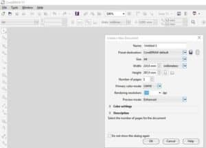
Now, we must choose the final, actual size of our work. That means that if the size of a business card needs to be 90×50 mm (or 3.5×2 inches), this should be the size of the document. Please do not place multiple cards on an A4 page, since this not only means extra work and time, it can also cause errors.
In the Create A New Document dialog box you’ll find some useful items, such as the name of the job, the number of pages, color mode, color settings, etc. but we will talk in more detail about each of these items later.
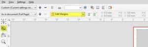
If you already have a new A4 document, don’t worry, you can change the page size in the Property Bar.
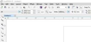
There are some presets in the Page Size drop-down list on the left of the Property Bar. You can add your own if you want to the end of the list by clicking on the “Edit this list…” button at the bottom of the drop-down. Note: you can access the same menu faster by double-clicking on the page border.
Defining the margins
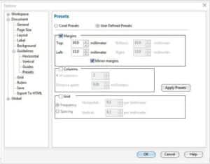
This is part of the Page Setup, but it’s an important step. After defining the page size, you should choose the inside and outside page margins. Inside margins, because it’s not good to place text or objects near the edge of page ̶ it’s not just about the aesthetics or design visuals ̶ even if there is little difference when cutting and it’s not noticeable that there is a margin around the inside.
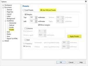
To add inner margins, double click on the page border and navigate to Document > Guidelines > Presets, choose the desired margin width (depending on the job), then click on the “Apply Presets” button.
If you are using a background, or if an image is near the edge of the page, you should add extra space around the outside. This outer margin is called “bleeding” and is very important because the cut is not always as accurate as expected. This additional margin helps the process of post-printing a lot. You can specify the size of the Bleed when you choose the size of the page. Double-click on the edge of the page, or go to Tools > Options > Document > Page Size. In the section “Bleed” you can set the desired distance (usually 3mm or 0.125″). In addition, you can make this area visible by selecting “Show bleed area“.
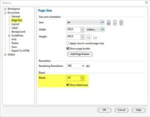
But it’s not enough to set the bleed distance, it is also necessary to expand the objects (the background, for example), in order to extend over the page border. Don’t worry if the image is larger than the bleed area, it will be cropped automatically when creating a PDF file or print.
Image quality
One of the most common issues is related to the image quality. For example, if you download an image from the internet, such as a wallpaper, it will be good for viewing on your screen but not for printing. Most of the images on the internet are low-quality (for example 72 dpi or 96 dpi), because it makes uploading the images to the web faster. But this resolution is not good for printing, because the image will be “pixelated” with jagged edges and the printed result will be bad.
For printing color photos, you should use images with a resolution of around 300 dpi and using the CMYK color mode. The “300 dpi” is a standard value, since imagesetters and CTP (computer-to-plate) use LPI (lines per inch) as the unit of measure.
- If the file output at 150 lines per inch, the max resolution available will be 150×2 = 300 dpi.
- If the output is at 175 lpi, the maximum resolution available will be 350 dpi.
- If the file output at 200 lpi, the max resolution will be 400 dpi, indeed 300 dpi will be good enough.
So far, there’s no printing device on the market with more than 200 lpi, so the best quality will be between 300 and 400 dpi.
Therefore, if you send an image with 600 dpi or higher resolution, this will produce only slower and larger files but will not improve the resolution. Some people send images with 1800 dpi, 2400 dpi and more and this only creates much larger files, but does not increase the quality of the output. You’ll see it better on screen if you zoom in on the image, but the printed result will be 300/400 dpi. Some people ask about inkjet printers that claim to print at 2400 dpi or more. There’s a lot of confusion about this, since they use “dpi” (talking about printed dots per inch), which is the printing quality, not the resolution of the images. And, for large format printers (plotters), there is no need to use high resolution bitmaps – on the contrary, the larger the size the lower the resolution needed. But, since they don’t produce color separations and the printing process is totally different, the “300 dpi” standard is not applied to plotters, laser or inkjets.
Another common mistake: be careful when enlarging or reducing the size of the images. If you import an image, for example 15×10 cm at 300 dpi, but want to enlarge it to 45×30 cm, the resolution decreases proportionally (in this example, it’s going to 100 dpi), so the quality will be affected. On the contrary, if you reduce the image to 3×2 cm the resolution will increase proportionally (in this example, 1500 dpi). Both are bad, so you should be careful with the resolution. Remember, 300 dpi should be the resolution at real size, not before enlarging or reducing.
Defining colors
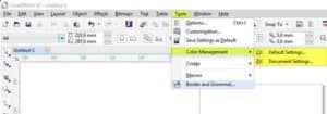
The next step is to define the Color Mode and Color Profile. Under Tools > Color Management you will see two dialog options; one for the general settings (Default Settings), and other relative to the currect document only (Document Settings). Both are very important.
The “Color mode” refers to the way in which we use the file, in this case, for high quality printing. The first choice is between RGB or CMYK color modes. RGB has brighter shades but is only good for web and desktop printers (for example inkjet printers) and plotters, but not for commercial printing. RGB has 16.8 million colors and CMYK only 64,000 but all commercial printers use CMYK. If you use a RGB color profile, the color mode will change when the file is sent to print, and perhaps the result will be bad or inaccurate. Then, you should choose CMYK as the “primary color mode” in both dialogues of Tools > Color Management.
Choosing a CMYK color profile doesn’t means that all objects will be CMYK automatically. When you import an image, or copy/paste a text, if the image is RGB it will be stored as RGB until you change the color mode. The best way is to use a image-editing software (such as Corel PHOTO-PAINT, included with the CorelDRAW Graphics Suite, or Corel PaintShop Pro), for correcting the image before importing it in to CorelDRAW. But if you insert an RGB image you can always change the color mode later. (NOTE: You can go to File > Document Properties… to make sure that all objects are in CMYK mode) For this reason it’s so important to have a good color management.
To adjust the color profiles go to Tools > Color Management and adjust the color settings for the current document and the overall settings (Default Settings and Document Settings). It’s not enough to set the default settings, because each document can have its own color profile.
Color Management requires a very wide explanation since there’s no “universal color profile” for all documents. So you should adjust the settings for each kind of job. For example, you should change your color profile according the paper of the document being used.
But not all documents can use the CMYK color mode, because it requires 4 inks. If you create a file with only two or three colors (e.g. blue and yellow) perhaps it is best to use only two or three colors (Spot Colors), such as Pantone colors. In addition, not all colors can be printed using CMYK, e.g. “Gold”, “Silver”, etc. Some bright colors can only be achieved by using special inks, and these cannot be achieved with CMYK. Spot colors are also important for “non-printing objects” (for example, an outline to die cut) or “overprinted objects” (such as UV varnish). It’s not only vectors that can use spot colors, also bitmaps can use Spot Colors. On the Bitmap Menu go to Mode > Duotone and convert the bitmap to one (“monotone”), or more spot colors.
Creating Styles
Text and Graphic Styles and Color Styles will help you to change content faster and will speed up productivity.
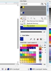
For example, imagine that we start a job with 2 colors, Blue and Yellow. Instead of applying these colors to each individual object, it is better to create two Color Styles and apply these to the objects (to create a new color style, select the object and right-click and choose > Color Styles > New from Selected…), If you need to use shades of each color (such as 10% of Blue, 20%, 30%, etc) you can choose “Create Gradient” on the same Color Styles docker (Window > Dockers > Color Styles), or (CTRL+F6).
Yes, it is also possible to manually change a color (Edit > Find and Replace > Replace Objects > Replace a Color…), but it is necessary to change every color and every shade of this color for each page. The Color Styles docker will replace the color and all shades on all pages in just one step. But it is important to remember that it is necessary to “apply” the Color Style to the object, since it is not enough to be “Yellow” or the same color (e.g. Pantone 012), the Color Style must be applied. When you change the Color Style, only the objects using that style will change, not all yellow objects.
The same happens with the styles of text and graphics. Suppose that we are working on a magazine, and we use Garamond, 24 pts for titles and Times New Roman, 11 pts for the body of the text. But after we have finished, our customer wants to change the fonts, and asks us to use Humanist777 – 30 pts for the titles and HelveticaNeue LT Pro 55 Roman – 12 pts for the body of the text. Although you can change it manually if we edit the Style of the titles it will change on all the pages in a second.
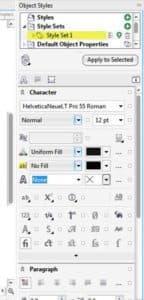
You can see, it’s not only about the Font name and size, there are a lot of text attributes that can be used in the same style, including colors. And you can have several color styles, i.e. for footnotes, headers, etc. Editing a style will change the entire document in just one step. Remember that as with Color Styles, it is necessary to apply the style to an object/objects, so that replacing or editing a style that uses Garamond will change all text objects that have had this style applied, not each and every Garamond text object.
Sending files and publishing to PDF
If you are sending the original .CDR file, you must provide all the required information. The best way to do this is to go to File > Collect for Output which creates a new folder with a copy of the .CDR file, the fonts used and the color profile. If you are using externally linked images, these files will be also be included. Optionally, you can also create a PDF.
It’s not good if the file is opened in a different version of the program because some things can change. For example, the fills of CorelDRAW X7 are quite different to those of previous versions and also allow selective transparency. For this reason, if you save the file back as a previous version, the program will ask if you want to convert text to curves and fills to bitmaps.
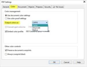
Anyway, there’s a good alternative: create a PDF. To do this, you can go to File > Publish to PDF (or go to File > Export(CTRL+I), and there choose PDF). But it is not enough just to create a PDF, since not all the PDF files have the same configuration. For example, a PDF for the web will produce a PDF of low quality but it will be a small file, suitable for attaching to an email or using on a web page. But for printing, we need the opposite: images of high quality and resolution. PDF settings is also a topic that requires a lengthy explanation, but this exceeds the scope of the current tutorial. There are many different configurations, according to each company’s work flow. But we propose a simple format that should work with most of the job outputs: choose PDF X-3 in the PDF Presets drop-down list, then go to “Settings” and change the “Compatibility” to Acrobat 8.0 or higher. Why? Because the PDF X-3 is a good standard but it has a default compatibility with Acrobat 4.0, which does not support transparencies and lenses. This problem is solved by changing the compatibility.
On the Color tab of the PDF Settings window, by default all color will output as CMYK, but you can change it to Native especially if you are using Spot colors. Always activate the option to Embed color profile. If you use custom overprints on your document, don’t forget to leave this option active (it’s enabled by default).
On the Objects tab you have several important options. The standard PDF X-3 is good, so you don’t need to change anything. In particular, it’s not needed to convert text to curves, because the PDF will embed all the fonts. Use this option only if you use fonts with restrictions for print, but only a few fonts have this problem. The Convert to curves option will create a bigger and more complex file, and some RIPs will have problems processing it. Since the fonts will be embedded, it is not necessary to convert text to curves.
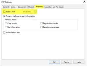
On the Prepress tab you have the option of activating Bleed Limit. Even if the current document does not have an active bleed, you can activate it while creating the PDF. But remember that the objects must extend out from the page limit. Activating the Bleed Limit does not automatically increase the size of objects used to create the design. Another option which is often useful is to activate Crop marks to indicate the limits of our design. For this reason it is important that the page size is the real size.
Creating a card
Consider a couple of practical examples. First, we will create some business cards. As we saw at the beginning, we define the page size to be 90×50 mm (or 3.5×2 inches). Remember that it’s only an example, the size can vary from model to model.
Then we double-click on the edge of the sheet to define margins and add a 3mm Bleed.
Then, still in the Options panel, we’ll go to Documents > Guidelines > Presets > and choose User Defined to establish an inner margin of 5mm. Do not forget to click the Apply Presets button. We click on OK, and we have a page ready to start work.
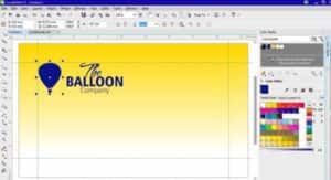
The next step is to define Color Styles (Ctrl + F6). In this case, we will use two spot colors, Blue (Pantone Reflex Blue C), and Yellow (Pantone Yellow 012 C), both of the Pantone Solid Coated v.2 color palette.
We will create an imaginary logo, and we apply the Blue Style. Then, to create the background, double click on the Rectangle tool to create a rectangle the size of the page. We apply the Yellow Style, and we then create a gradient (we press the G key to activate the Interactive Fill tool and drag the handles to adjust the gradient). Finally, we expand the size to cover the bleed area. As the card measures 90×50 mm, we will make the background of 96×56 mm, centered on the page (to center the background object, select and press P on the keyboard).
What happens if we need several different names on our business cards? If they were only two, we could duplicate the page contents (Layout > Duplicate page), but if we want to create several pages, the best way is to create a Master Layer. To do this, select the logo and background, and choose Edit > Cut (or CTRL + X). Then, go to the Objects docker (Window > Dockers > Objects), and there choose from the docker menu New Master Layer – All pages. Or we can click on the New Master Layer (all pages) icon at the bottom of the Objects docker.
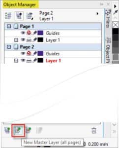
If you want you can rename this layer. Then simply “paste” (Edit > Paste or CTRL+V), to place the logos and background on the new layer. We can create as many pages as we need names, and all will have the same logo and background. But the advantage is, that it will only exist once in the file: and if you modify one element it will be changed on all pages. To avoid a change by mistake, we can “lock” that layer by clicking on the padlock icon on the Objects docker. Then, we just have to select the page and layer (usually, Layer 1), and enter the appropriate text (Name, Phone, etc)
If we send the file to print (File > Print or CTRL+P), notice that one card per sheet appears. But if we go to File > Print Preview, we can perform an Imposition (the second tool on the left), as well as set the gutter distance between the cards. Replays can be identical or different, why we chose it as the page number. We can also add Crop Marks (third tool), and many other options.
But we just need to create a PDF file, a print preview is not necessary. Just follow the steps above and create a PDF with several individual pages, each with crop marks and bleed. Imposition will be done automatically using PDF-based workflows programs (such as Heidelberg Kodak Preps or MetaDimensions).
Designing a magazine
As a magazine design, the process is similar but with a few differences. The first step, as always, is to define the format of the magazine. Suppose the finished magazine should measure 19×27 cm then double-click on the page border (this takes us to: Tools > Options > Workspace > Document > Page Size), and choose the size of two pages together: 38×27 cm (the bleed as always, should be 3mm but can be more if preferred).
We now navigate to “Layout” and choose “Booklet” from the Layout drop-down list. It is important to verify that the option “Facing pages” is active in order to see the magazine as it is read: the first and last pages as individual pages (as if the magazine is closed), and then pages 2-3, 4-5, etc. However, when creating the PDF each page will be individual, as it should be, so you can use any imposition software. If an object or image occupies two pages, it will be cut automatically.
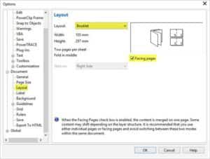
As with the business card, go to “Tools > Options > Workspace > Document > Guides > Presets > User Defined” and chose the inner margins if desired. If you wish, we can set different margins, for example, we may leave 1.5 cm at the top and 1 cm at the bottom. For this, we disable the “Mirror margins” option.
If we want to work with columns, we can also determine the number of columns and distance between them in “Tools >Options > Workspace > Document > Guides > Presets > User Defined > Columns“. An important detail is, not to be confused with Paragraph Text columns which involves splitting a block of text into two or more columns (Text menu >Columns…). Dividing the page into columns does not automatically separate the text or content ̶ it’s just a visual reference.
Then, after clicking on Apply Presets, we can add the desired number of pages (Layout > Insert page), or press the Page Down key). We are now ready to start working.
For reasons of space and not to deviate from the main theme, I will not go into details about how to design the magazine as there may well be many design options. Just remember some important points to consider:
- You can automatically number pages (Layout > Insert Page Number > On All Pages)
- When sending to print (laser or inkjet), by default the last and first pages will appear together, as we would print it.
- When you generate the PDF (File > Publish to PDF or File > Export > PDF), we will have individual pages as necessary for imposition programs.
- Remember, as we have already said, don’t forget to add Bleed and Crop Marks.
 CorelDRAW Graphics Suite
 Ultimate Vector Bundle Vol. 1
 CorelDRAW Standard 2021
 Ultimate Vector Bundle Vol. 2
 Corel Vector
Start your FREE 15-day trial and embark on a design journey with powerful tools for vector illustration, layout, photo editing, typography, and collaboration.

Comments (1)
Reader Interactions
Comments
Please update this article to include screenshots that show what the final markings on the print file look like. Great job showing the menu items, complete command line paths, and explaining the important steps. However, at the end I have no idea what the crop lines look like so the print shop knows they are crop lines and not part of the image. I don’t know what registration marks look like or where to place them. I don’t know to have the color references shown on the file I send to the print shop. Please add images of the work in progress, or at the very least show what the file looks like that is sent to the print shop -at least as far as the features you discussed. The one file image in the article does not seem to show any markings for the print shop to use. Add the requested images and this becomes a one-stop reference for me. Also, please always provide a date for articles and reference the version level of the software used.