
This guide to brochure design is packed with helpful tips from CorelDRAW Master Ariel Garaza Diaz. You will learn how to properly set up your CorelDRAW document and guidelines for a tri-fold brochure layout, what page layout and branding guidelines to consider during the design phase, and which CorelDRAW tools are particularly useful when creating a brochure. You will also learn how to prepare your brochure for printing.
Start your FREE 15-day trial and embark on a design journey with powerful tools for vector illustration, layout, photo editing, typography, and collaboration.
Download these free resources:
Written Tutorial (PDF, 996 KB)
CorelDRAW Graphics Suite Resources
Quick Start Guide (PDF, 2 MB)
Keyboard Shortcuts (PDF, 3.5 MB)
CorelDRAW and Corel PHOTO-PAINT user guides
For CorelDRAW Graphics Suite subscription and perpetual licenses (2018 to 2024), languages include English, Português do brasil, 简体中文, 繁體中文, Čeština, Deutsch, Español, Français, Italiano, 日本語, Polski, Русский
What’s New in CorelDRAW Graphics Suite
A Guide to Brochure Design
This guide to brochure design will take you through the design process, from setting up your CorelDRAW document, to adding content, and finally preparing the file for printing.
Click on any of the images below to view full-size.
What is a brochure?
A brochure is a printed document, used to advertise a product or service, or to convey information through a combination of text and images.
Typically, a brochure design is made up of only one folded sheet, although it could be two or more, taking the form of a booklet or magazine. If a brochure is not folded, it is considered a flyer.

Types of Brochure Design
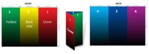
Brochures are usually classified by the number of sections or “faces” resulting from the folding. For example, bi-fold brochures (folded in two parts, whether or not it’s folded down the middle), tri-fold (having three sections), four-fold (having four sections), etc.
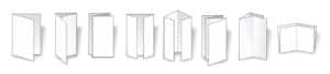
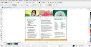
In this tutorial, we will be using a tri-fold brochure design, the most common of the standard brochure formats. This will be a horizontal A4 sheet divided into three sections.
Part 1: Document Setup for Brochure Design
Before opening CorelDRAW Graphics Suite, it’s wise to divide an A4 piece of paper into three parts. This simple step helps you to visualize how the final printed piece will unfold and can help you avoid common layout mistakes.
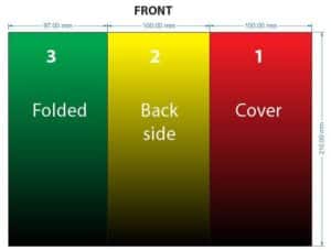
If you divide the horizontal A4 sheet (297 x 210 mm) into three equal parts of 99 x 210 mm, with the third section folded inwards like you’d fold a letter for an envelope, you’ll notice it tends to curve when closing. This doesn’t happen if your sheet is bent into a Z shape. To solve for this curve issue, the first two sections must be slightly larger (100 x 210 mm), and the third section narrower (97 x 210 mm).
Creating a New Document
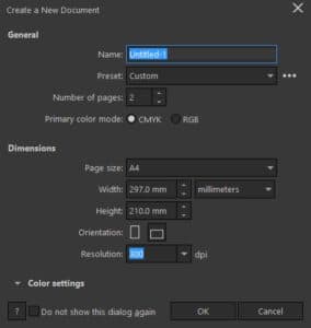
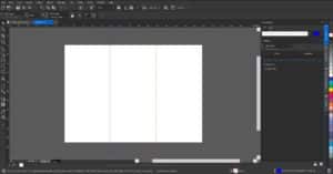
1) Open CorelDRAW and create a new file (CTRL + N).
2) Set the number of pages to 2, then choose A4 as the page size, and Horizontal (landscape) for the orientation. Click OK.
It’s important to be aware that page two will be the reverse of page one. If on page one, the cover is on the right side and the narrower section is on the left, then the narrower section will be on the right for page two. Again, the folded sheet will be invaluable in helping you to understand this clearly.
To divide the two pages (which will serve as front and back of your brochure) into three sections each, you’ll need to place guidelines.
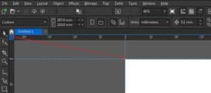
3) Go to the View menu and make sure that both Rulers and Guidelines are checked, so that they are visible.
4) Drag the ruler intersection to the upper left corner of the page to set the zero point of both the horizontal and vertical rulers to coincide with the corner of the page.
NOTE: As the divisions of the page are not equal, we can’t use Master Guides, since they would be the same on all pages.
Adding Guidelines
There are 2 methods to add guidelines to your document. First, go to Window > Dockers and select the Objects docker (Windows) / Objects inspector (Mac) and the Guidelines docker/inspector.
1) Method 1: In the Objects docker, select the Guides layer on page one. Drag a guide from the vertical ruler on the left and place it in the 97 mm position. It’s not necessary to be precise as you can adjust the position exactly in the Object Position box on the Property Bar.
2) Method 2: You can also set the guideline using the Guidelines docker/inspector:
- Set the Guideline Type to vertical.
- Enter 97 mm in the Guideline Position box.
- Click Add.
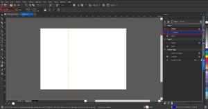
3) Add a second guideline at 197 mm. Now you should have one section measuring 97 mm and two sections of 100 mm each.
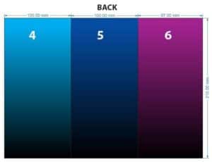
4) On page two, add the first guideline at 100 mm and the second guideline at 200 mm. Now you will have two sections measuring 100 mm each and a third section measuring 97 mm, to match the front side of the brochure.
To learn more about guidelines, watch our full tutorial on How to Align and Position Objects.
Alternatively, there is another way to go about setting up the three panels on each page, which involves creating rectangles for each section. This is particularly useful if you are planning to use different backgrounds for each section.
1) Ensure that you have Layer 1 selected in the Objects docker and then on page one, double-click on the Rectangle tool to create a rectangle the size of the page.
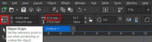
2) On the Property Bar, change the Object Origin reference point to the left.
3) Also on the Property Bar, change the width in the Object size from 297 mm to 97 mm (make sure that you have the Lock Ratio set to unlocked). Because the reference point was changed, the resized rectangle remains aligned to the left.
4) Set the Duplicate Distance to 0:0 and then use CTRL + D (or Edit > Duplicate) make a duplicate to the right of the rectangle and change the width to 100 mm. Duplicate this second rectangle to make a third.
5) Use the Pick tool (or change the X value in the Object position box) to place the second and third rectangles in the middle and right side of the brochure design.
6) Holding down the Shift key, select each of the rectangles and use CTRL + C to copy.
7) Go to page two and use CTRL + V to paste. Because the dimensions of the 3 sections are reversed on page two, the rectangles need to be adjusted.
8) Set the Object Origin back to center and then click the Mirror horizontally button on the Property Bar.
To follow along, fill each rectangle with a different color to clearly differentiate between them. Adding numbers to each section of the brochure will help you to follow the rest of this tutorial too.
Part 2: Adding content
Now comes the fun part: the actual brochure design! The possibilities for creative options such as colors, fonts and layout are endless, but in this section we will provide some brochure design tips and introduce you to some helpful CorelDRAW tools.
Page Layout
1) On the outer side (your page one), each face will be seen separately, while inside the three faces will be seen together (your page two). Having your page two design span across the three panels will keep your brochure design looking consistent. In this case, it is good that the design continues and covers the three sectors. But if you decide to keep the look of the panels separate, make sure that the division is accentuated, so it appears deliberate and is not deemed an error.
2) The sector that is folded (your section three on page one) may contain important information but will always be separated from the rest. Because of this, there’s no need to extend the inside design to this panel.
3) As a general rule, the cover page (section one of page one) should include the title and main message. The detailed information should be reserved for page two, (panels four, five and six). Section three is a good place to include highlight information, and the back side (section two) generally includes contact information, web addresses, etc.
Branding Considerations
Whether this brochure design is for a client or for yourself, make sure you have all the necessary information and design assets before you begin:
1) Branding guidelines, such as corporate colors and fonts.
2) Image assets such as company logos, product images, etc.
3) Examples of other marketing collateral, such as flyers, web pages, stationery etc. if your brochure design needs to match a company’s brand personality.
CorelDRAW Tools for Brochure Design
While you will be using many different CorelDRAW tools, here are a few that are particularly helpful for brochure design.
1) If you’re not sure where to begin with brochure design, you can start with a CorelDRAW template.
- Go to File > New from Template and then select Brochures from the Filter Content dropdown list. Double-click on a thumbnail to open the template.
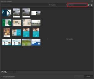
- Starting with a template layout, you can now modify all elements such as fonts, colors, position and size of images, backgrounds and text boxes, etc.
- You can even save your modified template as a new template to use again.
To learn more, watch our full tutorial on How to Use CorelDRAW Templates.
2) The Layout toolbar contains commands for converting objects to PowerClip frames and text frames, displaying alignment guides as well as setting columns and margins.
- To display the Layout toolbar, go to Window > Toolbars > Layout.

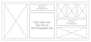
3) Creating empty PowerClip frames or Text frames is useful when you want to define the layout of your document before adding the content. Add a PowerClip frame as a placeholder for an image.
To learn more, watch our full tutorial on Clipping Objects into Other Objects with PowerClip.
4) If you want to see the layout of your document before you add the final content, you can fill the text frames with temporary placeholder text.
- With a text frame selected, go to Text > Paragraph Text Frame > Insert Placeholder Text.
Part 3: Preparing for Print
The best way to deliver a file to a printer is to export to PDF.
In CorelDRAW 2019, select File > Publish to PDF. Choose PDF/X-4 from the PDF Preset drop-down list. If you have an older version of CorelDRAW, you could use PDF/X-3 and change the Compatibility to Acrobat 8.0 or higher in the PDF Settings dialog box.
To learn more, watch our full tutorial on Publishing PDFs for Print Output.
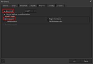
If you are planning to get your brochure professionally printed, you’ll likely want to add a bleed so when the brochure is cut, the color goes right to the edge of the sheet. The objects that reach the edge of the sheet (backgrounds, images, etc.) must exceed at least 3 or 4 mm off your design.
When publishing to PDF, you’ll want to activate the Bleed option on the PrePress tab. You can also activate Crop Marks.
It is convenient to place folding marks since we have done it manually, the marks will also be personalized. To differentiate them from the cut marks, which are continuous lines, we will use dotted lines.
Providing a customer proof
You may want to send a proof to the customer to review and approve. A flat view might be confusing to a client, so it’s a good idea to consider creating a simulation for the final piece.

The most frequent option is to convert each section to a bitmap and then create a mockup, skewing each side to simulate the 3D effect. The result, despite being enough to show the content, is somewhat crude and rigid. Fortunately, in the more recent versions of CorelDRAW you can apply the Envelope tool to bitmaps. This allows you to create softer shapes, curving each section to obtain a more pleasing result. You can also add a shadow to each section separately (using the Drop Shadow tool) for even more realism.

 CorelDRAW Graphics Suite
 Ultimate Vector Bundle Vol. 1
 CorelDRAW Standard 2021
 Ultimate Vector Bundle Vol. 2
 Corel Vector
Start your FREE 15-day trial and embark on a design journey with powerful tools for vector illustration, layout, photo editing, typography, and collaboration.

Reader Interactions