
In this tutorial, CorelDRAW Master Ariel Garaza Diaz provides design tips and step-by-step instructions to design a letterhead for corporate communications. You will learn how to use a header and footer to creatively display a company logo, address and contact info plus how to get your document ready for printing.
Start your FREE 15-day trial and embark on a design journey with powerful tools for vector illustration, layout, photo editing, typography, and collaboration.
Download these free resources:
Written Tutorial (PDF, 1 MB)
CorelDRAW Graphics Suite Resources
Quick Start Guide (PDF, 2 MB)
Keyboard Shortcuts (PDF, 3.5 MB)
CorelDRAW and Corel PHOTO-PAINT user guides
For CorelDRAW Graphics Suite subscription and perpetual licenses (2018 to 2024), languages include English, Português do brasil, 简体中文, 繁體中文, Čeština, Deutsch, Español, Français, Italiano, 日本語, Polski, Русский
What’s new in CorelDRAW Graphics Suite
Marketing and branding projects
Creative design projects
Letterhead and stationery
A letterhead is a document template that includes a company logo and information. It is used to provide authenticity and ensure consistent branding in corporate communications. Usually a letterhead template will have a similar design look and feel as other stationery such as business cards, brochures and such.
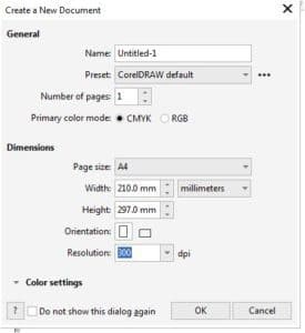
The size or format of a letterhead changes according to the country of origin’s specifications. In most markets the A4 format (210 × 279 mm) is the standard, corresponding to the ISO 216 standard, derived from the DIN 476 standard (which is why it is sometimes called DIN A4). However, in countries like the United States, Canada and Mexico, Letter format (8½ × 11”/215.9 × 279.4 mm) is the standard. Since there is a marginal difference, this tutorial applies to both systems, but uses the A4 format as a reference.
To create a new document, go to File > New (or use Ctrl + N) and choose the appropriate size (Letter or A4). Since letterheads are most commonly printed, we will be selecting CMYK as the Color Mode.
TIP: you can use the Find and Replace docker to convert the document to RGB for web use.
Anatomy of a letterhead
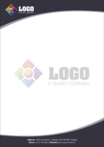
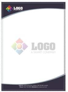
The structure of a letterhead is comprised of three sectors: the header (top), the body (where the text is written) and the footer (bottom).
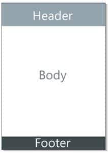
There are no mandatory rules for the dimensions of each sector. Some people put all the content in the header, others put everything at the bottom, although most divide the contents between the header and footer.
An important criterion for creating a letterhead design is leaving an open space in the center, to allow enough room for the contents. Therefore, when a logo or background design is placed in the center, it is usually as transparent as possible. This is often referred to as a watermark.
TIP: It is most convenient to leave as much space as possible to write comfortably. Often a word processor with an already printed letterhead sheet is used, so both must match. The larger the open space, the less the possibility for error.
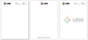
Highlight the header
If the contributors reviewing and approving the letterhead, deem the logo or name of the company should be most visible, we may consider highlighting the header by adding a background. It is important that there is a clear contrast between the logo and background, so it helps to highlight the logo. It may be necessary to invert the colors in some cases.
TIP: A rectangular frame conveys the idea of solidity, but also of rigidity. Adding a curved shape can greatly help convey a feeling of dynamism, of movement. We can create a curved shape by placing a rectangle, converting it into curves (Ctrl + Q) and then, with the Shape tool (F10) we select the bottom side and choose to convert that segment “into a curve”, then we curl with the Shape tool.
Add a footer
As we have seen from the example above, some letterhead designs place all the address and contact information at the bottom. But even if we use the logo in the header, a good footer will effectively give its audience a final impression, as well as highlight the contact details.
TIP: We can create an attractive effect using alternating curved shapes. In the previous example, we have duplicated the shape used in the header (Ctrl + D) and made “mirror” in the Property Bar twice, one horizontal and one vertical (equivalent to rotating the figure 180º).
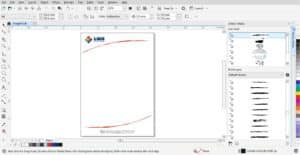
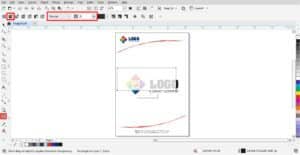
Creating a clean design
Maybe a more minimalistic and clean approach is what you’re seeking; in that case, we can define the same areas with more simple elements. In the below example, we are simply using curved lines, to which we apply an Artistic Media Stroke.

TIP: Instead of using an Artistic Media Stroke, we can open the Artistic Media docker (Window > Dockers > Artistic Media) and drag it over an existing line. That will allow us to try different Strokes. We can regulate the thickness and other options in the Property Bar.
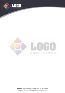
Adding a watermark
As we mentioned earlier, in some cases it is customary to place an image or logo itself in the background of the body. Among other things, unlike copies of the original, this avoids fakes.
The simplest form, and the most commonly used, is to place a white rectangle on top, with a uniform transparency in “Normal” merge mode with a transparency value of 10% to 20%. Simply draw a rectangle, fill it with white, then take the Transparency tool and adjust the tone until you achieve the desired color.
That said, we can also apply Transparency directly on the logo or image. In this case, when using the “Normal” merge mode, the transparency value is the opposite: between 80 and 90% transparency. A 90% transparency is equivalent to 10% of the selected color.
TIP: Remember when adding transparency to the watermark we should not be using the screen for reference as to whether it is transparent enough. The percentages of ink should be between 5% and 20% for optimal values, less than that is not visible and more than 20% could be too dark to add text.
Preparing the file for printing
If our letterhead design has a background, we must add a leftover of about 3 or 4 mm called “Bleed”. We can make that area visible by going to View > Page > Bleed. However, that is not enough to generate the surplus: we must expand the background, so that it exceeds a few millimeters from the page edge (if it is more, it does not matter, since it will be cut to the established distance).
TIP: The bleeding margin in the View menu is only a visual reference as an aid. Even if disabled, bleeding can be created.
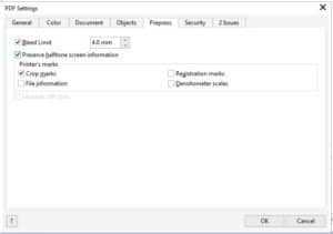
Then, in File > Publish to PDF (or in File > Export and choose PDF as file type to save as) we choose PDF/X-4: 2010 CMYK from the PDF Preset list (this is new in CorelDRAW 2019; in previous versions it is necessary to go to the “Settings” button, select PDF/X-3 and change “Compatibility” to Acrobat 8.0 or higher). Click on Settings to open the PDF Settings window and we select the Prepress tab, where we choose the Bleed Limit and also, we add automatic Crop Marks for a precise cutting.
TIP: It is important to remember that some companies use Pantone colors as corporate reference, and it is important to respect them. It is also important to remember that the color tone can vary considerably, in comparison with coated papers, matt or gloss, since the letterhead is usually printed on regular paper.
Final tips
There are countless styles to design a letterhead. According to the corporate identity of the company, the design can vary from colorful, to modern to formal.
A common problem is the excess of data, as in the case of a company that has many offices or branches. In such a case, an alternative solution is to create a column with that data, so that it is visible but does not affect the design or general content.

As a final note, remember that you are transmitting a message. The image of the company transmits sensations, from the forms, texts, images, and colors you choose. You can make the company look modern, reliable, dynamic, solid, or versatile; it’s whatever you want to convey. Take care that it is the correct message, regardless of what is written on that letterhead.
We hope you found this tutorial helpful and we would love to hear your feedback in the Comments section at the bottom of the page. You will find a written version of this tutorial below, and a printable PDF copy to download on the Download Resources tab above.
 CorelDRAW Graphics Suite
 Ultimate Vector Bundle Vol. 1
 CorelDRAW Standard 2021
 Ultimate Vector Bundle Vol. 2
 Corel Vector
Start your FREE 15-day trial and embark on a design journey with powerful tools for vector illustration, layout, photo editing, typography, and collaboration.

Reader Interactions