
Have you ever wondered where some of these printing terms come from? Why do we talk about ‘leading’ when we look at line spacing? Why do you have to “mind your P’s and Q’s”? Is upper case called upper case because it’s taller? What is the K in CMYK?
I don’t know about you, but I have a lot of questions here! But I think we should start by clarifying one little thing. What is a font?
What is a Font?
It doesn’t matter who you are or what you do these days, you have absolutely heard of fonts and typefaces. You’ve definitely used more than a few in your time. But what are they? Are we using the word right? Don’t they mean the same thing?
Well…no. We are not, and they do not.
Remember that this whole printing business started out as massive machines holding rows of metal blocks that you would roll ink over, then stamp down on your paper to print. These blocks all had a letter on one face. Some type on one face. The type’s face. Typeface! We’re getting somewhere here.
So typeface is the style of lettering on your block, right? Times New Roman is a typeface, and Calibri is a typeface. That wasn’t so bad. But then what are fonts?
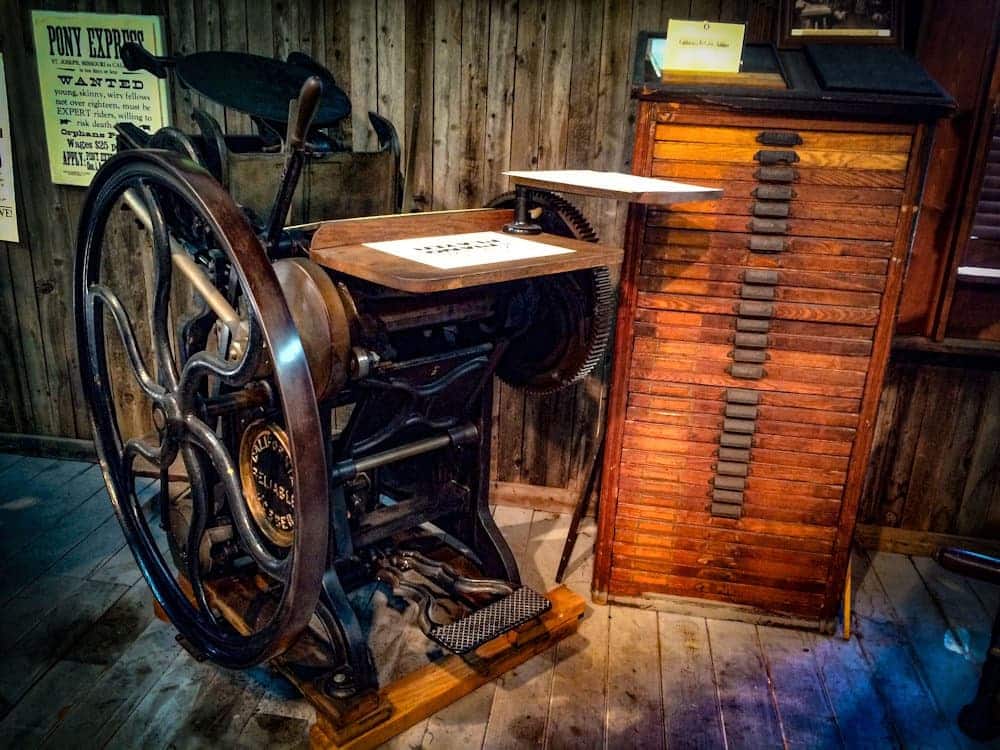
Turns out, fonts are just all the little differences in our typefaces that we take for granted in the digital age. After all, italicizing a word isn’t hard, and changing the size of a word is downright simple. But we’re talking about something that used to be done by hand! Every letter screwed into place, all at once, and then the press…pressed! A great big lead stamp the size of a page.
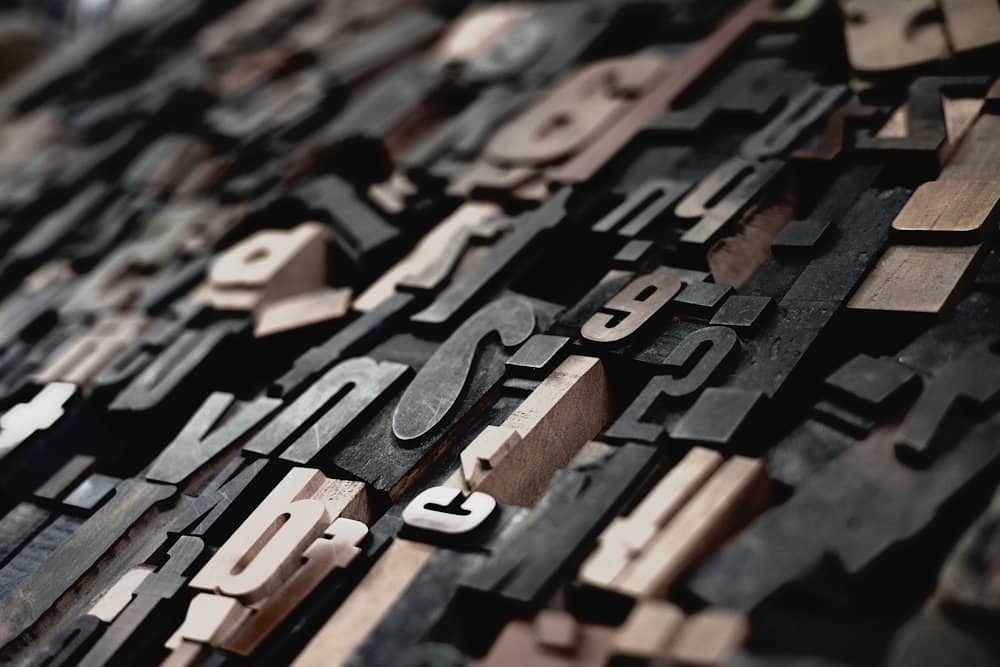
That means if you wanted italics, you needed a whole separate set of letters. So you had your Arial typeface, but I bet you were a pretty well-off printer, and had Arial and Arial fonts. And maybe you were an exceptionally well-off printer, and you had Arial, and Arial, and Arial, and Arial! That’s right, even different sized fonts were just that – different sized fonts! That means another whole new set of letters for any change to any typeface.
Printers didn’t want to use the same letters all the time any more than we would want to make posters covered in nothing but Lines and Lines of Times (New Roman) now! Different typefaces were just as important for making your text and graphics meld then as now, and certainly important for making your newsprint or title attract a reader. You needed lots of different typefaces, and lots of fonts for your typefaces.
Leading the Charge
Leading is a deceptive term. I bet when you say it, you could just as easily be talking about what you might do to bring a horse to water. That’s fine, but in this case you’d be better off if you were talking about having already brought that horse to water!
Too much? Think about metals. That’s right, lead!
Turns out, leading refers to two things. First, there is the standard leading, which is built into your typeface. It’s the width of lead above and below the letters on your font face. Second, there’s the leading strips – these are thin strips of lead the printer would wedge between each line of type as they were set into to ensure lines of text were evenly spaced in the chase.
The width of these strips was standardized at one point. Or, one ‘point’. Now that’s a word we have definitely heard before…
What’s the Point?
This is a familiar word! We know this one. Points are how big the letters are. But why do we talk about fonts in points? What is a point? What is the Point?
Turns out, the point is the smallest dot you can reliably print. We’ve gotten that quite small these days, but back in the day (think 1800s), a point was about 0.4 millimeters. So that would have been about how thick your leading was, and that number also lets you quickly figure out how tall your 10-point font is!
The size of a point varied by place, time, and printing press, and we’re sure there were plenty of arguments about whether, say, the French or English point was the proper size, but thanks to computers things are a bit simpler now. We mostly use the Desktop Publishing Point now, which is about 0.35 mm (or 1/72 of an inch if you prefer). Not so different from those olden times!
Casing the Joint
So that’s leading and points. But what about upper case? Why is upper case upper and lower case lower? Turns out, this was a very literal name at the time. It was all about the cases. Or drawers, depending on the printer’s press.
Typeface was kept in large cases or drawers to keep it organized and easy to access. By convention the capital letters were kept in…you guessed it. The upper cases. The top drawers. I guess “top drawer” didn’t have the same ring to it.
What’s the K in CMYK?
I’ll be honest. When someone asked me this, I knew the answer. “Cyan, Magenta, Yellow, and Black!”, I said. Now I don’t know if you knew this, but there are people in the Corel offices who know a thing or two about fonts and printing. This was a bold claim to make in there, and I learned something from it. So before you go challenging a bunch of designers like this writer did, what does the K stand for?

Turns out, it stands for Key! This is thought to originate from the screw key in the earliest rotary printers that controlled how much ink flowed on to your printing rollers. There is also an argument that black is the key color, since it adds contrast and detail to your color images. Since the first color printing presses used a Red-Yellow-Blue-Black color model, we also couldn’t use B: that was already used in blue!
Mind your P’s and Q’s
Now here’s an expression we’ve all heard! But why do you have to mind your P’s and Q’s? Well, it turns out there are a lot of competing theories on this one. But one we find particularly compelling is also very close to home – it’s all about the printer!
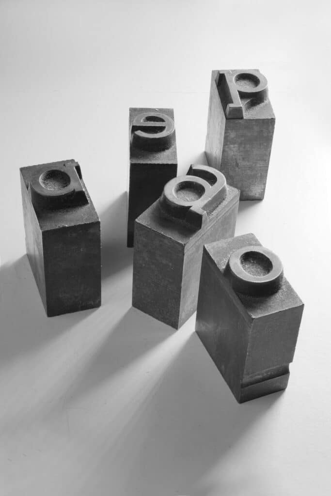
As an olden-times printer, you were always working in mirror-writing; you set letters in backwards, so that when the press plate or roller comes down on the paper the letters are the right way round there. Making puite sure to qlace your q’s and p’s in the right place would be a tricky – but important – task!
Why are Pencils Yellow?
Now this isn’t really a printing question per se, but thanks to an autocorrect error when looking up P’s and Q’s we found the answer! And it is an unusual and interesting fact.
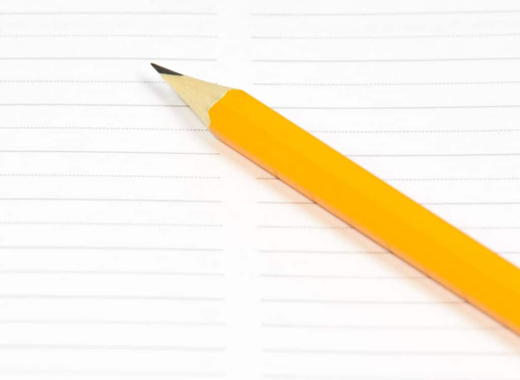
Back around the mid-1800s or so, pencils were all the rage. But if you wanted a good pencil, you wanted one with Chinese graphite in it. So how could pencil manufacturers easily signal that their pencils contained the good stuff? By painting them yellow!
But why yellow? Turns out, yellow is a color that traditionally carries associations of dignity, royalty, and respectability in China. So local manufacturers tipped their hats to the folks that sent them that premium graphite, and painted their pencils the color of royalty.
That’s all I have for you today! Do you have any great printing facts or trivia that you want to share? Let us know in the comments – we’d love to hear from you.


5 Comments