
How to Create a Vector Portrait
Transforming a beautiful portrait into a vector illustration is a fun task that doesn’t require outstanding drawing skills and can give you a great final piece of design. It does, however, require a good amount of time and patience. In this tutorial we will take you step by step through the process to create a vector portrait based on a picture.
Download a printable copy of this tutorial (PDF, 1.6 MB)
*Corel Vector is a newly updated version of the Gravit Designer Pro web-based graphic design app.
Download your FREE 15-day trial and see how easy it is to design your creative projects with this web-based vector graphics app that empowers you to create on any device.
Start by choosing a good picture
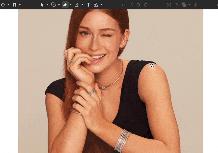
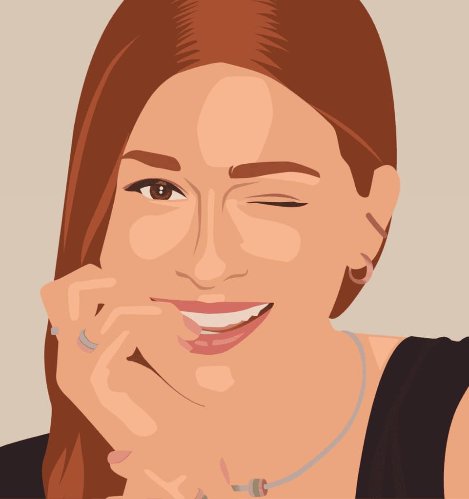
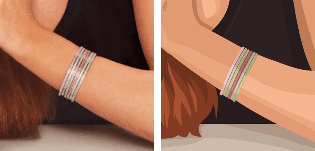
The final result will depend greatly on the kind of picture you choose. Look for something not only good looking, but also with good lighting, contrast (which will make your work a lot easier, as you will see later) and nice details. Least but not last, it’s preferable to use a high-quality picture because you might zoom in and out a lot. If you need to remove a distracting background, see our tutorial on removing the background from an image.
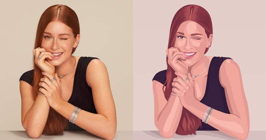
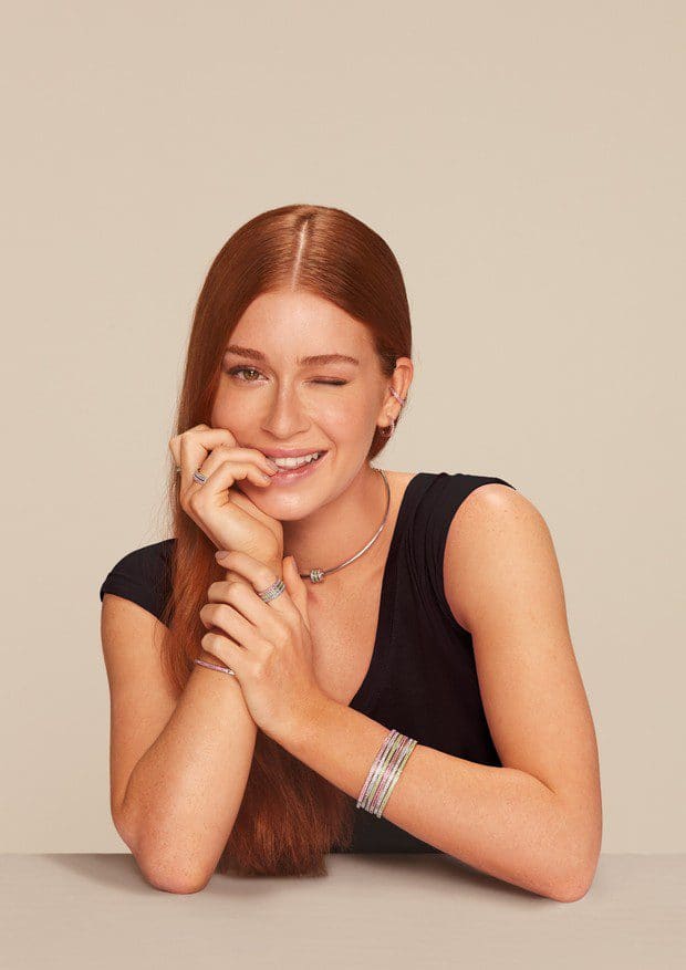
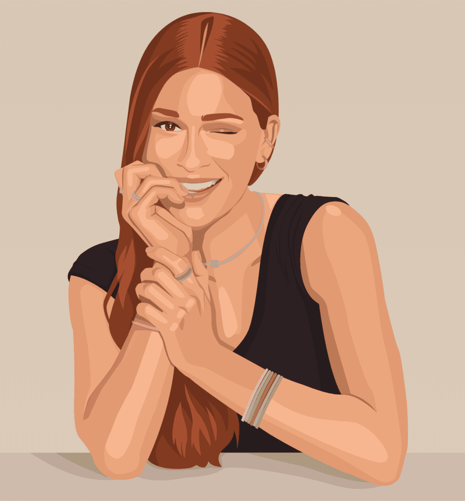
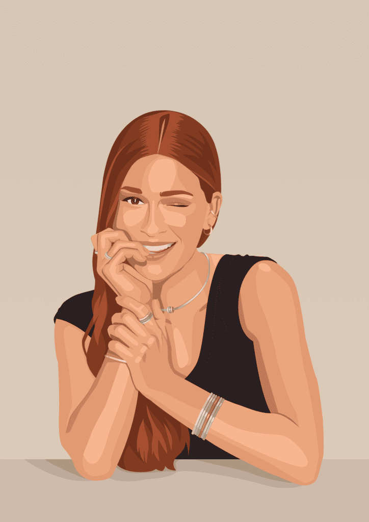
This is the image we will use for this tutorial. It’s a beautiful portrait with good light and contrast, and some accessories as interesting details.
Create a new document
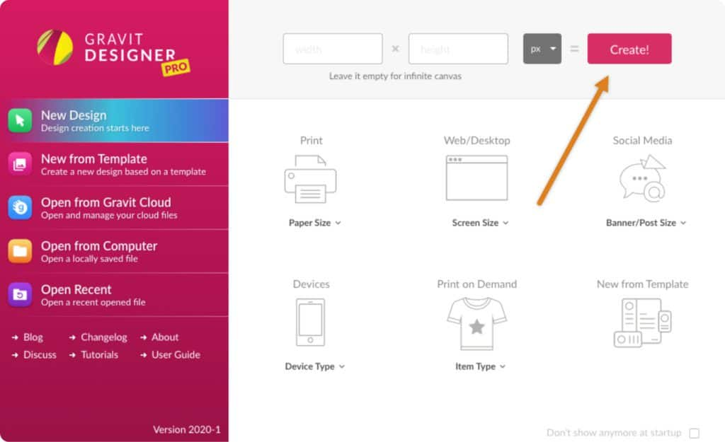
To get started, open Corel Vector and create a new document with an Infinite Canvas to have plenty of space to work. To do that, leave the Width and Height fields empty and click “Create!”.
Import the image
With the document ready, it’s time to import the image you chose previously to the canvas. To do that, you can use the Place Image option on the toolbar button, or go to menu File > Import > Place image.
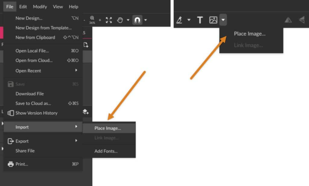
The easiest way, though, is to drag the image directly from your computer folder onto the canvas.
The basic drawing tools
For the rest of this tutorial, it’s necessary to have a good notion of how to use the main drawing tools, the Pen and Bezigon. If you have already mastered those, go ahead!
If not, check our tutorials and our User Guide to learn the tricks on using the drawing tools. And remember: practice makes it perfect.
Base shapes
Time to get started. There are many different approaches, techniques and styles for creating a vector portrait, or any illustration for that matter, but in this tutorial we will use one particular style and follow a particular way. Let’s start with the base shapes of the portrait.
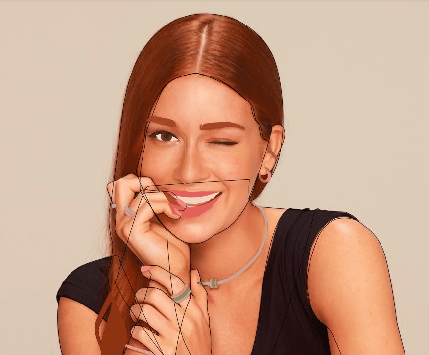
What you will do now is basically outline the major “pieces” of the picture with the Pen or Bezigon. In the case of the photo we chose, the main parts are the face, hair, blouse, arms, neck, the table and the background.
Choosing to using the Pen or Bezigon is entirely up to you. Use the tool that makes you feel more comfortable drawing, or even use both! The Pen is more of a “free drawing” tool, while the Bezigon can help you achieve perfect curves.
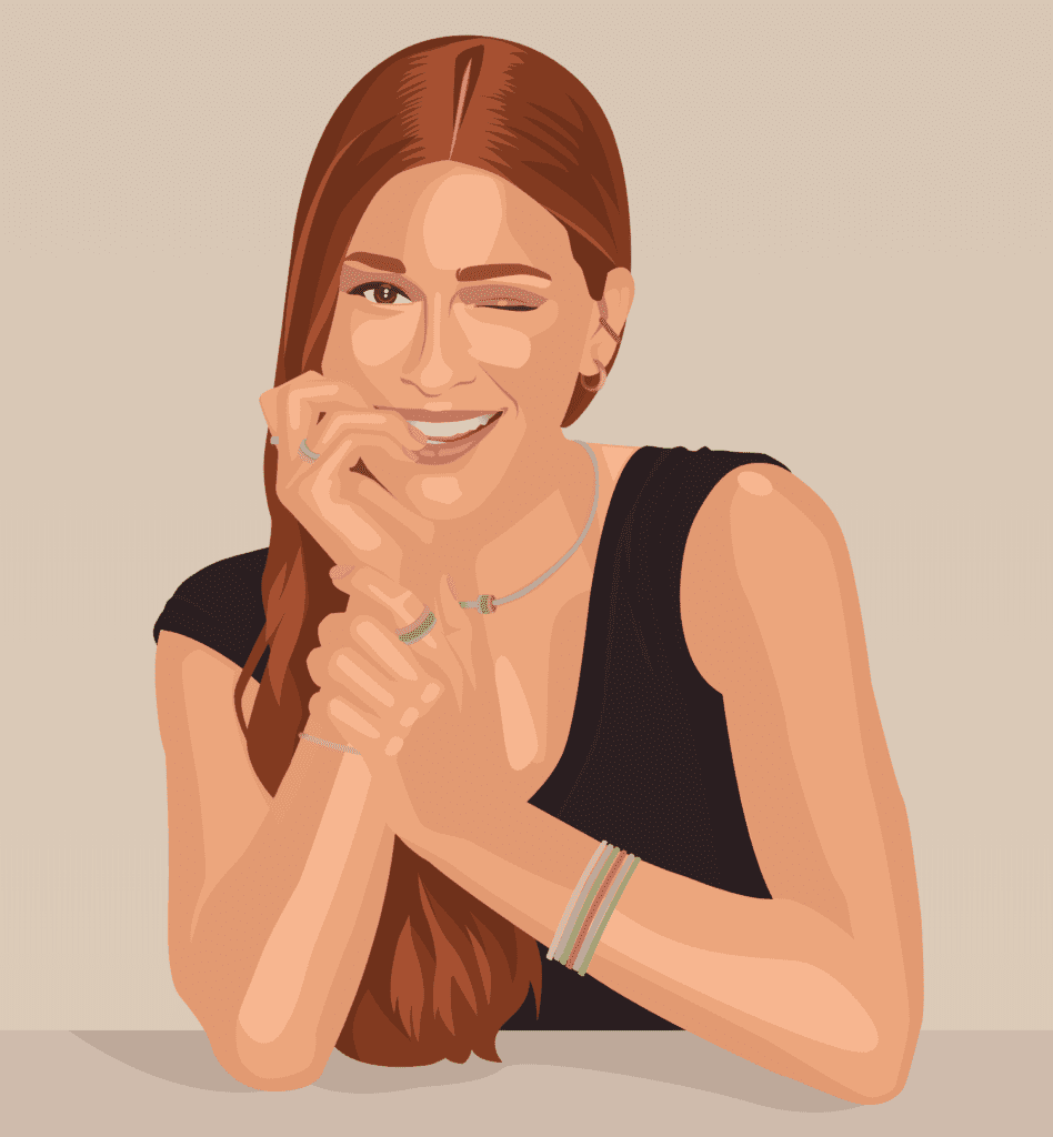
This is the final result of outlining. You can see how it looks with the outline only, without fills on the left, and using fills on the right.
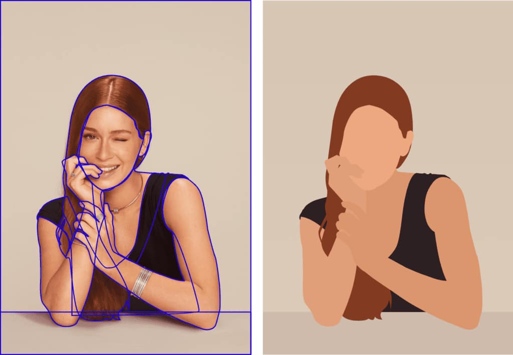
You don’t need to worry much about the final colors just yet, as this can be defined later. For now, use whatever colors you see fit to continue with the work.
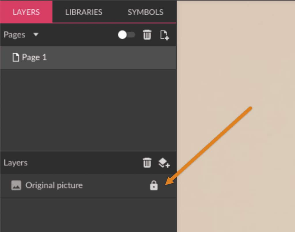
Tip: lock the picture layer to avoid moving it by mistake while you’re creating the outlines.
Main features
Now that you have the base shapes, you can start with the main features such as the eyebrows, eyes, mouth and accessories. The process is the same: outline with the Pen or Bezigon tools.
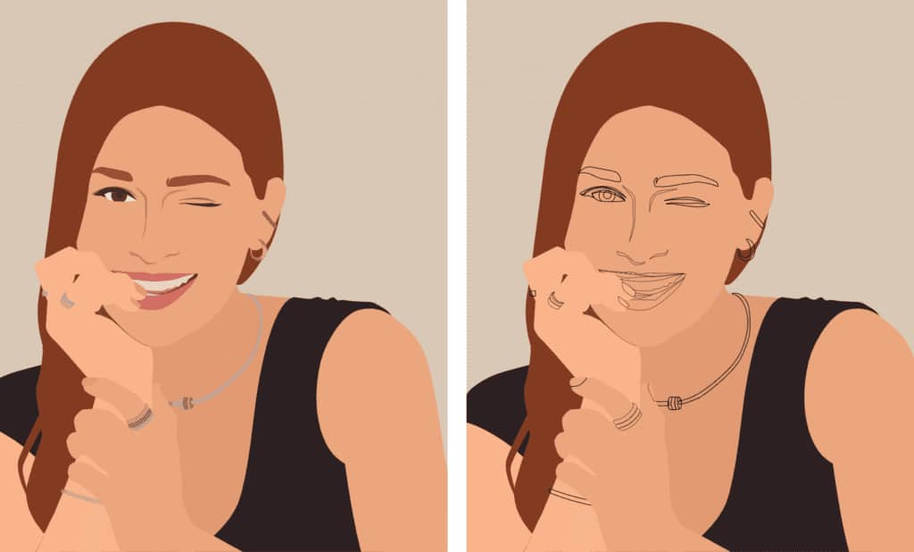
Leave the base shapes either hidden or leave just the outline visible so you can see the rest of the picture to continue outlining it. Lock the base shapes as well, to avoid moving them by mistake, same as with the picture layer.
Lights, shadows, mid-tones and outlines
It’s possible to divide the rest of the process in four steps: lights, mid-tones, shadows and outlines. As you can observe on the picture, besides the lighter reflexes, we have darker areas, that we will call mid-tones, and even darker parts, that we will call shadows. Besides that, at some intersection points we will need to add a more solid outline to better delineate them. One example of this is the place where the fingers touch other areas of skin, and the part of the arms that is bending.
The next step is to start creating solid shapes with the drawing tools for the shadows, lights, mid-tones and outlines. You can start wherever you feel more comfortable, but for this tutorial, let’s start with the lighter parts.
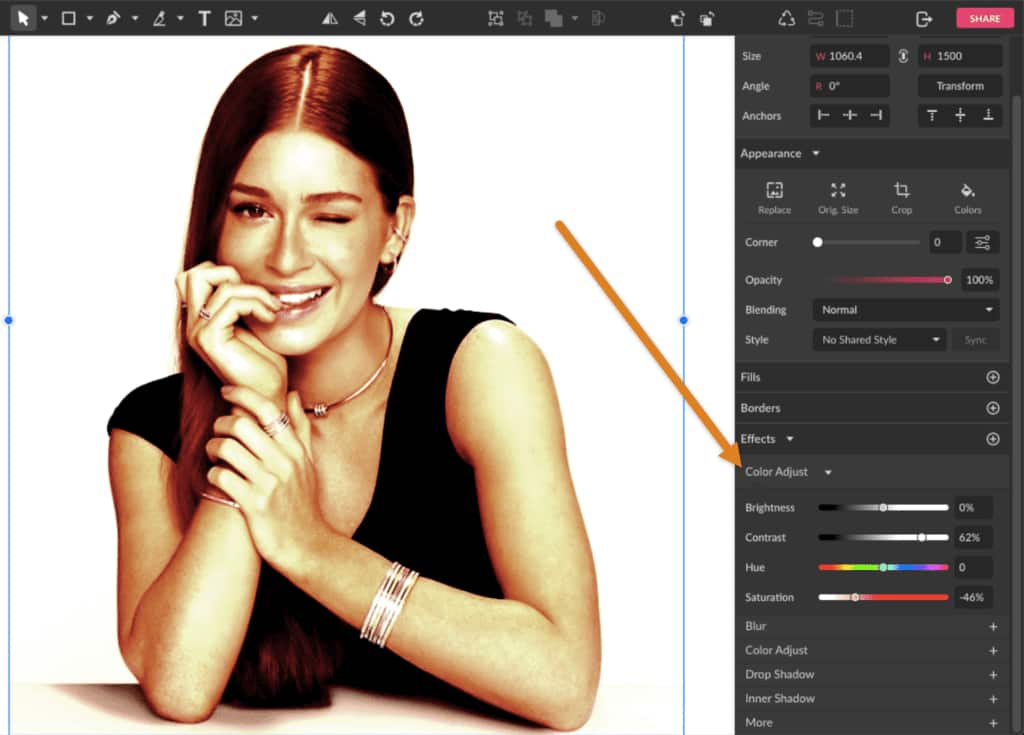
That is why it’s easier if you choose an image with a good contrast of lights/shadows and colors. In case your image is more washed up or you think you could use more contrast, you add a little contrast with the Color Adjust effect.
Light spots
The source of light on the picture defines where there are lighter tones and where there are darker tones. You can see in this picture that the light is coming from somewhere above/front of the woman because of the light reflexes on the top of the hair, face and on her shoulder, for example.
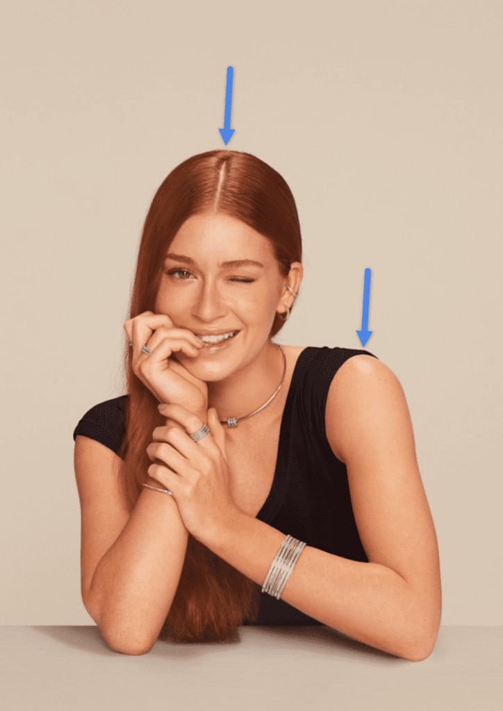
Not only the skin and hair are affected by the light, but also all solid shapes touched by it. The black blouse, lips and even the eyes and eyelids have darker and lighter details, even if very subtle.
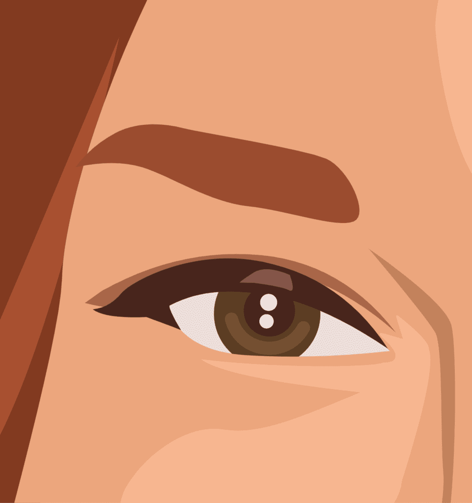
Tip: You don’t need to worry too much about making a “perfect” shape, after all, the shadows and light reflexes are diffuse and blurry, and we are going to represent them as solid shapes for this style of portrait. You just need to stick to what you can observe on the original picture and re-imagine it as a solid shape.
We will leave the accessories for last, so you don’t need to worry about them just yet.
Mid-tones
Continue to the next step with the darker shades that we are calling mid-tones and outline them. So far we use three distinct tones: the base skin color, the lights and the darker shapes.
It’s okay to use different shades to represent darker tones and not-so-dark tones, like on the eyelids, for example. Even the teeth and nails have darker tones, so keep attention to the details.

Shadows
Time to create shapes representing the darkest tones of the picture, like left side if the face, the neck, inner arms and parts right below the hands. The black blouse also has darker shades since the blouse itself is not 100% black, with the light reflecting on it.
Notice that it’s necessary to add a dark shape even right below the accessories, as they cast a dark shadow on the skin.
Final outlines
Finally, it’s time to add some final darker outlines where you find the necessity to better delineate the shapes. This will happen mainly with the lines of the fingers, arms and the division between the face and the neck.
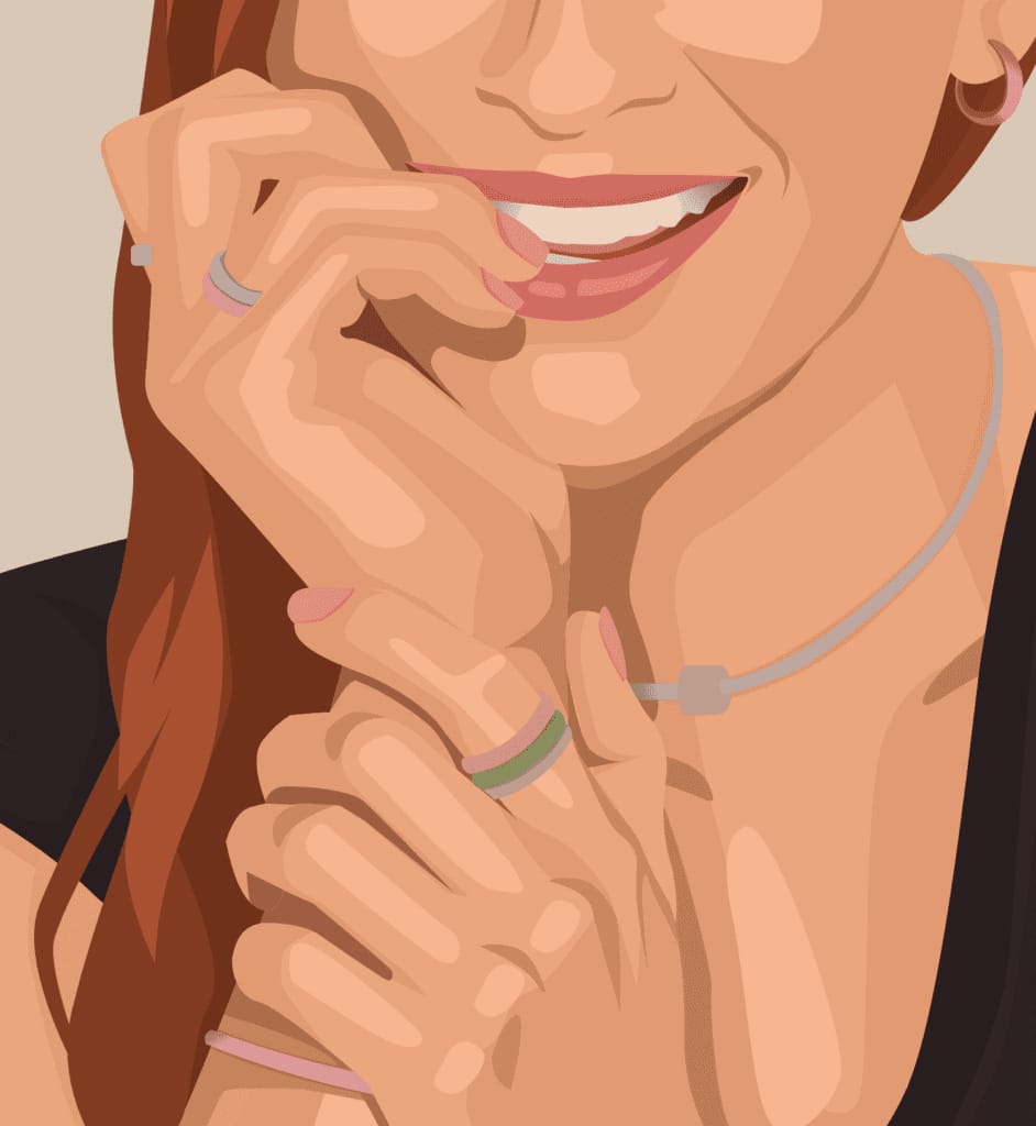
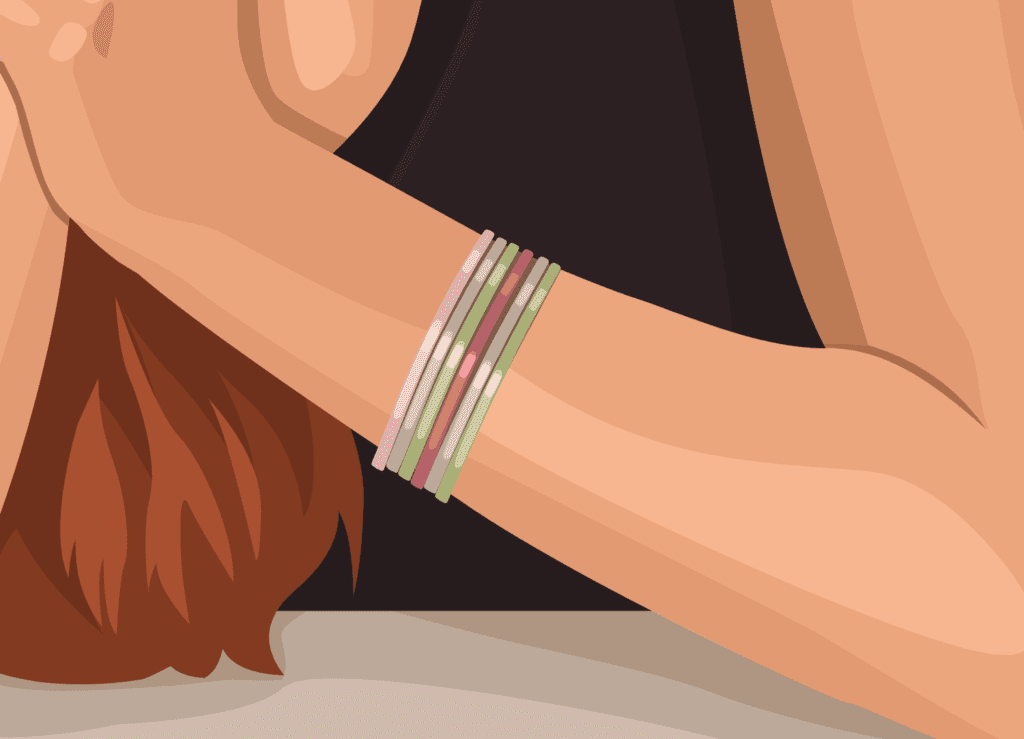
Accessories
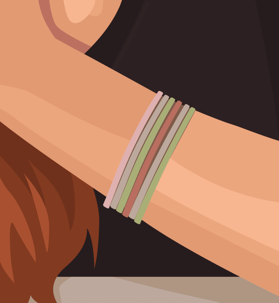
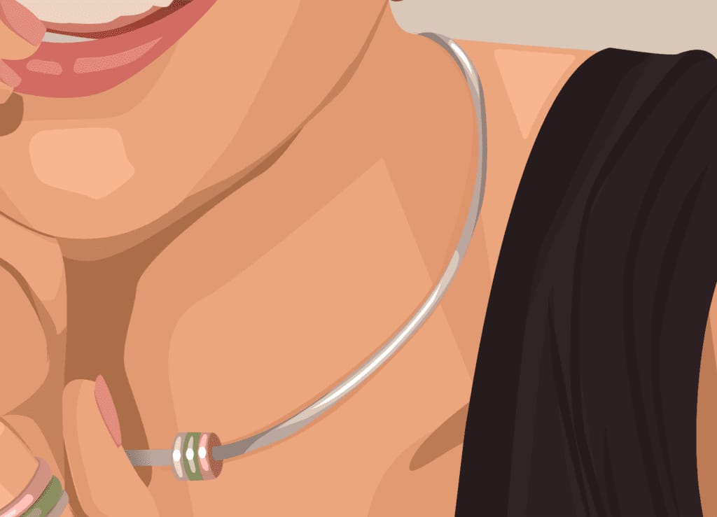
We saved the accessories for last because, since they are made of metal, the light reflexes work a little differently. Starting with the bracelets, besides the base color you will add a lighter color and then small reflexes that are even lighter, representing the way that the light shines on a metal piece.
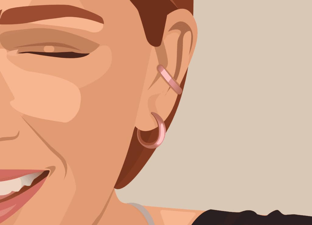
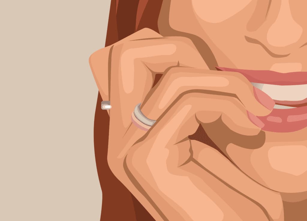
The same principle can be applied to the earrings and pendant. Note that the rings on the right hand don’t have as many light reflexes as the other pieces.
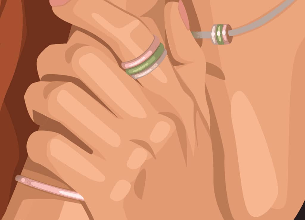
The necklace not only has two tones of highlights but also some shadows.
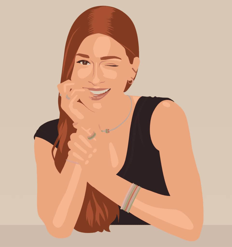
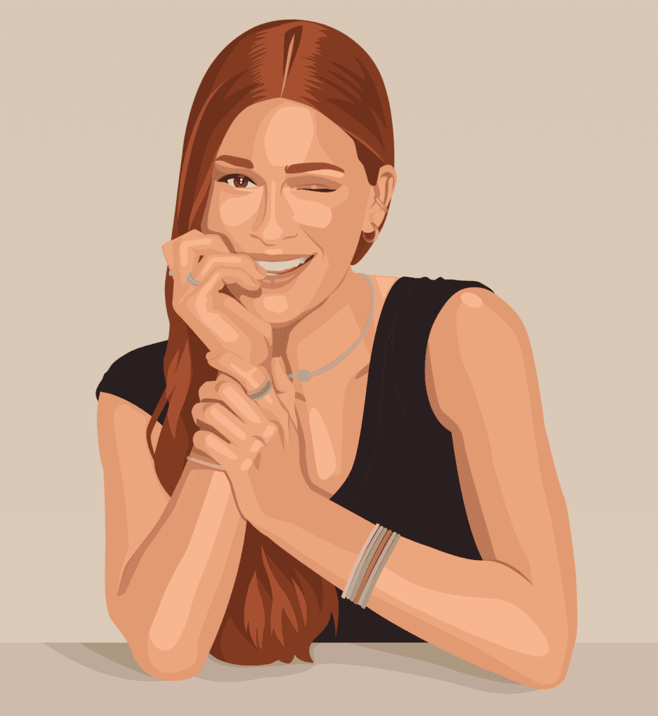
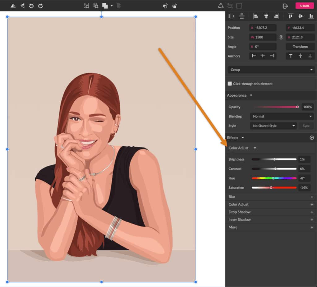
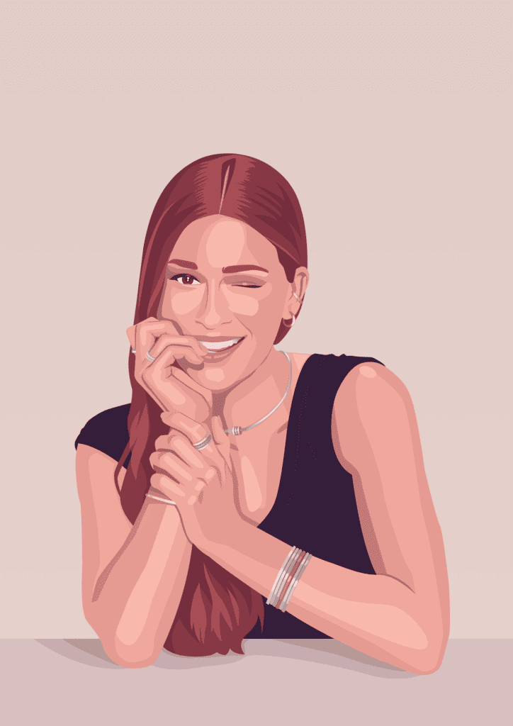
And you’ve come to the finish line! This is the final result so far. Feel free to tweak the color palette and change some hues and saturations.
You can even use the Color Adjust effect to make some alterations.
Final touch
After finishing tweaking the color palette, you can still add a final extra detail. Create a rectangle with the same size of the background one and place it on top of the illustration. Set the layer Blending mode to Screen on the Appearance panel.
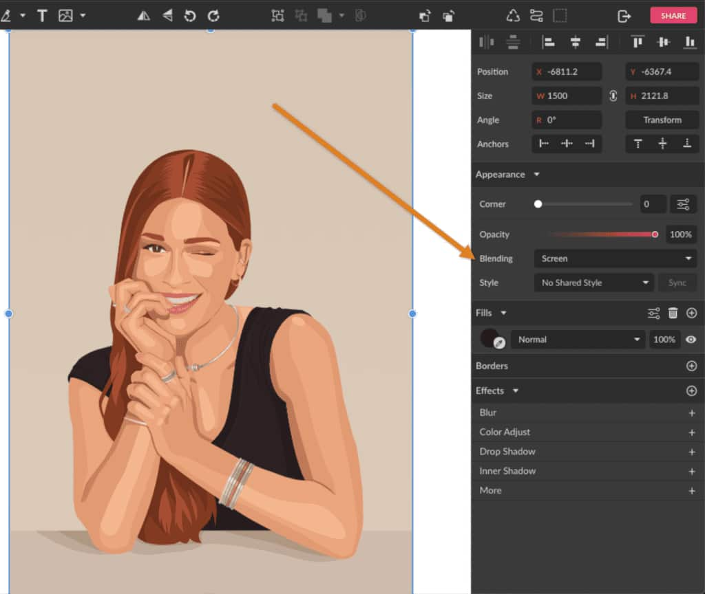
And now you can play with the color and opacity to create a cool color effect. You can try different blending modes as well.
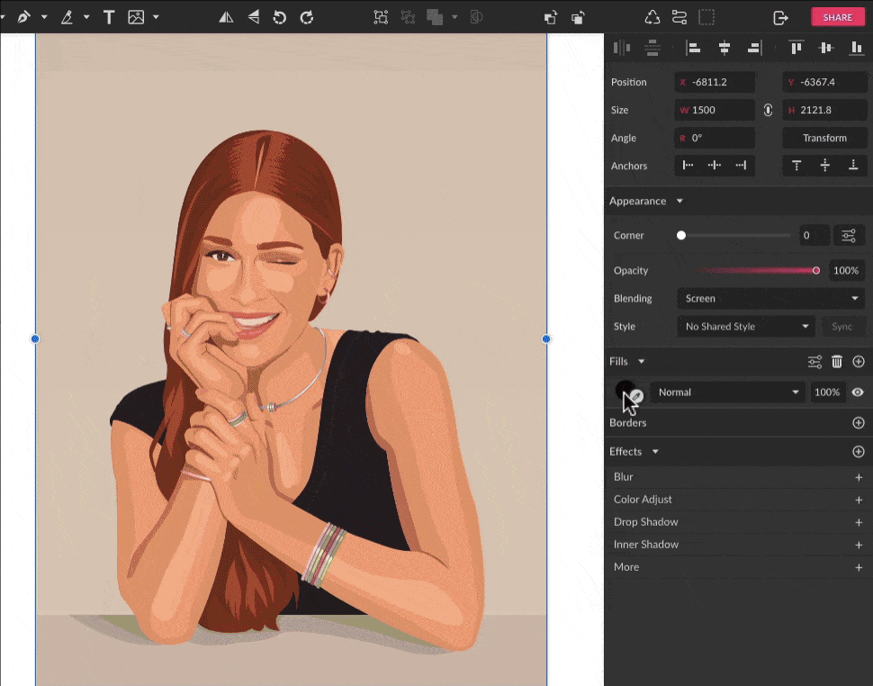
For the final result of this tutorial, use the color #9900FF with the Screen blending mode with 14% Opacity.
Different styles
This is just one of many different styles you can use to transform a picture into a vector portrait. The possibilities are many: you can use blurry shapes instead of solid, a minimalistic style or a more realistic one, or even use a greyscale pattern.
 Corel Vector
 Ultimate Vector Bundle Vol. 1
 CorelDRAW Graphics Suite
 Ultimate Vector Bundle Vol. 2
 CorelDRAW Standard 2021
Download your FREE 15-day trial and see how easy it is to design your creative projects with this web-based vector graphics app that empowers you to create on any device.