

Designing an icon can seem like a simple task, but once begin, you might find yourself facing some very common pitfalls. Which tool should I use to make everything even and smooth? How to make every aspect sharp and precise? How to make it pixel perfect? How to export it correctly so it looks good (and not blurry)?
In this tutorial we’ll share some basic tips and tricks that make the difference between an average icon and a top quality one!
Pixel Perfection
That’s an expression we hear more and more every day. But what is really the way to make an icon sharp and elegant? “Pixel perfect”, in other words?
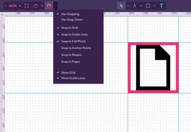
First, of all, use your Grid. Setting a grid and using the aid of the Guide Lines, be it the regular one or the isometric, is necessary to define pixel limits and the real measures you are going to use for the final design.
Snapping is another must: snapping to the grid you just set and snapping (always!) to full pixels will improve your workflow a million times and give you the precision you need. Leaving your icon, by mistake, with half a pixel on the size (35.5 instead of 36, for example) will make it blurry and not as defined as you want it.
Basic Shapes
For starters, most of your icons can be made using basic shapes. Not only will that save you a lot of time, but also gives more precision to your final result. Designing curves, for example, can become a lot more precise if you use a basic Ellipse shape. Using the Pen Tool can at times seem easier and more intuitive, but this tool might not give you the precision you’re looking for.
Bezigon Tool
Talking about curves, there’s another way to make perfect curves: the Bezigon tool. While clicking and pressing ALT, you choose the highest point of your curve, click it and there it is: a precise curve. Take the classic wi-fi icon as an example. Even easier than using an ellipse and a triangle to do that, using the Bezigon tool does the job very well and in just a few seconds.
Visual Alignment
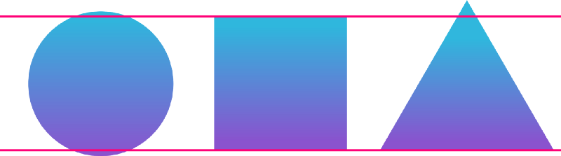
Designers are used to being super precise, but sometimes aligning everything to mathematical perfection doesn’t look right — take a triangle as an example. If you align the triangle to an ellipse and a rectangle to the bottom and set the same height for them, something looks odd, right? That’s because the mass center of the triangle is not exactly in the middle, so visually it does not look aligned, even though it is. Visual alignment is simply accommodating an element till it looks visually more comfortable.
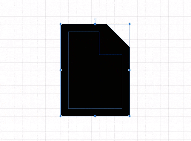
Custom Corners
Round corners are everywhere, whether you like sharp icons better or not. In Corel Vector you can easily control the roundness of any corner by just clicking with the Subselect Tool — it can be any shape, a basic one or made with the pen tool. You have easy control of each corner in separate and choose between round, bevel and inset (and there’s even the “fancy” option!).

The Transparent Rectangle
Not all icons are perfectly round or square, and that can get in the way when it comes to alignment. The solution is simple: a transparent rectangle. Let’s say all your icons must be 36×36 pixels. All you have to do to make sure that they will be aligned correctly, no matter what shape they are, is create a 36×36 pixels transparent rectangle, centralizing your icon on it with a small margin, and grouping them together before exporting. This will guarantee, after exported, that your icons will be aligned correctly.
Icon Fonts
Icon fonts are commonly used on the web for their versatility, but for designing them the correct way, there are a few tricks. An icon font needs to be precise to look good on an interface, so there are two basic tips that will make your icon “pixel perfect” and fit perfectly on your UI.
First, do not use any effects. Shadows, blur and transparencies are not supported and won’t show when you upload the icon.
Another very important point is not using lines and borders. Not only will the lines always be aligned exactly in the in the middle, no matter the weight, and that will complicate all your grid alignment, but also, icon fonts don’t support borders. That’s why you should always use shapes instead of lines, or, if you really need the line, convert it to a shape before exporting.
Some icon font generator websites have issues when it comes to recognizing holes within a path. The website reads the SVG as if it was filled, so the hole won’t show. If that happens, there is a small hack: the knife tool. Just make a cut across your icon and the website will read your SVG correctly.
Also, icon fonts should always be exported in SVG file format.
SVG exporting
Scalable Vector Graphics (SVG) are resolution independent, smaller in size and make the development part a lot easier, which means they’re an awesome option.
Corel Vector can export Blur and Drop Shadow as native, and that means you can use these effects on your design and still export it as SVG — the effects will not become a bitmap and will be scalable just like the vectors. How cool is that?
PNG exporting
The PNG option goes well for any icon that is not meant to be a Font icon. This option supports colors and any kind of effects, since it won’t give you a vector icon but a bitmap image. Because of that, you have to check the quality of your icon before exporting — 1x for normal screen resolution and 2x for Retina display.
Making exportable
Corel Vector has a very interesting feature that lets you export your icons in more formats (SVG and more PNG sizes, for example) at the same time. You have a set of 30 icons, for example, and need each one of them in SVG, normal PNG and PNG for retina display. In Corel Vector, you just select all of them, set the formats you need on “Make exportable” and export all of them with one click. This saves you a lot of time!
Download your FREE 15-day trial and see how easy it is to design your creative projects with this web-based vector graphics app that empowers you to create on any device.