
How To Create a Duotone Cutout Poster
Duotones and bold colors are an excellent way to make any work to stand out. This design style consists of two halftones contrasting over an image.

In this tutorial, you’ll find out how to achieve this effect in just a few minutes in Corel Vector, also adding a cutout text to create an even more powerful image.
Step 1: Set up your document
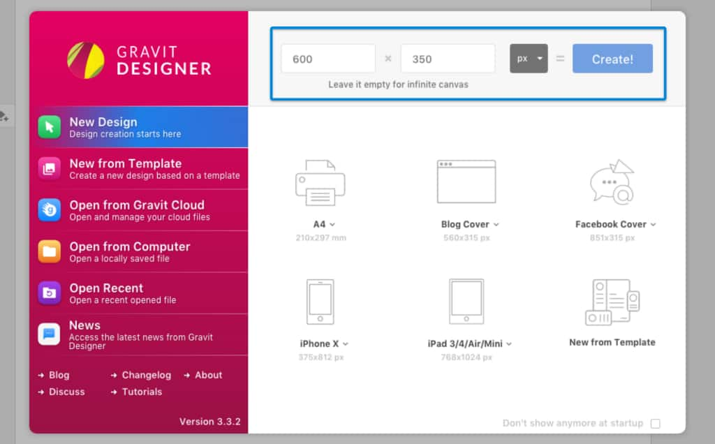
Start by creating a new file; ours will be 600 px by 350 px.
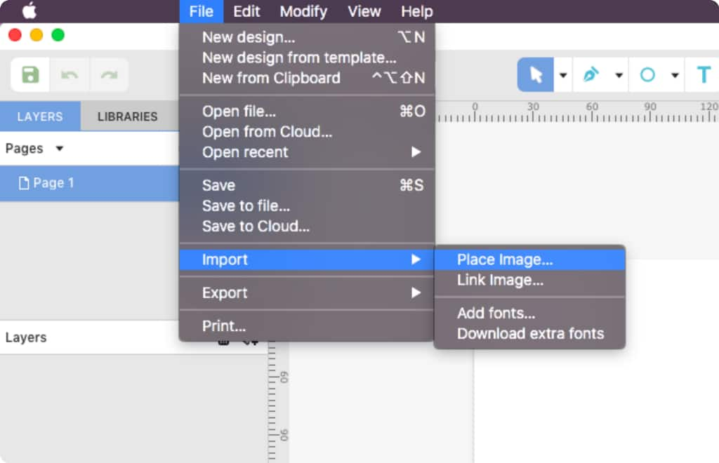
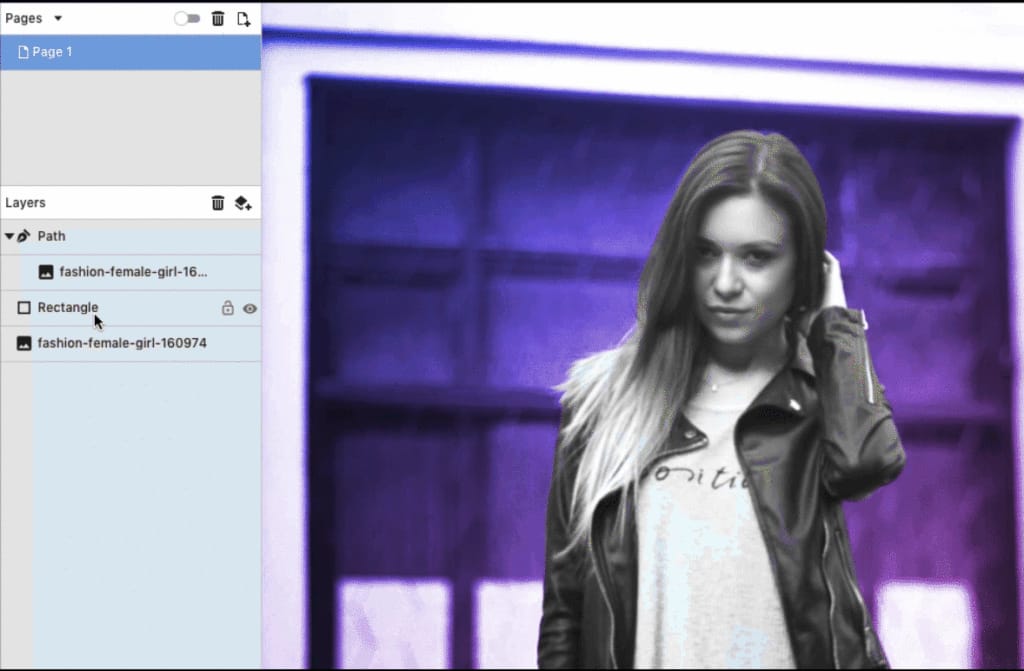
Import a picture of your choice using File > Import > Place Image or by dragging the image to the canvas. We’re using a photo from a free photo stock website, or you could choose from any of our free design templates as a starting point.
If you want to follow along with this tutorial, you can find the photo we are using here. (Remember to always check the usage rights for any stock photos you are using in your design projects).
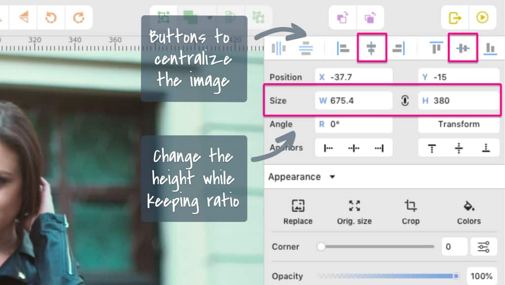
After importing your image, make sure to center it on your page with the alignment buttons. If you’re not happy with the size of the image, adjust it a little bit. We’re going to stretch ours a tad. It was imported with 337 px height, and we’re going to change this to 380 px while maintaining the ratio. After that, we just need to center it again.
Since the image is now bigger than the canvas, we can set the view mode to Output to visualize your work better. Do that by going to View > View mode> Output view.
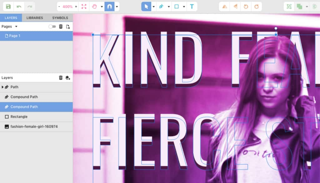
Step 2: Cut out the subject from the background
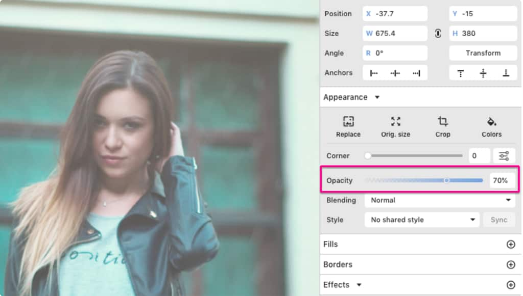
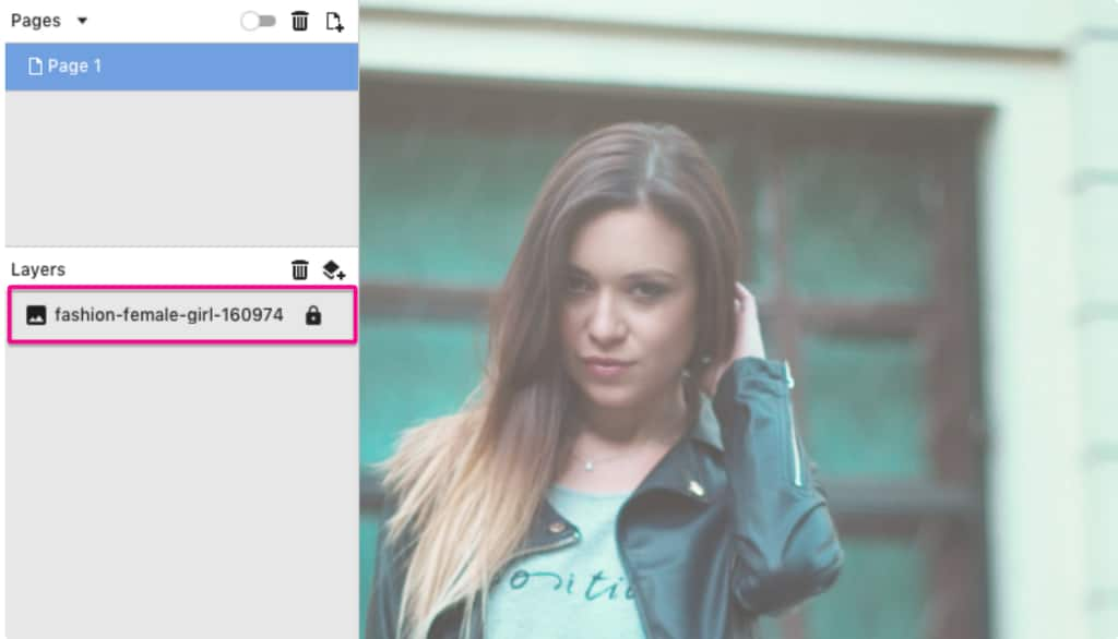
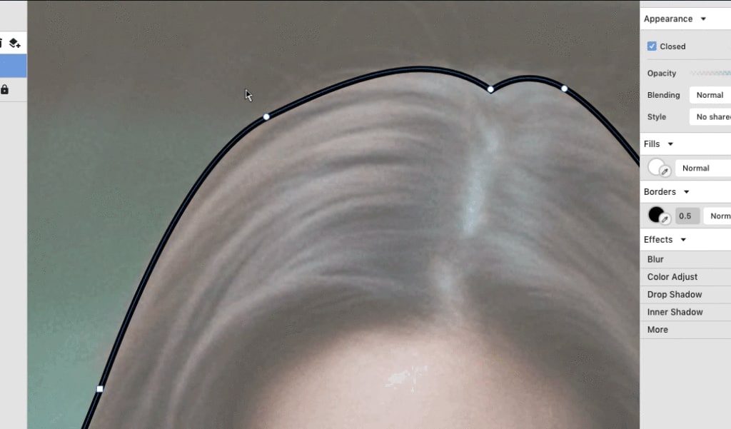
To separate the girl from the background, let’s use the Pen tool (P). First, lock the image layer and lower the opacity to 70 % to make it a little easier to see.
With the Pen tool, create anchor points outlining the girl. The Pen tool adds straight lines if you just click and release, but if you hold and drag the mouse, you can create curves while outlining.
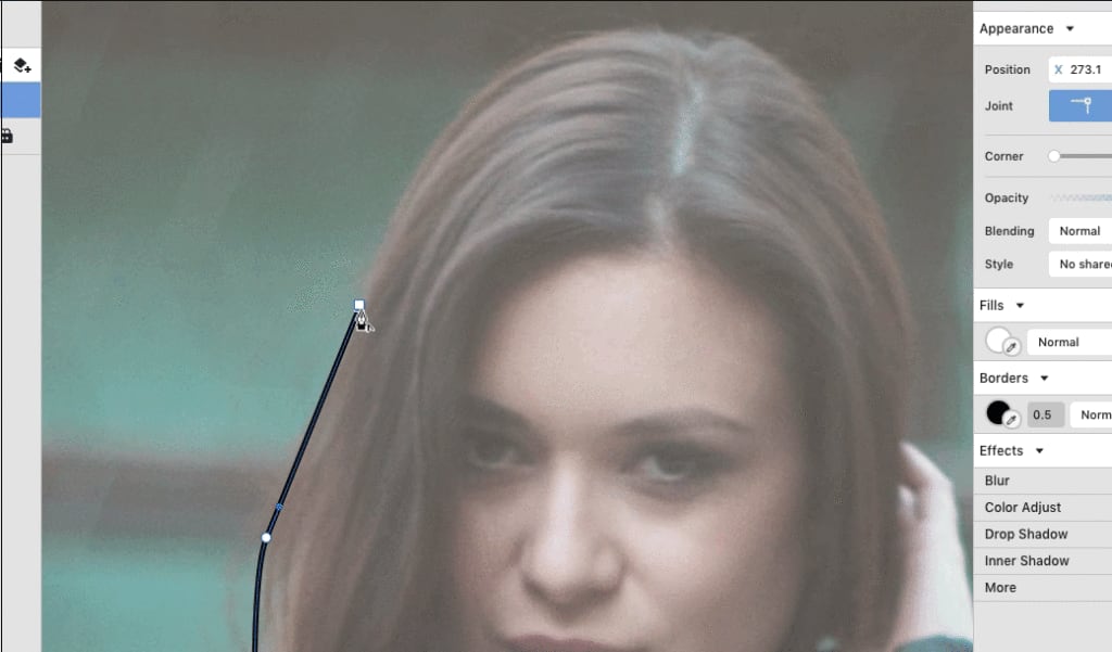
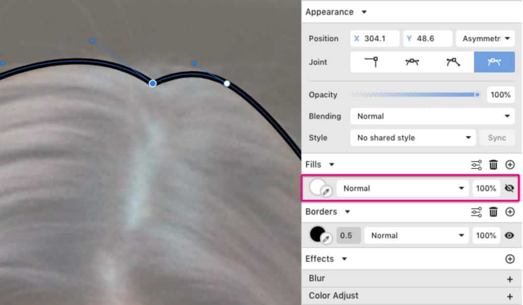
After closing the path (by clicking on the original starting point), toggle the color fill’s visibility to see only the outline. You can also adjust each anchor point by dragging it and pulling the handles with the Subselect tool (D).
You can now unlock the image layer and set its Opacity back to 100 %. Then, duplicate the image (Ctrl/Cmd + C, then Ctrl/Cmd + V) and select the copy together with the path you just created. Right-click on this selection and select Mask with Shape (Ctrl/Cmd + Shift + D) to insert the copy of the image inside the path.
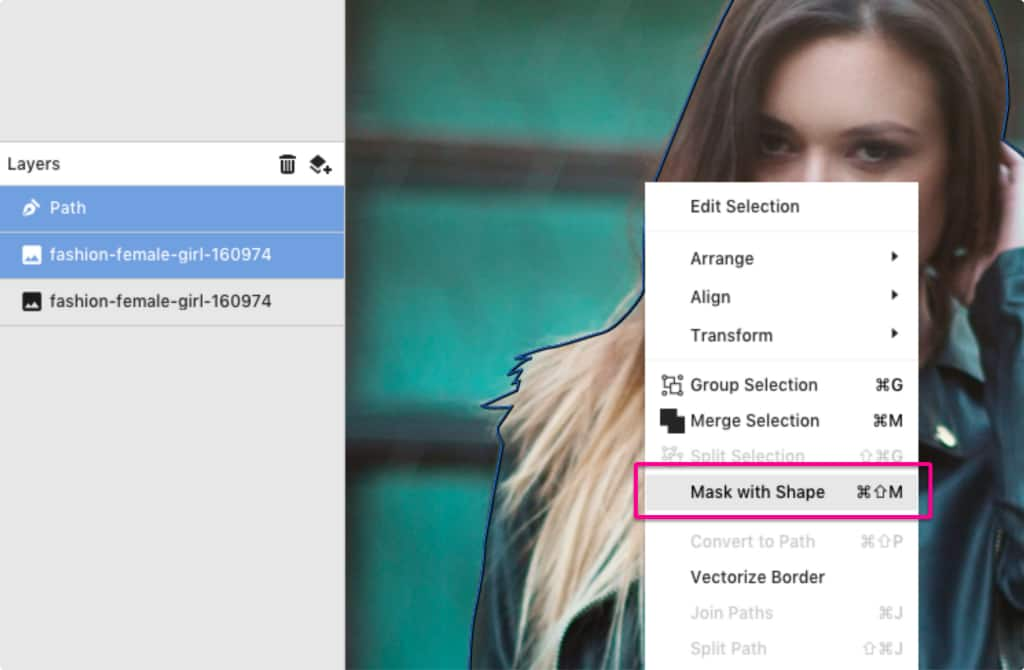
An alternative for that is dragging the copy of the image to the path layer.
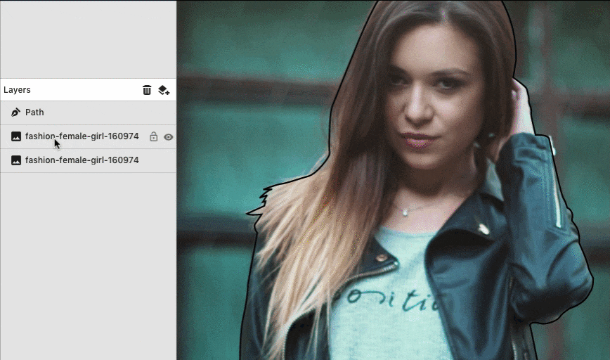
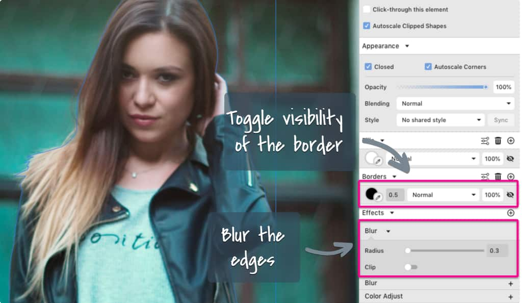
Now you can make the outline of the path invisible by toggling its visibility on the right panel. After that, add a Blur effect with 0.3 strength to make the edges of your path look less harsh. Now you have the girl in a different layer than the background.
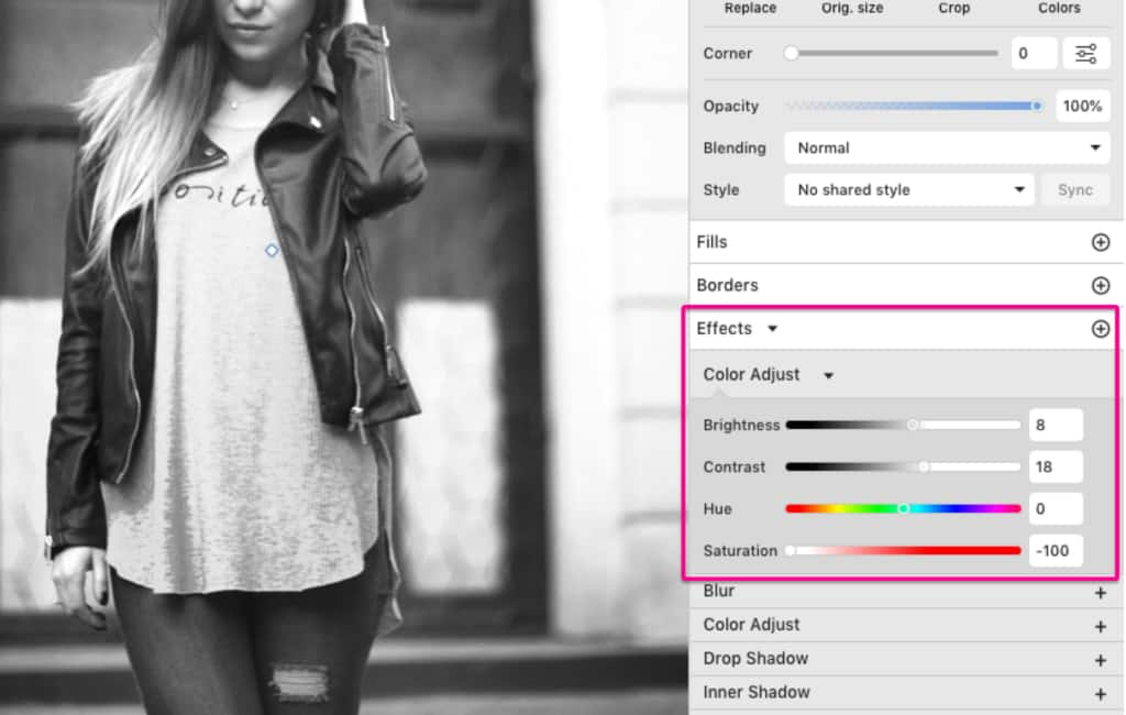
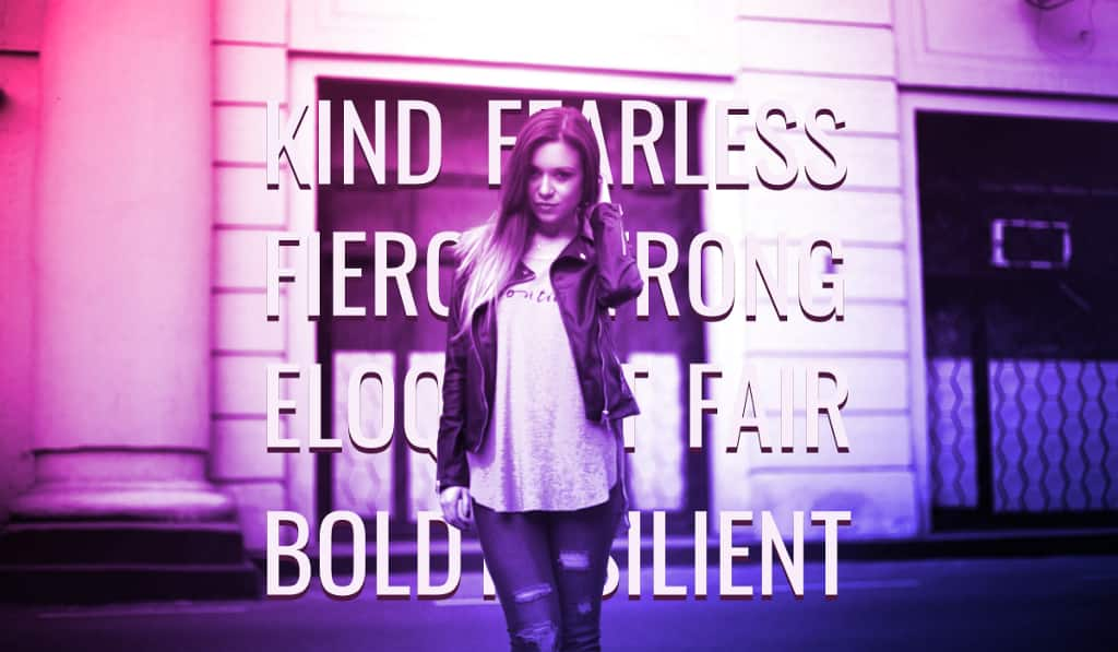
Step 3: Color Adjust
To prepare the image, add the Color Adjust effect. By changing the Saturation to -100, your image will become black and white, but to retain a good contrast for this image we’ll also change the Brightness to 8 and Contrast to 18. We’ll do that for both images, the background and the one inside the path.
Step 4: Blending modes
Now let’s add some color. Create a rectangle with the same size as the canvas and position it above the background and under the clip mask. Add a color of your preference (we’ve chosen #4242FF), and on the Appearance panel, change the Blending mode to Overlay.
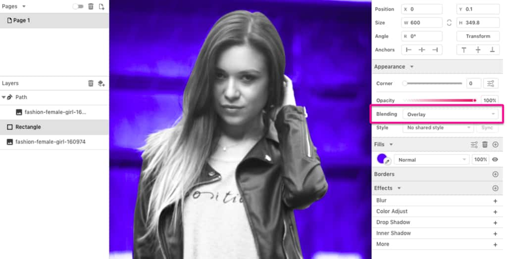
The Blending mode is the feature that will give you the Duotone effect. Different blending modes will give you very different results, and for this design we’re choosing Overlay.
To make the visual even more bold, we’re going to add another color (#FF398F) to the rectangle to make a linear gradient. We also changed the direction of the gradient to make it diagonal by moving the handles.
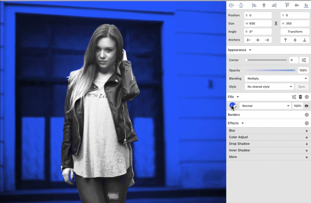
You want the exact same color effect on the image clipped inside the path, so just copy the rectangle where the color and blending mode are applied and insert this copy inside the path (above the image).
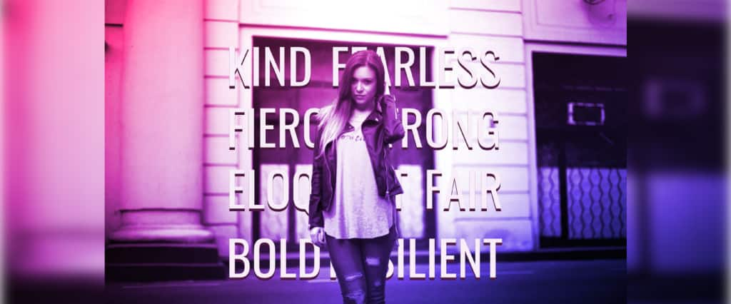
Your duotone effect is ready! Now let’s add the text, which will be positioned behind the girl. We wrote some adjectives for the girl using the font Oswald, then aligned the words so they would all form a sort of square.
After typing the words, we aligned them and brought them closer while holding Shift so that they stay aligned. After that we converted all the text to a path (Ctrl/Cmd + Shift + P) or right-click and Convert to Path), so it’s easier to work with the words.
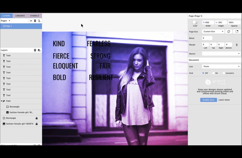
Then we grouped the four lines of text so I could distribute them equally vertically. After that, we grouped all the words to resize them together while holding Shift to keep the ratio and positioned the group behind the path in the Layers panel.
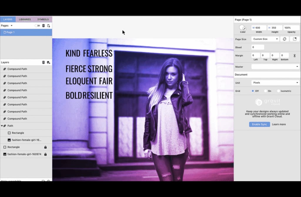
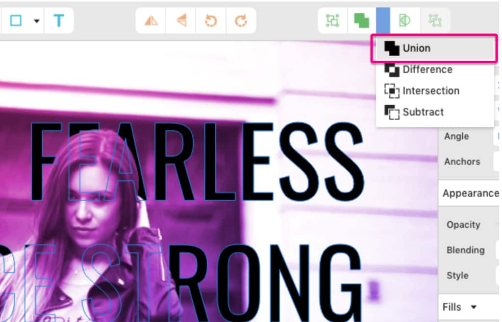
After that, we made all the words into one object. To do that, ungroup the text, and with everything selected, merge them with Union.
Then pick a color from the background using the color picker.
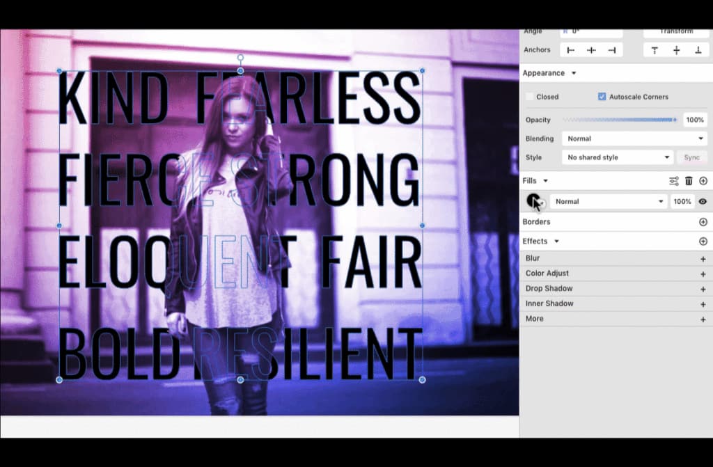
We created a shadow for this text by making a copy and positioning it under the other text, picking a dark color with the color picker from the background.
And that’s it! Your duotone poster is ready. You can always get different effects by changing the colors, the Blending mode and even the adjustment effects on the base image.
Download your FREE 15-day trial and see how easy it is to design your creative projects with this web-based vector graphics app that empowers you to create on any device.