
Learn how to create a neon sign effect
Whether you want to add a pop-culture vibe to your work or simply experiment, the neon sign effect is surely fun to work with.
In this tutorial, we will demonstrate an easy way to create this effect in Corel Vector, using nothing but basic effects and color blends.
Step 1: Set up the document
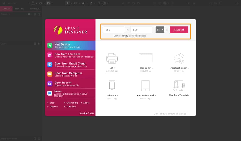
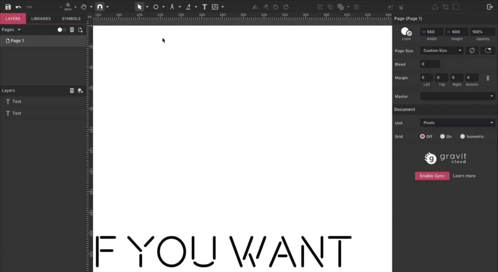
Create a new document of 560 px wide and 600 px high.
Step 2: Text
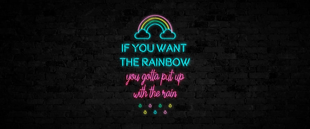
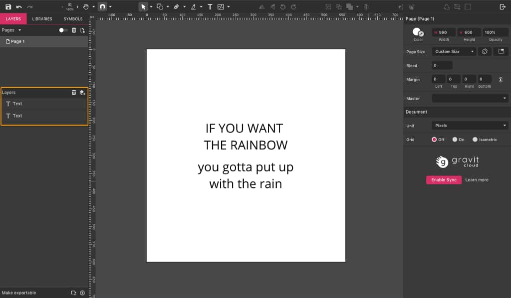
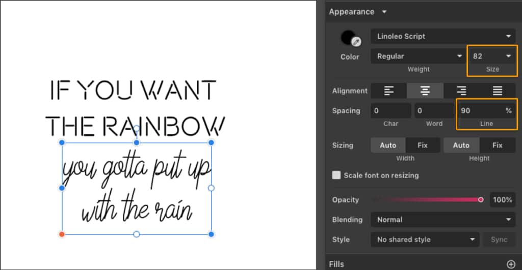
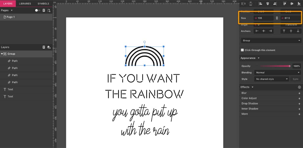
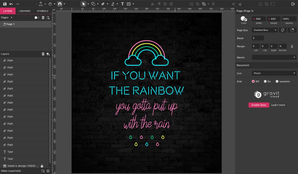
With your canvas ready, let’s create the text which will be our neon sign. For my example I’m going to use “If you want the rainbow, you gotta put up with the rain”, a quote from Dolly Parton. I’m going to split this text into four different lines of text. The first two lines, in caps, is a separate text layer than the two bottom lines, which is written with small letters.
For the first text I will use the font Beon (you can find it available for download here), and for the second text layer the font Linoleo Script (available here).
NOTE: always check the usage rights (commercial vs. personal use) for any fonts you download from font sites.
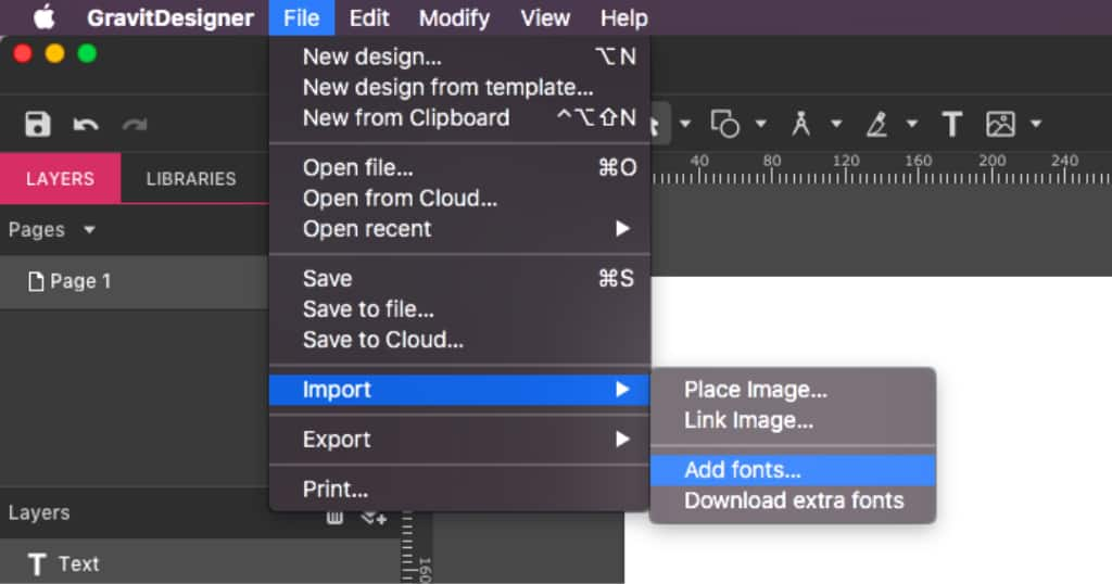
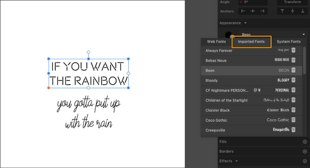
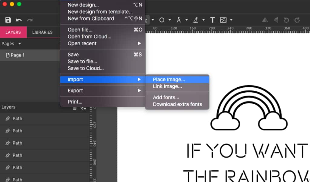
To add these fonts to your list in Corel Vector, go to File >Import >Add fonts.
These fonts will then appear on the Imported Fonts tab.
Let’s change the first text to a size of 43 px and increase the line spacing to 110%. The second text will be sized 82 px, with less line spacing: 90%.
Step 3: Details
Our neon sign won’t consist of text only — let’s add some details, like a rainbow and some rain drops.
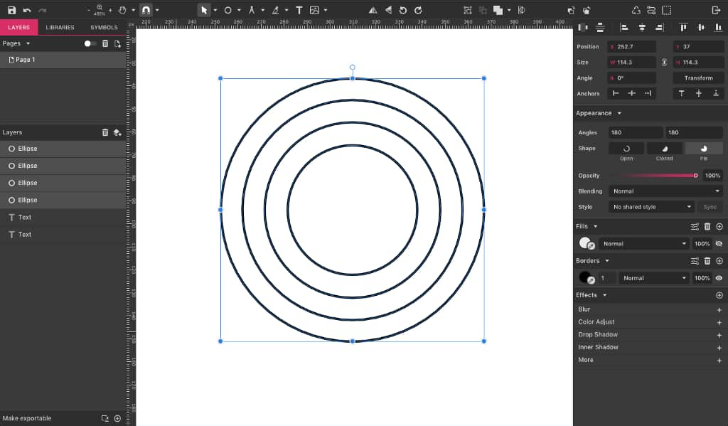
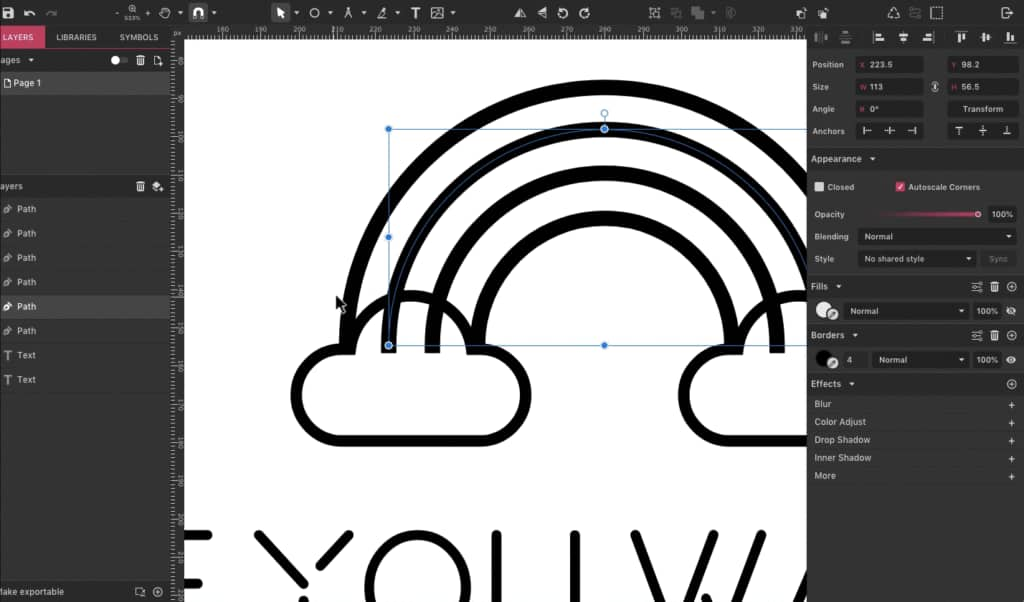
Starting with the rainbow, I will create four concentric ellipses. Select the Ellipse tool (E), click and drag while pressing Shift to keep the ratio, then add a simple border and toggle the Fill’s visibility to make it more visible.
Copy and paste it (Ctrl/Cmd + C, then Ctrl/Cmd + V), and while holding both Shift and Alt, resize it to make it smaller.
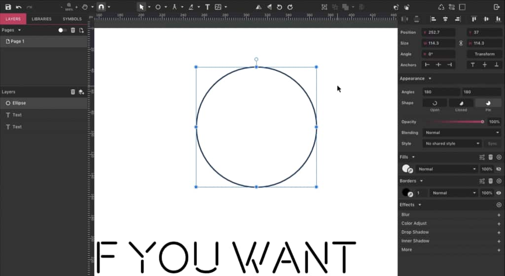
Repeat that two more times, until you have the four concentric ellipses. Make them with equal distance visually, but don’t worry, it’s ok if the distance is not exactly the same.
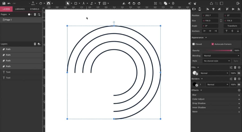
After that, convert the ellipses to paths. Do that by selecting them and right-click > Convert to Path, or use the shortcut Ctrl/Cmd + Shift + P. With your four paths selected, go to the right panel and uncheck the Closed option on the Appearance panel to open the circles.
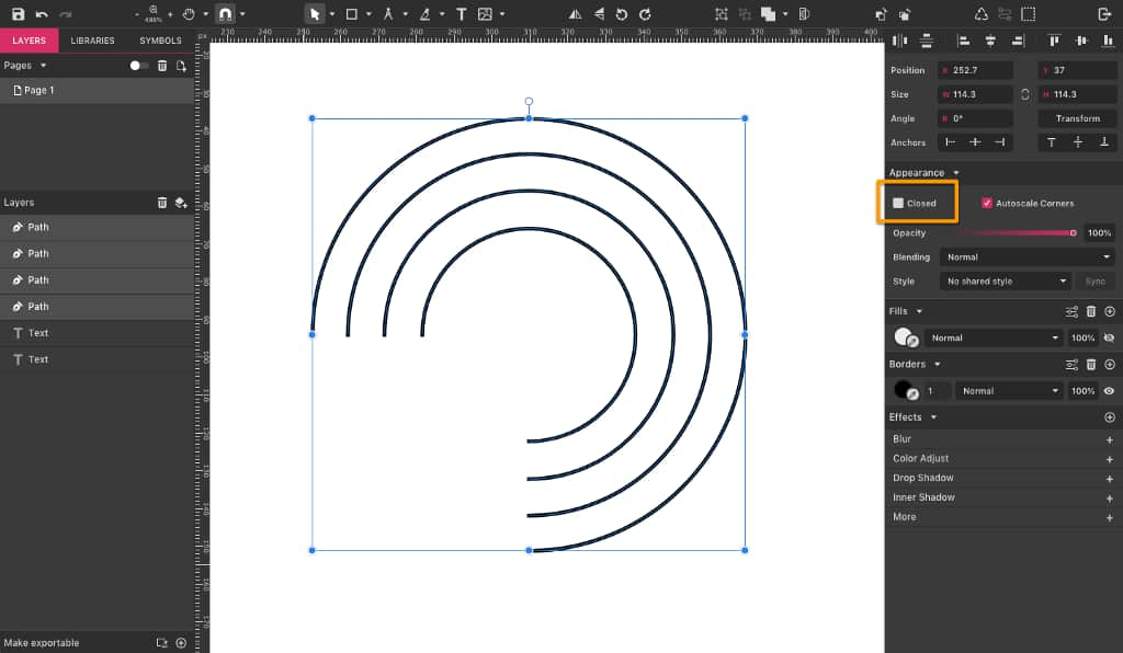
Now that the paths are opened, let’s use the Subselect tool (D) to select the bottom anchor points. Delete them and you have your rainbow!
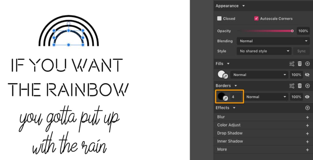
Increase the Border Width to 4 px, then group the lines and increase the Width of the whole group to 135 px, while keeping the ratio.
Now let’s make two little clouds to place below the rainbow. First, create a rectangle with 60 px Width and 24 px Height. On the Appearance panel, make the corners with 12 px of roundness.
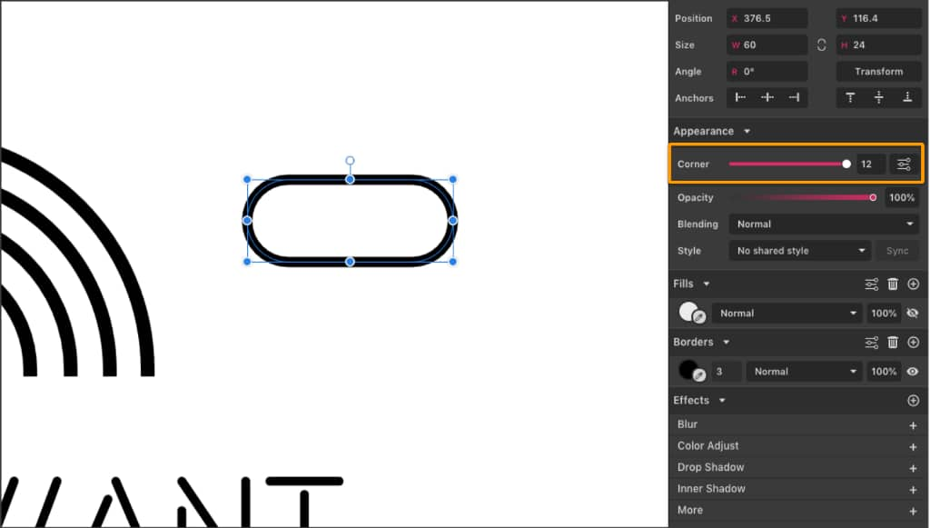
After that, create an ellipse that is 32 x 32 px and place it on the rectangle. Select both shapes and merge them using the Union option on the toolbar, creating a Compound Shape.
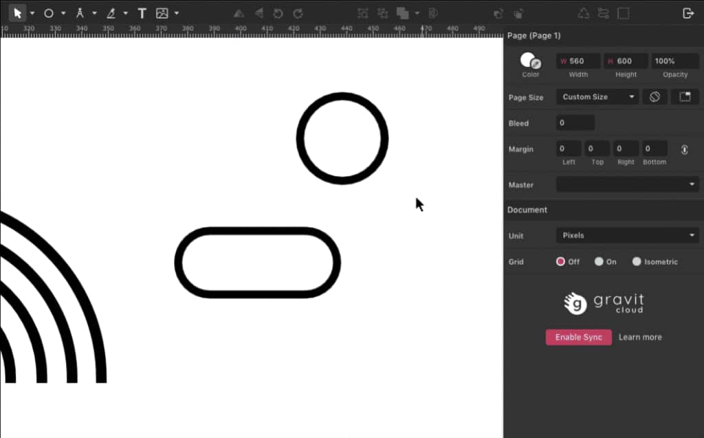
Convert your Compound Shape into a Path (Ctrl/Cmd + Shift + P)because we won’t need to modify it anymore. Make a copy (Ctrl/Cmd + C, then Ctrl/Cmd+V) and place both clouds at the bottom of the rainbow.
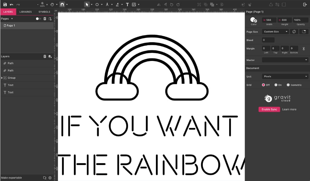
To make it look like the clouds are in front of the rainbow, erase the parts of the paths that appear inside the clouds. To do that, create anchor points before and erase the ones in the end.
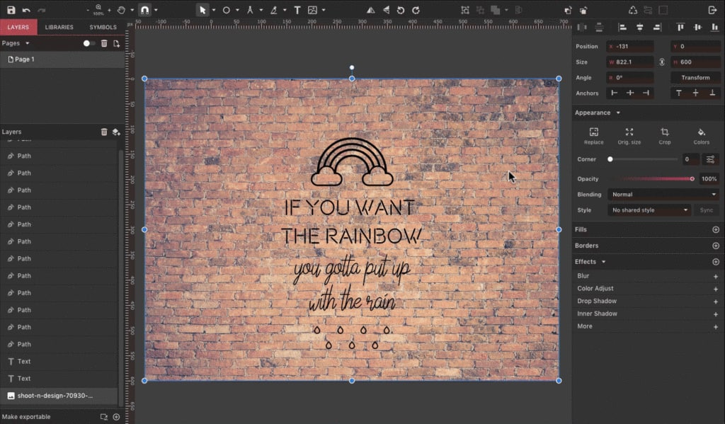
This is the result so far:
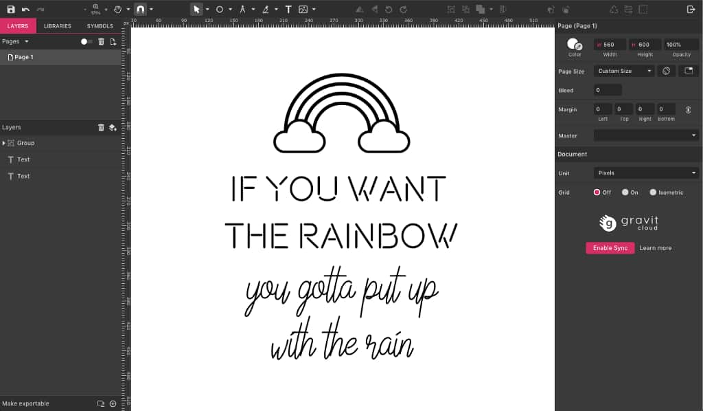
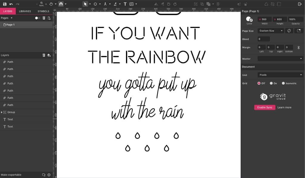
Now let’s create some raindrops. Add an ellipse, convert it to a path and then, with the Subselect tool, pull the top anchor point up. After that, convert that anchor point to a Straight point on the Appearance panel and your raindrop is ready.
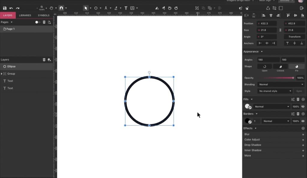
Resize your raindrop to 10 px high (keeping the ratio) and make 6 more copies, distributing them under your quote.
Step 4: Background
Now that we have our design, let’s add a background. You can create your own pattern background, but I chose a brick wall texture. You can either drag it from your desktop/folder directly to the canvas or go to File > Import > Place Image.
You can set the image to the same size as your canvas (600px) and position it in the background with a right-click, selecting Send to Back.
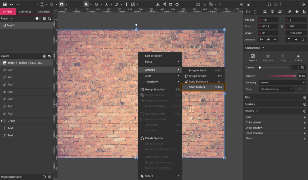
After the image is positioned in the back, crop the sides using the Subselect tool (D) so that the image has the same size as your canvas.
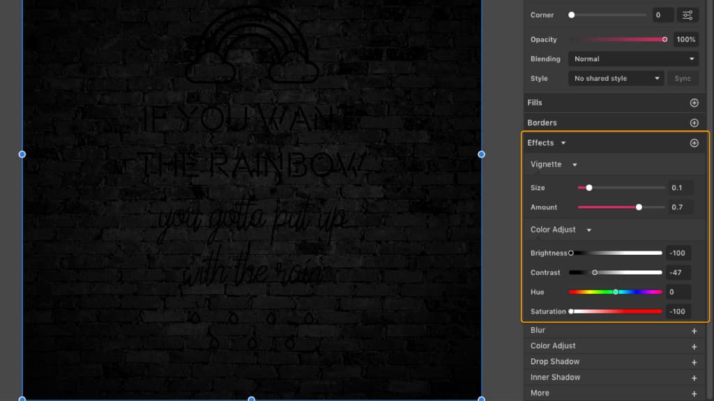
To make the image darker, add the ColorAdjust effect and set Brightness to -100, Contrast to -47, Hue to 0° and Saturation to -100. Add also a Vignette effect to make the corners darker, setting Size to 0,1 and Amount to 0,7. The result is a desaturated and darker brick wall.
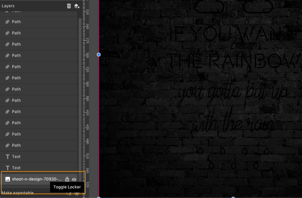
After that you can lock the image layer to prevent moving it by accident. Hover the mouse pointer over the layer and click on the lock icon when it appears.
Step 5: Colors
It’s time to add some color to our design now. The first two lines of text will be bright blue (#00F2FF) and the other two will be bright pink (#FF7BBB). Use the same colors, plus bright yellow (#F2FF3D) and green (#00CA87) for the rainbow and the raindrops.
Step 6: Neon Effect
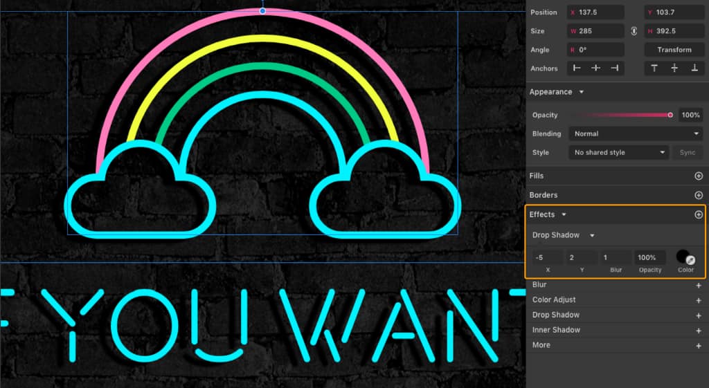
Let’s start by adding a Drop Shadow effect on everything to give the impression that the letters are attached to the wall. Select all the elements withCtrl/Cmd + A (this way you can add the effect on every element at once) and add the Drop Shadow effect.
Now for the actual neon part!
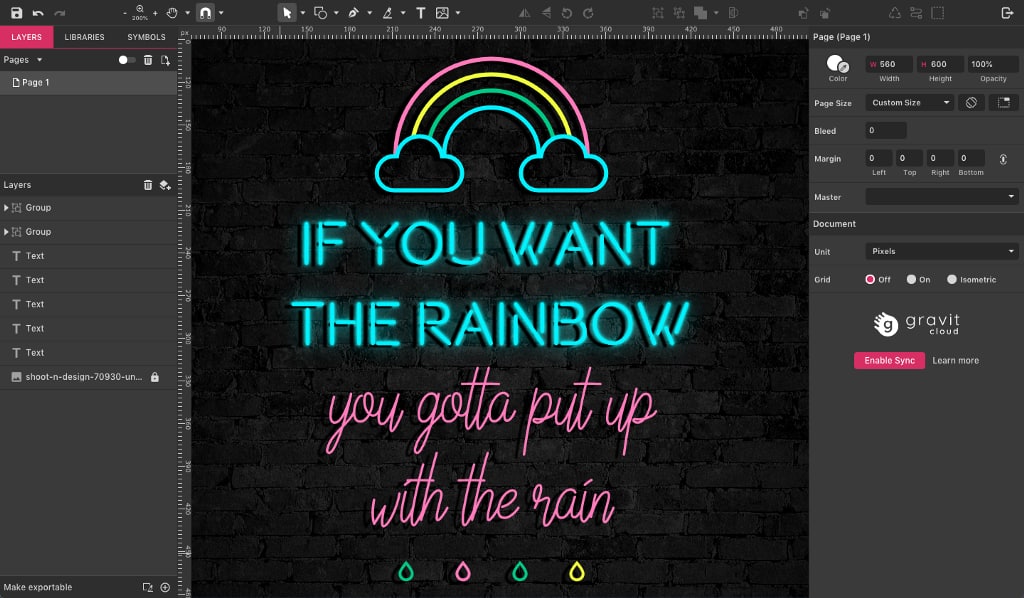
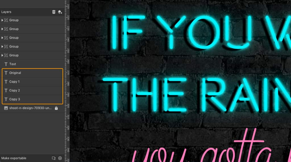
For each element you’ll make three copies, which you will drag on the Layers panel so that they are positioned hierarchically below the original layer. To make the process shorter, you can group the elements that form the rainbow, and the raindrops can also be one single group. Make sure you remove the Drop Shadow effect from these copies.
For the blue elements, on the first copy under the original, change the Blending Mode to Add, and add the Blur effect, setting it to 2 px.
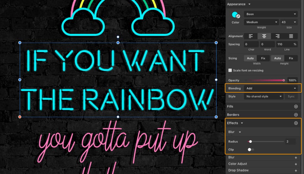
On the second copy under the original layer, change the Blending Mode also to Addand Blur set to 5 px. On the third copy, also set to Add, set Blur to 16 px. The final result should look like this:
You can organize yourself better by naming the layers on the panel:
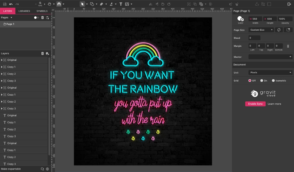
Keep in mind that Blending Modes change their look with different colors, so, with that in mind, repeat the same process as above (three copies with Blur and Blending Mode) for the rainbow, the raindrops and the pink text, only for the latter use the Color Dodge Blending Mode instead of Add.
This should be your final result after creating all the copies:
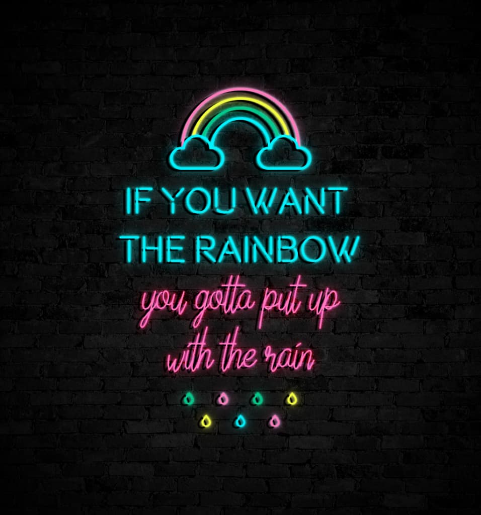
And that’s how simple it is to achieve the Neon effect!
Download your FREE 15-day trial and see how easy it is to design your creative projects with this web-based vector graphics app that empowers you to create on any device.