
Although backlighting your subject can be problematic in photography, sometimes it can be used to great effect – as seen in this pretty example. This tutorial will take a look at some of the most commonly made mistakes and situations to avoid in photography.
You will learn how to:
- Tilt Down: Leaving too much space above your subjects distracts from your subjects.
- Avoid Cropping at Joints: This tends to give a more unnatural look to the photo.
- Look Space: Leave more space in front than behind.
- Avoid Bright Backgrounds: Brighter backgrounds lead to subjects that look like a silhouette.
- Avoid Silly Juxtaposition: Unless you want to give your friend antennae.
Check out some examples of these common mistakes below.
Thanks for watching! We hope you found this tutorial helpful and we would love to hear your feedback in the Comments section at the bottom of the page. You will find a written version of this tutorial below, and a printable PDF copy to download on the Download Resources tab above.
Written Tutorial (PDF, 881 KB)
Download your FREE 30-day trial and make every shot your best shot with PaintShop Pro, your all-in-one photo editing and design software.
Photography Composition Tutorials
 PaintShop Pro 2023 Ultimate
 Vision FX 2.0
 PaintShop Pro 2023
 AfterShot Pro 3
Composition, simply put, is the arrangement visual elements in a work of art. In this module we will discuss what some of those elements are and how their arrangement within a photograph can strengthen or weaken the impact of a photograph on the viewer.

While its easy to become overwhelmed with the theory and complex concepts of composition, there are a few key elements and rules which can be learned quite easily and with a little practice will drastically improve your images. Over time you will probably just begin to feel these rules in play and eventually they become instinctual. Keep in mind that these rules are meant to be bent. None are set in stone and rarely will you find a photo that is in perfect harmony with all of the rules of composition.
The beauty of this module is that it applies to all types of visual art. Whether you’re using an SLR, a large format film camera, a point and shoot camera, a paint brush or even video camera, the rules of composition are the same.
Quick Tips On How To Take Better Photos:
Before we get into the actual rules and elements of composition there are a few basic mistakes that most people make that can be taken care of instantly. This mostly applies to candid shots of people. Take a look through your average social media site and pretty quickly youll notice that many of the shots people take contain one or more of these problems.
Headroom
The most common compositional mistake made is too much headroom. When taking candid shots make sure you are not leaving too much space above your subjects heads. With too much space at the top you’re leaving a large area of the photo that really isn’t conveying anything important and diminishes the strength of your subject matter. With too little you create a cramped feel which is equally distracting.
Look Space
When photographing a person that’s looking to the left or right, leave more room in front of their face than behind their head. This applies to moving subject matter as well. If, for example, the subject is a skier or a car or say a pedestrian, you should generally leave more space in front of the subject than behind. This implies direction into the frame. If the subject has too little Look Space it appears to be leaving the frame and has a visually unsettling effect.
This is related to the Rule of Thirds, covered later in this module.
Not enough look space
Proper look space

Cropping People
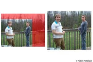
When composing your shot or cropping the image later, avoid cutting people off at their joints, ie. knees, wrists, elbows or ankles. Crops like this give the impression of an amputation.
Cropped at the knees.

A better framing not cropped at the knees.

Fill the frame
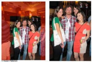
Often you will notice that many shots will have their subject(s) in the middle of the frame with a large amount of empty space, or worse, space filled with parts of other people and miscellaneous stuff not related to your subject. Zoom in or physically get closer to your subject(s) so that they take up most of the frame, be careful not to start cropping them out of the photo or cutting off the tops of heads. You can also crop the picture in your photo editing software to fix this problem but its best to capture the photo properly to avoid the need to crop too much.
The areas in red are unnecessary and distracting. Proper framing eliminates this.

Bright vs. Dark
You will often see pictures of people up against backgrounds that are brighter than the foreground or where the light source is coming from behind the subject. The result is often a silhouette… Unless this is what you’re going for, you generally want to choose a background that is darker than your subject and if possible you want the subject facing your light source. Dont shoot against bright skies, bodies of water, bright light sources or windows etc. A flash or other artificial light source can allow you to shoot against brighter backgrounds.
As is often the case though, there are situations where you can break the rules. Placing the light source behind your subject (backlighting) can have a dramatic silhouette effect.
The bright background caused the subject to become a silhouette.
Use of a flash or other light source can solve this issue.

If you have no other light source, reposition so that your background is darker than the subject.


Juxtaposition
Juxtaposition refers to a placement of elements in a photo that in some way conveys a relationship between them. While this can be used to great effect… especially comedically, there are certain situations that are usually undesirable.
- Avoid trees or poles placed so that they appear to be growing out of peoples heads.
- Make sure background lines don’t look like Martian antennae or that they appear to be an arrow through the head for example.
- Have fun with this. With a large depth of field (See depth of field section in this module), background objects can be made to appear as though they share the same space as your subject matter… hilarity ensues.
Avoid placing elements in such a way as they appear to grow out of your subject.

Juxtaposition can be used to create an often comedic photo by playing with perspective and foreground and background objects.

Orientation
Before taking a shot decide which way you will orient your camera. Some photos need to be taken vertically (Portrait) others Horizontally (Landscape). Try both orientations for the same photo, the best choice will be easily noticeable.
The vertical lines formed by the rows of buildings made this a shot best taken vertically.

The wide view of the entire city dictated a horizontal orientation for this shot.

Download your FREE 30-day trial and make every shot your best shot with PaintShop Pro, your all-in-one photo editing and design software.