Learn how to effectively use negative space in your photos. “Negative Space” is a more advanced concept in composition, and is all about positioning your subject matter correctly. Negative space can also be used to give a sense of direction or movement. In this tutorial, you’ll learn how to use the Rule of Thirds and headroom to help eliminate useless negative space, and how to create balance in your photos by strategically using negative space.
Thanks for watching! We hope you found this tutorial helpful and we would love to hear your feedback in the Comments section at the bottom of the page. You will find a written version of this tutorial below, and a printable PDF copy to download on the Download Resources tab above.
Download these free resources:
Written Tutorial (PDF, 1 MB)
Download your FREE 30-day trial and make every shot your best shot with PaintShop Pro, your all-in-one photo editing and design software.
Photography Composition Tutorials
Photography Quick Tips
Natural Lighting in Photography
 PaintShop Pro 2023 Ultimate
 Vision FX 2.0
 PaintShop Pro 2023
 AfterShot Pro 3
How to Use Negative Space in Photography Composition
All photos used in this tutorial © Robert Patterson
Negative Space is difficult concept to grasp. It is somewhat nebulous and for this reason is an often-overlooked element of composition. Simply put, negative space is the area of an image not occupied by your subject. The negative space in a picture is defined by the positioning of the subject so it is easy to disregard, but the space around the subject in a photo is very important to the overall picture. Too little and there can be a cramped feeling; too much and the strength of the subject is reduced. Here are a few ways negative space is used in photography composition.
Headroom
When taking candid shots make sure you are not leaving too much space above your subject’s heads. With too much space at the top you’re leaving a large area of the photo that really isn’t conveying anything important and diminishes the strength of your subject matter. With too little you create a cramped feel which is equally distracting. The black areas are the negative space, and the white areas are the positive space or the subject.
Example 1: Too much headroom in this candid shot

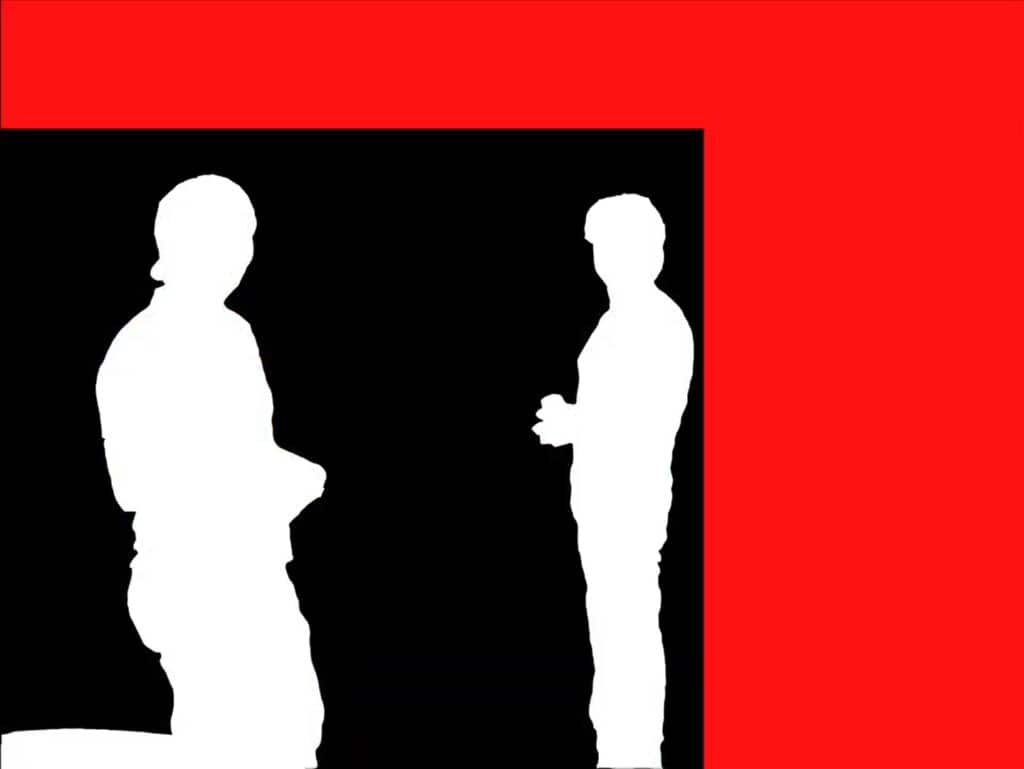

Example 2: Too little headroom

Example 3: Proper use of headroom

Motion
Similarly a sense of motion can be emphasized (or lost) by the negative space in a photo. With this photo of geese in flight, the empty space ahead of them gives direction to the photo and emphasizes the sense of flight of the geese. This is also a good use of the Rule of Thirds, as the geese occupy the lower right corner of the frame.
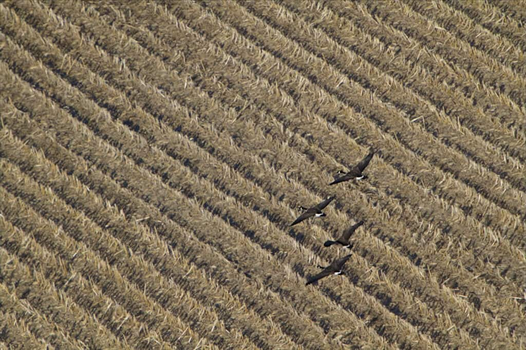
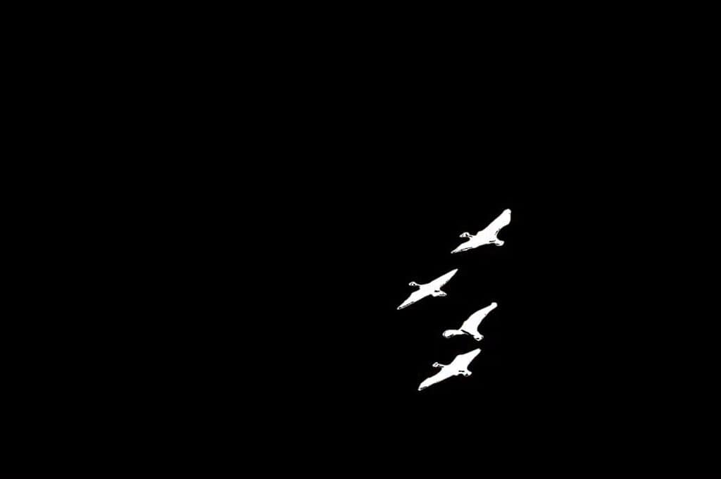
TIP: Once you’ve decided where to position your subject matter try changing your camera angle slightly (left, right, up or down) then recompose the shot to place your subject where you originally wanted it. This will change the relationship between your subject and the negative space that surrounds it.
Look Space
In this example below, proper use of the Rule of Thirds leads to the proper implementation of look space – the empty third of the frame to the left gives a sense of direction to her gaze.


As with too little headroom, too little look space can make a photo feel cramped.

TIP: Learning to control Depth of Field can be a very powerful tool in creating a strong negative/positive space relationship. By properly using Depth of Field it is possible to have your subject in very sharp focus and the background completely out of focus. This places all of the emphasis on the subject and not miscellaneous background objects.
Object Spacing
A somewhat easier use of negative space to grasp comes into play when you have two subjects in an image. The space between these objects, no matter how subtle, can have a huge effect. A great example of this can be seen in Michelangelo’s painting of God and David in the Sistine Chapel. The tiny space between God’s and David’s fingertips creates tension and implies a sense of motion by capturing the movement neither at its beginning or ending.
It’s a subtle concept but paying attention to the division of subjects in a photo can create great emotional appeal.
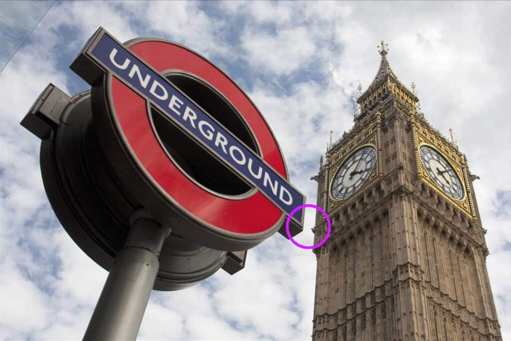
In the shot on the left, the underground sign is touching the clock tower. This lack of negative space takes away from the sense of depth in this photo. In the shot on the right, the slight separation of the sign and the tower gives a better sense of depth.


What is depth of field?
Golden Mean and the Rule of Thirds

Creating a Depth of Field effect

Cropping photos for better composition
Download your FREE 30-day trial and make every shot your best shot with PaintShop Pro, your all-in-one photo editing and design software.

