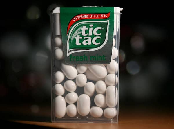
Once you have an idea of the general shape of your logo you’ll want to think about color. For many people the color of the business or product may actually be predetermined and an obvious choice. For others though, this may be an opportunity to define the entire look of the company, product, service or whatever the logo will represent. You may have a favorite color but depending on the image you are trying to project you might want to think about how that color makes people feel. Research on color is plentiful, and it doesn’t often agree. One study will suggest that color perception is universal and another will suggest that color preference exists by age, gender, race, country and even season. Fortunately, we aren’t really looking to find someone’s favorite color, we’re trying to draw out a snap judgement. A quick, passing suggestion about what we’re all about. We can absolutely draw on cultural reference here. Let’s look at the color green to illustrate this. How do you feel when you see the color green? Maybe it makes you feel a bit refreshed, or perhaps healthy, eco-friendly, sustainable, calm and even nourished. It’s very likely we owe those feelings, at least in part, to this iconic logo.

23-year-old Gary Anderson won an art contest in 1970 that was held in support of the very first Earth Day. His design is now public domain and considered the universal symbol for recycling. While his original design was not colored, the fact we find this symbol so often in green must reflect how we as a people see the color green. We associate it with positive, natural behavior. Recycling is good for the environment, and a healthy environment is often green, right? Well, of course that’s not always true, but we’ve decided that it’s true enough. So let’s say you have a company or product that falls into this sort of sub-concept. Does green make sense for you? It did for these brands.
Green is also often used to reflect finance related logos.

Now, let’s say hypothetically you owned a company that was widely considered to be environmentally unfriendly. Maybe you splash some green on your logo and try to soften your image a bit.

So as we can see, a logo’s color definitely has the potential to evoke an idea about your brand and it can be used in various ways, even as a form of defense. Let’s try a little experiment. Here is one of the most recognizable logos in the modern world.

What happens if we splash some different colors on it?

I showed this image to a few people and asked them to comment on it. Almost unanimously those questioned confirmed that something about the logo felt different, and 4 out of the 6 people I questioned said they were drawn to the yellow version. Well it turns out that Facebook founder Mark Zuckerberg is actually Red-Green color blind so it may not surprise you to learn that at the very least those colors weren’t chosen. But what can we learn by this observation? Well, let’s be honest, it’s a small sample size and unlikely to convince any big businesses to change their color scheme, but when you are creating a logo for yourself make absolutely sure you test out various colors and version on people. See what they respond to most favorably.


4 Comments