Choosing Images for Texture Synthesis
You can synthesize a texture from an image or from brushstrokes in a Corel Painter document.
When choosing a source image, you may find the following tips helpful.
- Use images that have some repeating similarity across the image (like the sample images in the “near-regular” or “irregular” categories).
- Avoid exactly repeating geometric patterns (see the sample images in the “regular” category).
- Avoid very chaotic images that have little repeating similarity or pattern (see the sample images in the “near-stochastic” or “stochastic” categories, like waves, clouds, or fire).
- Choose images with similar color cast, brightness, and contrast across the image so that parts from opposite ends do not look too dissimilar next to each other. A big variance in color cast or brightness in the source image may result in a noticeable seam in the synthesized texture where the color or brightness varies greatly across the edge of the tiles. To improving the variance, open the image in Corel Painter, click Effects > Tonal Control > Match Palette, move the Variance (Color) and Variance (Brightness) sliders to the left to reduce the color and brightness variance, and click OK to apply the effect. If the colors in the source image don’t match, create a grayscale version of the image. This is also useful for synthesizing textures that don’t require color, such as images for papers and flow maps. Click Effects > Tonal Control > Adjust Colors. Move the Saturation slider to the left for a less colorful image, or choose the lowest value for pure grayscale. Click OK.
- Avoid images that have vignetting or other significant changes in appearance around the edges, or make a selection in the image to avoid the unwanted areas.
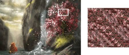
- Ensure there are many repetitions of the objects or features in an image. Avoid having unique objects and features (for example, a single green apple in a pile of red apples) or large objects and features that take up more than 10% of the image. These will not have any other features to match with and will make the resulting image fragmented and repetitive.
- Objects or features in an image should have a roughly similar size to other similar objects in the image. For example, in an image with apples and oranges, the apples should be approximately similar in size to the other apples; the oranges can be a different size as long as they are also approximately similar to the other oranges.
Avoid images with perspective that make similar objects in the foreground and background have different sizes. You can use images with perspective provided objects across the image are similar in size, like the water lilies at the bottom of the “irregular” category).
RELATED TIPS