If you run an online store or eCommerce-based business, the Hero Image is one of the most important elements of your web page. You won’t find any capes or tights, but these engaging pictures have the superpower to help you catch the attention of your site’s visitors and convert them into customers.
A hero image is an eye-catching photo that usually takes up about 70% of the visible screen. Many hero images often include some catchy text or a “call-to-action” within the borders as an overlay. Whether you include one is entirely up to you—but, remember, this header is prime real estate on your page and is often the first thing visitors to your site will see.
Today, I’ll teach you how to EASILY create a stunning hero image in just a few quick steps using Corel PaintShop Pro X8. If you don’t have PaintShop Pro installed already, download our free 30-day trial now to follow along.
Getting Started with Hero Images
As a small business owner, I chose Shopify to setup my online store. Shopify is an amazing e-commerce platform that offers a wide variety of fully customizable website design templates. If you’ve never built a website before, templates are a HUGE timesaver—trust me.
Step 1 – Find the Right Template & Photo
The first step will be to choose a template from Shopify and find a photo you want to use as your hero image. The template I found calls for a single image that’s 1200 pixels wide by 450 pixels tall.
If you need to find some royalty-free images you can use, there are thousands of royalty-free images you can find online. I downloaded the one I’m using in this tutorial from picjumbo.com. Here’s a link to download the same royalty-free image I used.
Step 2 – Setup a Blank Canvas
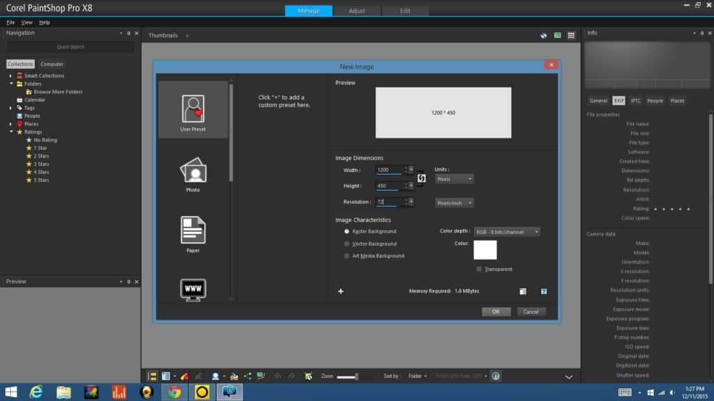
Now that we have a template and image to use, the next step is to setup a blank canvas to make our stock image fit inside the predefined space of our template. So, I fired up PaintShop Pro and selected FILE > New.
With the new Image dialog box in front of me, I entered the correct width (1200px) and height (450px) and punched in a resolution of 72 pixels per inch, since the graphic we’re creating will only be used on a screen and not for print.
Step 3 – Copy Stock Image & Paste to New Layer
The next thing we’ll need to do is op
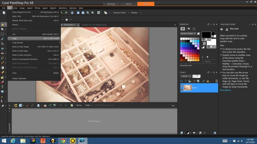
en up the image file we downloaded earlier by going to FILE > Open and locating the image. From there, I copied the image to the clipboard by selecting EDIT > Copy from the drop down menus at the top.
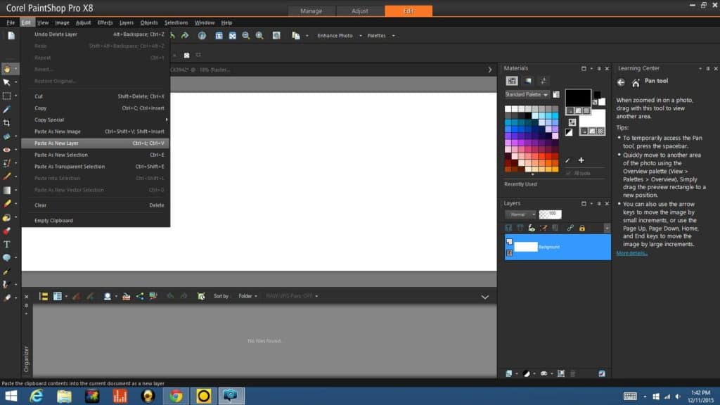
I then went back to the new file I had created in Step 1. When opening multiple images, I use the tabbed view so I just clicked the tab at the top labeled “Image 4” (yours will probably be labeled differently) and then went to EDIT > Paste As New Layer, just as you see below.
Step 4 – Adjust Image for the Right Look
Once the original image is pasted on the new canvas, you can adjust the image as you’d like until you get a look you’re happy with for your final image. Personally, I like to zoom in real close to make the photograph less distracting and have it appear as more of a graphic background.
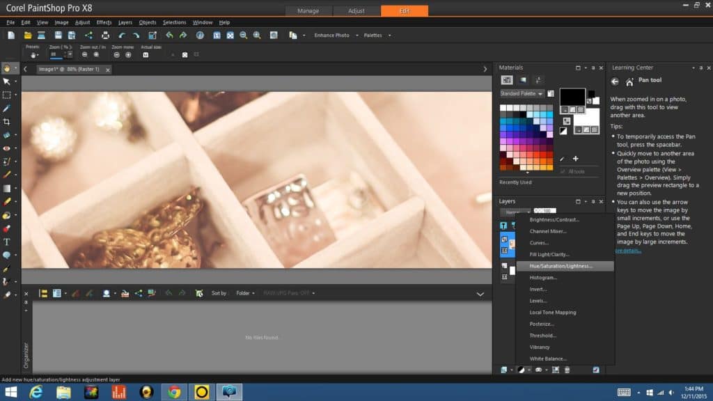
Then I decided to alter the color of the image a little bit by adjusting the Saturation from the drop down menu in the Layers Palette. I brought the saturation down, taking color out of the picture and rendering it more towards the gray.
Step 5 (Optional) – Add Text
This next step is optional… if you think your hero image is complete and tells your business’s story without text, then just skip right down to Step 6. In my case, I felt like my image could use a bit of help to explain what it is the business does, so I decided to add the company name and a short descriptor.
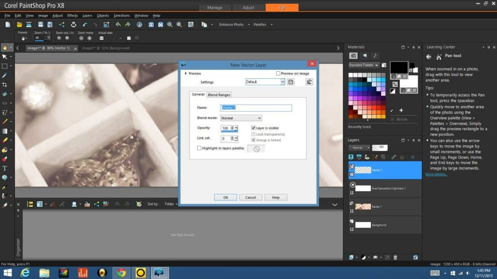
First, I created a New Vector Layer by clicking on the New Layer icon (the furthest left of the four icons below the Layers Palette). When working with text, it will always be placed on a vector layer to start.
With the new vector layer down, I went over to the left and selected my Text tool to add the title of my site. I named my fictitious company “here comes the bride…” and used a nice hand-written font to tie it all together. I then added a short tagline beneath the business name in a sans serif (or block) font to differentiate it from the business name but still provide a little extra information.
Step 6 – Final Save & Optimize for Web
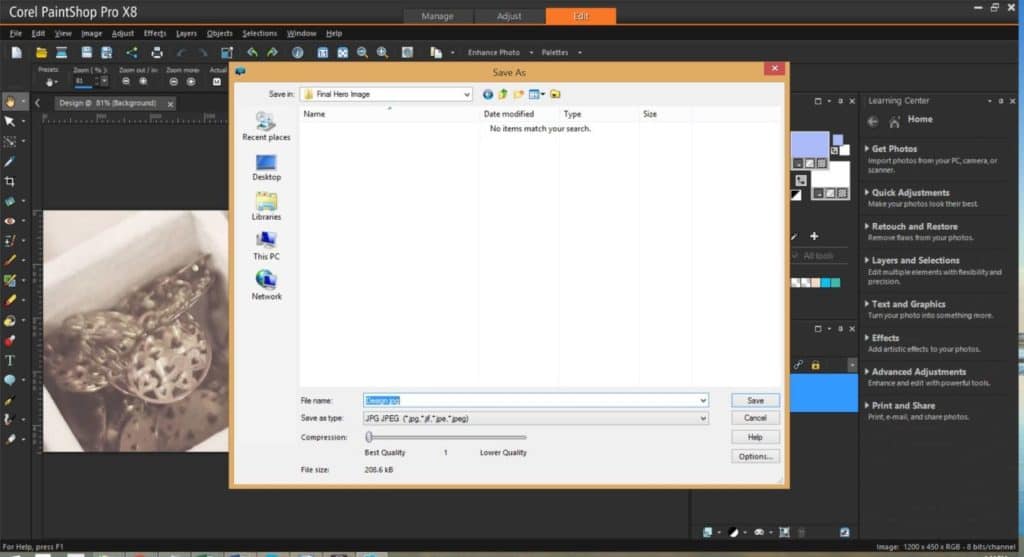
With our image sized properly for the template and adjusted to get the look we want, it’s time to wrap up our Hero Image project. The final step is a quick “SAVE AS” where you’ll name your file, select JPEG as your file type and apply any compression options to manage file size. My image is already pretty small in size, so I left the compression value at 1.
Remember, using larger image sizes on a webpage will take longer for that page to load, so be mindful of the image size when saving (see more on image optimization).
Hero images can come in all types and different web pages use them to achieve different goals. This has been a pretty basic design, but the possibilities for your hero images are endless. There truly is a world of possibilities to explore, so try it out and get started today!
If you want to see more tutorials like this one, don’t forget to sign up below to become a Points of View Insider. Until next time!







0 Comments