
Five Quick Tips for Creating the Perfect Banner
Take a look at nearly any website, and what’s the first thing you see? A large, colorful banner right across the top. The header banner of a website is probably the most important part of the site: it gives visitors their first impression and gives you a chance to showcase a product or tell them what your company is all about. Ad banners on other websites direct traffic to your site and catch the attention of potential customers, and ad banners on your own site can showcase products or promotions and make it fast and easy for people to find what they are looking for.
Banners are your chance to impress people and make them want to like your company – or to turn them away in boredom before you ever get a chance. Here are five quick tips to make sure your banners are helping and not hurting.
Choose a Goal
What is the banner for, and who do you want to see it? Just like in any other form of marketing, understanding your audience and your intentions is the most important step in designing a banner. If you’re running a funeral parlor, you probably don’t want a neon banner with flashing lights. Is your banner meant to represent your business as a whole? Then don’t talk about specific products. Is your banner meant to sell one product or let customers know about a sale? Then keep it simple: make sure every part of your banner works towards getting people to click the link for that product. Anything in your banner that doesn’t further its single, clear goal should be removed.

Use Color Contrast
There’s no point to a banner if people don’t even see it’s there – make sure the colors of the banner stand out against the background either of your site or of the sites the ad is sitting on. Here’s a tip when designing ads for advertising services like Google Adsense: most website backgrounds are white or gray, so banners in blues, greens, and earth tones will pop without clashing. On your own site, you have the luxury of being able to choose the perfect colors for your website’s design. One easy way to make your banner stand out is to reverse your color scheme – if your website is mostly gray with blue highlights, try a banner that’s mostly blue with gray highlights and add a splash of a bright color to draw the eye.
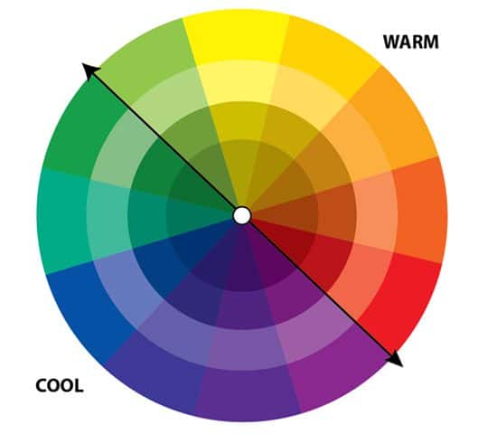
As a rule of thumb, colors pair well with the three colors directly opposite them on the color wheel or the two colors next to them – try to pick one color to build your design around and work in splashes of colors that pair well with it. There are a ton of great resources for more detailed information about color theory, but this article has a clear overview (and a great title!) to get you started.
Keep Text to a Minimum
Nothing drives people away faster than having to wade through a wall of words to figure out what your banner is trying to convey. Don’t worry! There’s plenty of space to tell them all about your product or company after they’re on the right page. Your banner should have as few words as possible – let the picture do the talking. Take a look at this banner on www.microsoft.com:
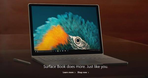
Notice how the designers have chosen eye-catching colors and a large image, with only a single line of text and two links– this helps the banner jump out from the page and gives visitors clear directions on where to go if they’re curious.
Link Where You Want to Send Visitors
This may seem obvious, but it’s surprising how many web banners don’t make use of the best part of the internet: links. When people see a banner, they expect to be able to click on it for more information – and of course you want them to! As a rule of thumb, a header banner or an ad banner on another website should link back to your site’s home page, and an ad banner for a specific product or service should link to the purchase page for that product.
The faster people can get to your site and the easier it is to navigate to where they want to go, the more likely they are to stick around!
Hire a Designer to Get You Started
Unless you’re a digital artist, you probably won’t have experience making this type of image yourself. Luckily, you don’t have to do it all on your own! Hiring a good designer for your banners is probably the single most efficient way to spend your web budget. A designer can work with you to find the perfect combination of image and text to represent what you are all about. Once you have an image you’re happy with, you can use and reuse it in all kinds of banner designs that you can modify yourself if you need to.
Don’t have the budget to hire a designer? Or want to try your hand at creating your own banners? Check out this tutorial on creating a web banner, complete with web links, using PaintShop Pro.
Steps to Making a Banner
- Decide where the banner belongs – is this going on the home page of your site, or is it a banner you’ll submit to an advertising service to go on other sites and drive traffic to yours?
- Know your audience – Who is the banner meant for? Are you targeting new customers, or telling existing ones about a promotion?
- Hire a designer. If you’re planning to hire a designer, do so early in the process. Know what you want out of it so they can help as much as possible.
- Pick a theme. Every banner needs an image, and you need to find the right image for the job. Try to have your theme be something that will appeal to your target audience.
- Pick a primary design color.
- Make the image. This is the part where you and the designer get to have fun.
- Add text – keep it simple!
- Put the banner on your page, or submit it to the advertising service. Link to the target page. You’re done!
One Bonus Tip
Have fun! Banners and other artistic elements are the places in your website where you get to play around and do something cool. If you enjoy making it, chances are people will enjoy looking at it.


0 Comments