
By Ariel Garaza Diaz
This overview will give you an essential primer on the definition of color, from its origins to current day definitions. It provides a deeper understanding of the printing process and the differences between RGB (Red, Green, Blue) and CMYK (Cyan, Magenta, Yellow and Black). In addition, it will highlight the many benefits of Color Management and color matching in CorelDRAW to get the precise colors you need for any creative project.
You will learn:
- How color is produced
- Definition of RGB
- Definition of CMYK
- Converting RGB to CMYK
- CorelDRAW’s Color Match
Start your FREE 15-day trial and embark on a design journey with powerful tools for vector illustration, layout, photo editing, typography, and collaboration.
Download these free resources:
Written Tutorial (PDF, 291 KB)
CorelDRAW Graphics Suite resources
Quick Start Guide (PDF, 2 MB)
Keyboard Shortcuts (PDF, 3.5 MB)
CorelDRAW and Corel PHOTO-PAINT user guides
For CorelDRAW Graphics Suite subscription and perpetual licenses (2018 to 2024), languages include English, Português do brasil, 简体中文, 繁體中文, Čeština, Deutsch, Español, Français, Italiano, 日本語, Polski, Русский
CorelDRAW Community
CorelDRAW learning center
Facebook
X (formerly Twitter)
YouTube
What’s New in CorelDRAW Graphics Suite
Origins of Color
How is color generated? Over the years, there were many theories in many parts of the world about how color is produced, with theories reaching from Greece to the Medieval period.

Theories from Sir Isaac Newton

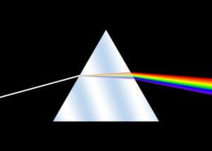
One of the best-known theories originated from Sir Isaac Newton. He showed that the white light of the sun decomposed in the colors of the rainbow when traversed across a prism or the atmosphere.
Some of Newton’s ideas seem strange to us today. He believed that there were perfect shapes (like the circle or square) and perfect numbers, like 3 and 7. In that way, he believed that it should be 3 primary colors and 7 secondary colors, and he believed that the primary colors were red, blue and yellow. Newton was the first one to introduce the notion of a “spectrum” to explain how colors were created.
Color Spectrums
Today, we know Newton’s original theory is not correct. What the human eye can see is only a small part of a wavelength of the total electromagnetic radiation, which includes many types of waves, such as X-rays, radio waves or microwaves.
The human eye only sees between 390 to 750 nanometers. The shorter waves are red, and the longer waves are blue or violet. Waves that are shorter than red are called “infrared” and waves that are longer than blue and violet are called “ultraviolet.” Between both, the central area is green.
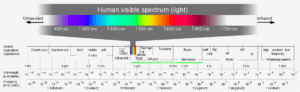
The human eye has three receptors called “cones.” One cone reads the red waves, another receives the green waves and the third one receives the blue. When the three tones are added together, we see the single color with our eyes.
Definition of RGB
To try and reproduce that effect through electronic devices, such as monitors, digital cameras or scanners, three colors are needed to create the images. This system of three is called “RGB,” which stands for red, green and blue. However, it is only part of the total spectrum of visible light so there are many colors that we can’t see in RGB mode.
Definition of CMYK
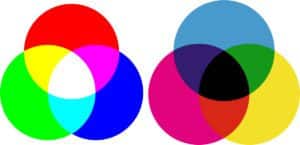
A printing company uses a very different color system called “CMYK,” based on four inks, called cyan, magenta, yellow and black. The letter “K” represents black, both to differentiate black from blue but also because it is the key color in print. CMYK inks are translucent, that is, they can be superimposed on one another. It’s also important to note that we are talking about ink tones, not shades of light.
Here are some helpful tips about color:
- The black ink is obtained from the carbon and it was added to define more clearly the impression
- Cyan plus yellow produces green
- Magenta plus yellow produces red, and cyan plus magenta produce blue
- Adding black gives darker tones
- To obtain a lighter shade, we use a percentage of each ink, so that you can see the white color of the paper
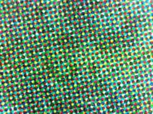
Halftone Screens
Each color is printed separately, and larger or smaller points are printed to create tones, such as 10%, 5%, etc. This is called a halftone screen as shown below.
At this point, we must clarify that the “Cyan RGB” or “Magenta RGB” are very different colors than “Cyan CMYK” or “Magenta CMYK,” especially for its brightness. It is not possible to obtain those types of luminous tones in CMYK.
First of all, we must convert the RGB images of our camera, cell phone, or Internet images to CMYK in order to print correctly.
While RGB has 16.8 million shades, CMYK has only 64.000. Naturally, there is a loss of color brightness. It is a very common problem when converting from RGB to CMYK, as some images are very dark or lose color. However, we can minimize that loss of color if we use the correct data. That is what we call a “color profile.”
Color Profile in CorelDRAW
In CorelDRAW, the Color Profile feature can be found in the menu under Tools > Color Management. We can define a global profile for all files or chose a specific profile for each job. When we save the document, we have the option to incorporate the color profile to avoid a color change when opening it in another computer. In addition to several default settings, we can also create custom settings.
Both RGB and CMYK are “modes” of color, which are ways of representing color, and clearly not the only way to do so. There is not a single RGB or a single CMYK color because within each one there are different options called “spaces.”
For example, within RGB we have the space sRGB, ProPhotoRGB, AdobeRGB, AppleRGB, and many others, and, for CMYK mode we have different spaces, according to the paper, the printing method and the country or region where we work, such as Europe or North America. For example, ISOcoated v2, Fogra 39. ISOUncoated v2 or Fogra 27. Each color space limits the total amount of ink, preventing the sum of the 4 inks from forming 100% of each (that would be 400% and it’s a huge problem for printing).
It’s important to remember that these color profiles are international standards, and that if we use the same profiles in other programs, the color will not change when importing or exporting an image.
Note: if we are going to create for the web or output to a desktop printer, we can choose RGB as the primary mode. However, if it is for commercial printing then we must choose CMYK.
Color Specifications for Commercial Printing
In commercial printing, it is important that text or thin lines are made only with black, not with the four inks, to avoid registration errors in printing.
Any text or object with RGB Black will be output in the four CMYK inks, but the option “preserve pure black” forces output only in the black channel. This step is useful in vectors, but not in photos. If you are going to convert a photo from RGB to CMYK the “preserve pure black” option must be disabled.
Some colors can’t be obtained using CMYK, such as bright colors, fluorescent or metallic, like gold and silver. Also, some shades of orange, blue or green can’t be shown in using CMYK because many of them can’t even be represented in RGB.
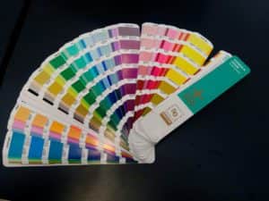
In those cases, direct inks are used. There are many different types of color palettes, depending on the industry. The best-known palette for colors is the Pantone™ Matching System (PMS).
Most of the spot colors are outside the RGB gamut, we must use Lab color mode, and they can’t be seen correctly on the screen, only as a simulation. Therefore, we must never choose a color according to what is seen on the monitor, and instead use a printed color guide such as Pantone.
Pantone Color Palette
What happens if we convert a spot color to CMYK? Most spot colors change significantly if you convert them to RGB or CMYK, and the reference values also change according to the chosen color profile.
For that reason, the Color Management dialog in CorelDRAW offers these options for spot colors:
- Leave them “as is” in Lab mode to see them as best as possible
- Use RGB values
- Use CMYK values
Spot colors are also used for die cutting, UV varnish and more. In those situations, we should select the object and choose “overprint.”
The most important point is to remember that CorelDRAW gives you an exact output and a perfect color match. That means, that if we use 40% cyan, then only 40% cyan will output. Not “almost 40%” or “around 40%.” It will be the same color in any country.
Many users want their printed output to match what they see on their screen, but the final color depends on several things: type of monitor, video card, and above all, the calibration of the monitor. In conclusion, working with a CMYK color mode is the most crucial part to guaranteeing that you will get the exact color values for each component.
We hope you found this tutorial helpful and we would love to hear your feedback in the Comments section below. And don’t forget to visit our user galleries and show us what you’ve learned by sharing your photos, videos and creative projects with us.
 CorelDRAW Graphics Suite
 Ultimate Vector Bundle Vol. 1
 CorelDRAW Standard 2021
 Ultimate Vector Bundle Vol. 2
 Corel Vector
Start your FREE 15-day trial and embark on a design journey with powerful tools for vector illustration, layout, photo editing, typography, and collaboration.