By Steve Bain
This tutorial will show you how to create great looking presentation graphics with CorelDRAW X3. Take advantage of the more powerful design features of CorelDRAW to make polished, detailed, professional presentations. To show your slide-show in full screen, you just have to export your document as a full screen PDF.
Start your FREE 15-day trial and embark on a design journey with powerful tools for vector illustration, layout, photo editing, typography, and collaboration.
What’s New in CorelDRAW Graphics Suite
You can easily create great-looking presentations with CorelDRAW by exporting your document as a full screen PDF. You make your presentation stand out by creating eye-catching master pages, using charts to get your message across, and adding navigational buttons. For best results, start with a new document with a landscape orientation.
You can make change an open document’s orientation by clicking the Landscape button on the property bar.

The size of the document doesn’t matter, as the end result, the full screen PDF, will fit to the screen.
Creating the master page
Now, you’ll create a master page, which contains all the design elements — such as backgrounds, logos or titles — that will be shown on all pages.
1. Click Window > Dockers > Object Manager. The Object Manager docker opens at the right side of the screen.
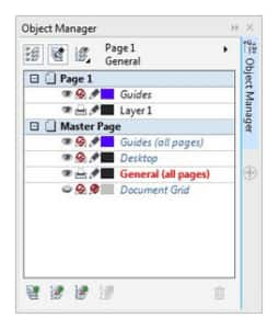
2. In the Object Manager, right-click Master Page, and click New Master Layer (all pages).
3. Rename this layer General, and a new layer, General (all pages), is created.
4. Next, import an image for the background by clicking Window > Dockers > Connect, and dragging the desired image or clipart onto the page.
5. Scale the image to fit the page by dragging the midpoints on the top and side of the image.
Regardless what image you chose for the background, it will likely interfere with text and other messages. To make the text and messages stand out, you should create some information boxes.
6. To insert the information boxes, create two rectangles as shown below by using the Rectangle tool from the toolbox.

7. To round the corners of the rectangles, select the rectangle, and then choose the Shape tool from the toolbox.

8. The rectangle has four anchor points, one in each corner. When you drag one of these points, you can round the corners. Notice that the property bar is context-sensitive, so it displays controls directly related to what you’re doing.
To the right of these fields, there’s’ a lock icon. When you disable this lock, you can round the corners separately.

9. Now, fill the rectangles using the Fill tool in the toolbox with 50% gray, which is works well for white text.
10. Next, create a black area at the top of the rectangles that will contain text, by drawing a horizontal line using the Bezier tool.
11. Click the Smart Fill tool, select black, and fill the area.
12. The rectangle to the left will be used as a navigational area, and the one to the right will be used for the actual information. You might want to draw a darker grey line to separate a headline of text from the sub-information using the Bezier tool.
You can draw a perfectly horizontal line by pressing the Ctrl key and clicking the start and endpoint of the line.
13. You can change the thickness of the line on the property bar by selecting the line with the Pick tool. You can change the line color simply by right- clicking a color in the Color palette.

Now you can put a company logo into the top-right frame by clicking File > Import, browsing your computer to find the logo, and clicking the Import button in the Import dialog box.
Insert header text using the Text tool to complete the master page:
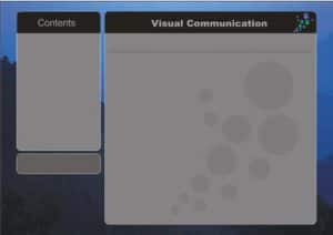
Now you have the master content, which will be consistent throughout all pages.
Feel free to experiment with the different information containers. The previous image shows another example, in which the left bottom frame will contain navigational buttons.
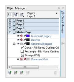
Now you can start to work on the content of the individual pages. To switch from the Master page to the individual pages, double-click the page icons:
Creating pie charts

On this page, you will draw a pie chart of five pieces.
- Draw a circle with the Ellipse tool, and fill it with a light orange color.
- Copy the circle, and paste it 4 times.
- Select the top circle, and select the Shape tool.
The outline of the circle will appear with a dotted line and an anchor point at the top of the circle. When you drag this anchor point counter clockwise, you create pie slices by dragging inside the circle, and line-segments, when you drag outside the circle.
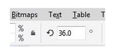
- Drag the anchor point to an angle 36 degrees to create the first pie slice.
- Darken the orange color by pressing Ctrl and clicking black in the Color palette once or twice. For every click, you add 10% of black to the orange color.
- Repeat the steps with the other circles, making the slices bigger and darker in colour as you go along.
- Add some white text next to the slices.
Creating flow charts
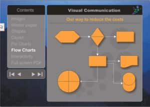
Flow charts are another way to communicate complex information. CorelDRAW has many ready-made symbols designed specifically for flow charts. And you can connect the symbols with lines that snap to the symbols. When you rearrange the symbols in the chart, the lines will automatically follow the symbols.
In the toolbox, you will find the Basic Shapes flyout.
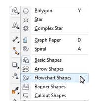
This flyout contains many tools for adding a variety of ready-made to your drawing, including the Flowchart Shapes tool. When you click any of these tools, you can click the Perfect Shapes button on the property bar to access the available shapes.
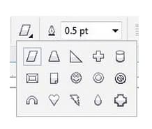
To add a shape, just select it, and and click the in your drawing. You can enhance a shape by adding a shadow using the Drop Shadow tool from the Interactive Tools flyout
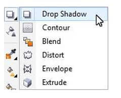
- Using the Drop Shadow tool, click the shape that you want to apply the shadow to.
- Drag from the center or side of the object until the drop shadow is the size you want.
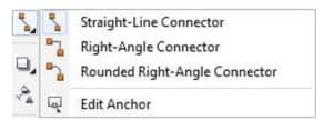
To add finishing touches to the flowchart, you can add connector lines between shapes. You can customize connector lines by modifying their thickness and adding arrowheads.
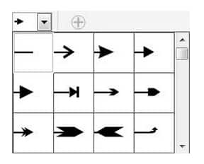
The Connector Tools flyout offers tools for creating a variety of connector lines, such as straight, right-angled, and more.
Creating interactive navigational buttons
You might have noticed navigational buttons in the bottom left box in the sample image. These are a series of triangles that offer document navigation opitons.

You can make any shape in your drawing interactive by right-clicking it and clicking Internet Links, which provides a list of the pages in your document. Just select the appropriate page for your button.
Publishing your presentation as a full screen PDF
Finally, it’s time to publish your document as a full-screen PDF.
Click File > Publish To PDF.
In the Publish To PDF dialog box, click the Settings button.
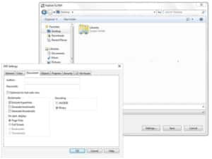
In the PDF Settings dialog box, click the Document tab, and enable the Full Screen and Include hyperlinks, and click the OK button.
When you open the PDF, it opens in full screen.
 CorelDRAW Graphics Suite
 Ultimate Vector Bundle Vol. 1
 CorelDRAW Standard 2021
 Ultimate Vector Bundle Vol. 2
 Corel Vector
Start your FREE 15-day trial and embark on a design journey with powerful tools for vector illustration, layout, photo editing, typography, and collaboration.

