
Before you hit “print”, you want to make sure that your output is exactly what you wanted. In this tutorial you will learn about printing color separations and how to manage the various settings in the CorelDRAW Print dialog box and Print Preview window.
Thanks for watching! We hope you found this tutorial helpful and we would love to hear your feedback in the Comments section at the bottom of the page. You will find a written version of this tutorial below, and a printable PDF copy to download on the Download Resources tab above.
Download Resources:
Written tutorial (PDF, 327 KB)
Exercise file (Zip, 1MB)
CorelDRAW Graphics Suite resources
Quick Start Guide (PDF, 2 MB)
Keyboard Shortcuts (PDF, 3.5 MB)
CorelDRAW and Corel PHOTO-PAINT user guides
For CorelDRAW Graphics Suite subscription and perpetual licenses (2018 to 2024), languages include English, Português do brasil, 简体中文, 繁體中文, Čeština, Deutsch, Español, Français, Italiano, 日本語, Polski, Русский
CorelDRAW Community
CorelDRAW learning center
Facebook
X (formerly Twitter)
YouTube
Start your FREE 15-day trial and embark on a design journey with powerful tools for vector illustration, layout, photo editing, typography, and collaboration.
CorelDRAW for Screen Printing
What’s New in CorelDRAW Graphics Suite
 CorelDRAW Graphics Suite
 Ultimate Vector Bundle Vol. 1
 CorelDRAW Standard 2021
 Ultimate Vector Bundle Vol. 2
 Corel Vector
Printing Color Separations
In this tutorial you will learn about printing color separations. You will learn how to manage some of the settings inside CorelDRAW that will help you feel confident that when you hit “print” you will get exactly what you wanted in your output.
What is a print separation?
In some printing processes that use spots color, like screen printing, you need to isolate each color into individual color areas so they can be printed on the same plate or screen. This is called a separation.
Think of it like a coloring book and each color crayon you color with or use from the spot color palette is a separation. They are labeled with a name, so you know exactly which separation or color plate you are printing.
Registration color/ marks
When printing screen-printed separations, you can add your own custom registration marks on the page so you can control where they are on the output. If you use the registration color for these marks it will show up on each separation without having to change the color. This color is good for job names and registration marks to keep them consistent on all films or screens. You can drag this color to the document palette or a custom palette for easy access.
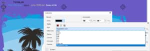
Select a registration mark, then double-click the Outline settings in the bottom right of the interface. Then click the color swatch drop-down. If you click the drop-down arrow in this window and look at the bottom of the list, you will see the registration color. If you drag the registration mark to your document palette or a custom palette, it will add the color to your palette to have it easily available whenever you need.
Use document pages for traps/ bases
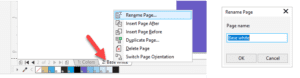
Sometimes screen-printed separations need trapping or a base color for printing. You can use another page for these modified versions of the artwork. For example, page 2 in the exercise file has the base white separation. For the white ink base, you would print it from this page. For extra organization in your file, you can label the page the color being printed by right-clicking on the name of the page.
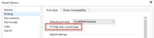
Global application settings
When printing separations only the active page is usually being printed. So, to make sure we only print from the active page you can modify a setting inside the CorelDRAW options.
Go to Tools > Options > Global and select Printing in the left column. Click the checkbox for Print only current page and click OK. With this setting on, you are less likely to waste films, screens or paper.
Print preview small/ large
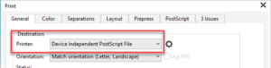
The next very helpful tool for printing separations is inside the actual print window. Our job is ready so go to File > Print.
Select your printer. For tutorial purposes, I am choosing DEVICE INDEPENDENT POSTSCRIPT FILE. This choice will show us all the options for printing separations. Normally you need a postscript output device selected to be able to see all these options.
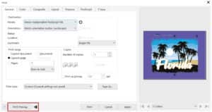
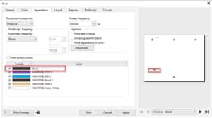
Next, click the 2 black arrows beside the Print Preview button in the bottom left corner. The visual nature of this window will give you clear view of what is being printed. The small print preview window will be interactive as options are changed in the tabs of the Print window.
Here are some settings on the various tabs in the Print window to get familiar with:
- General tab – set the Print range to Current page.
- Color tab – beside Color choose Separations.
- Layout tab – Leave Image position and size set to As in document. You can set imposition here if you need it.
- Prepress tab – Most settings can usually be OFF unless you know you need them. A common setting used in screen printing would be to Mirror the image, under Paper/ film settings.
- PostScript tab – You can adjust postscript settings here.
- Separations tab- This is where all the color separations are listed. Select one or more if they are ready to print by turning on or off the Include check box. The Preview window on the right will give you the visual of what each separation looks like. Use the arrows or dropdown list under the print preview to scroll through each separation. If you need an enlarged view of the separation click on the Print Preview Close out of this by clicking the Close Print Preview icon on the top toolbar or press CTRL + C.
- Preflight tab – Check this last tab for any warnings when all your settings are set. It will help you find issues before you print.
- Click Apply so that these settings will be remembered for this job if you close the Print Preview window.
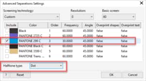
Advanced Settings for Halftones
The blue color in this job includes tints (the grey areas in the preview), so we need to set some advanced settings for that color to produce halftones or tints of that color.
To set the halftones:
- Go to the Separations tab and click the Advanced button in the Options
- In the Advanced Separations Settings window, uncheck all the colors except for blue and set the Frequency column to 30. A frequency of 30 will create 30 dots per inch for that specific color separation. This is an average halftone setting for screen printing.
- In the Halftone type dropdown select Dot which is the most commonly used.
- The angle of the dots can also be set here if needed so moire effects are not created.
- Then click OK.
Bonus Tip – Find Unwanted Colors/ Objects
If you are making art with spot colors, it is best to make sure all your objects are colors that belong on the proper separation. In this example, there is a non-spot color (RGB or CMYK) black. Note where the unwanted color is, then exit the print window to return to your document and remove or set the proper color.
Start your FREE 15-day trial and embark on a design journey with powerful tools for vector illustration, layout, photo editing, typography, and collaboration.