In this tutorial, we are going to look at some creative ways to use the Transparency tool to enhance your graphic design projects. You will learn how to combine photos into composite images, how to add fading reflections to images and text, and how to use transparency in combination with the Pointillizer tool to create unique halftone effects. If you are not familiar with the Transparency tool, we suggest you watch this introductory tutorial to get started.
Thanks for watching! We hope you found this tutorial helpful and we would love to hear your feedback in the Comments section at the bottom of the page. You will find a written version of this tutorial below, and a printable PDF copy to download on the Download resources tab above.
Start your FREE 15-day trial and embark on a design journey with powerful tools for vector illustration, layout, photo editing, typography, and collaboration.
Download these free resources:
Exercise File and Written Tutorial (Zip, 5 MB)
CorelDRAW Graphics Suite resources
Quick Start Guide (PDF, 2 MB)
Keyboard Shortcuts (PDF, 3.5 MB)
CorelDRAW and Corel PHOTO-PAINT user guides
For CorelDRAW Graphics Suite subscription and perpetual licenses (2018 to 2024), languages include English, Português do brasil, 简体中文, 繁體中文, Čeština, Deutsch, Español, Français, Italiano, 日本語, Polski, Русский
CorelDRAW Community
CorelDRAW learning center
Facebook
X (formerly Twitter)
YouTube
What’s new in CorelDRAW Graphics Suite
Color, fills, and transparency
Adding effects
 CorelDRAW Graphics Suite
 Ultimate Vector Bundle Vol. 1
 CorelDRAW Standard 2021
 Ultimate Vector Bundle Vol. 2
 Corel Vector
Advanced transparency effects in CorelDRAW
The Transparency tool can be used to enhance your graphic design projects in many creative ways. In this tutorial we will show you how to blend photos to create composite images, how to add fading reflections to images and text, and how to use the Pointillizer tool in combination with transparency to create some unique halftone effects.
How to use transparency to blend photos
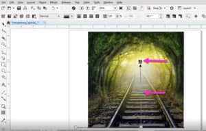
In CorelDRAW you can blend two or more photos together without using a photo editor. In this example, on page 1 in the exercise file, we will make the railroad tracks blend and fade into the trees by using transparency.
To begin, activate the Pick tool and move the railroad photo on top of the tree photo. Select the tree photo and note the size in the Property bar. It is 8” wide so now select the railroad photo and scale it to 8” wide also. Make sure the Lock ration is on before you scale the photo, to preserve the original width to height ratio.

The next step is to align the railroad photo to center and bottom of the tree photo. With the railroad photo still selected, hold down the Shift key and select the tree photo. Press the C key to center align, then the B key to bottom align.
Note: you can also align the photos by going to Object > Align and Distribute and choosing Align Bottom then Align Centers Horizontally.
Now we are ready to start blending.
- De-select the photos by clicking in a blank area of the page or desktop.
- Select just the railroad photo and activate the Transparency tool.
- Click on the Fountain transparency button in the Property bar and drag upwards from the bottom to the top of the image to apply a fountain transparency.
The white node at the bottom of the Transparency tool indicates the opaque area where the tree photo underneath can’t be seen. The black node at the top indicates the transparent area, where the railroad photo fades away. You can adjust the transparency by dragging the white or black nodes, or by moving the slider in the middle.
How to create reflections with transparency
Another use for transparency is to add a fading reflection effect to text or images. We will start with the car image on page 2 of the exercise file.
We are going to make a duplicate of the image but first we need to check our duplicate distance setting. Make sure nothing is selected and then go to the Duplicate distance settings in the Property bar. Set both values to 0 if they are not already. This will ensure that our duplicate is created right on top of the original image.
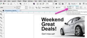
Activate the Pick tool and select the car image. Press Ctrl + D or go to Edit > Duplicate.
Next, we need to set the reference point to mirror below the original image. This can be done using the Object Origin setting on the Property bar – click the bottom center dot to set the origin to bottom center.
Now click on the Mirror vertically button on the Property bar, and the duplicate image will be mirrored down.

Now we can apply a transparency to make the mirrored image look like a reflection. With the bottom image selected, activate the Transparency tool and click the Fountain transparency icon in the Property bar. This time drag from the top down to the bottom of the image to apply the transparency.
Note: if your transparency is the reverse of what you need, you can redraw it the opposite way. You can also click on the Edit Transparency button in the Property bar and then click on the Reverse transparency button in the dialog box.
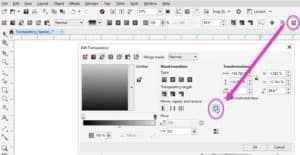
Now you can move the black and white nodes or middle slider to adjust the transparency to your liking.
The same type of reflection can be applied to text. Since our duplicate distance and object origin are already set, we can go ahead and create our duplicate. On page 3 of the exercise file, select the text with the Pick tool, press Ctrl + D on your keyboard then click the Mirror vertically button on the Property bar.
Activate the Transparency tool, select Fountain transparency on the Property bar and drag to apply the transparency so it is fading out at the bottom. As before, you can use the black and white nodes or middle slider to adjust the transparency.
Note: to make the top edge a bit softer, you can drag a darker color from the color palette to the white node lighten it.

Creating halftone effects with transparency and the pointillizer Tool
In our next exercise, you will learn how to use Transparency tool to create halftone effects in combination with the Pointillizer tool. You can use all the different transparencies like fountain, linear or elliptical and even the pattern transparencies to create unique results.
On page 4 of the exercise file, activate the Pick tool and select the solid blue star. Now activate the Transparency tool and select Fountain transparency in the Property bar. Drag from top to bottom to apply the transparency. Keep in mind that the white (opaque) area of the transparency is darker and will produce heavier halftones, while the black (transparent) area will produce lighter or less halftones.
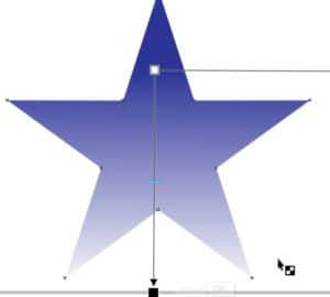
Go to Effects > Pointillizer to open the Pointillizer docker. For now, check Keep original for the source. This will allow you to experiment with the tool without losing your original object with transparency.
For this example, enter the following settings and then click Apply:
- Density: 12
- Scale: 1.0
- Screen angle: 15
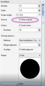
If you find that there is too much transparency at the bottom, delete the new star created by the Pointillizer, adjust your transparency and try again. The resulting halftone image is a vector that can be scaled to any size. You can also change the color by clicking on any swatch in the Color palette.
Creating a halftone effect using a custom shape
Another cool feature of the Pointillizer tool is that you can use a custom shape to create the halftone effect. In this exercise we will use a star as the custom shape. Select the Star from the tool group flyout under the Polygon tool.
Holding down the Ctrl key to keep the shape symmetrical, drag on the page to draw a star.
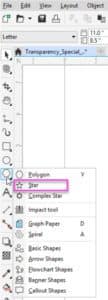
In the Pointillizer docker click the Shape drop-down menu and choose Custom. Click on the Select button and you will see that your cursor becomes an arrow. Click on the star you just created, and it will appear in the Shape window as the new custom shape.
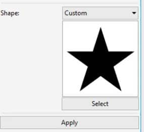
For this example, use the following settings for the Pointillizer:
- Density: 15
- Scale: 2.0
- Screen angle: 15.0
Make sure you have the original star with transparency selected and click the Apply button. Once the Pointillizer effect is applied, you can zoom in and see how all the dots are now stars instead of circles.

Creating a halftone effect using a pattern transparency
You can also use Pattern transparencies in combination with the Pointillizer tool. There are several types of pattern transparencies: vector, bitmap, 2-color and texture. For the Pointillizer to work effectively with pattern transparencies it’s best to find patterns that have some contrast in the values. This will create a wider variety of halftone areas.
Go to page 5 in the exercise file. Here we have a star that already has a Vector pattern transparency applied. In the Pointillizer docker, adjust the settings as follows and click Apply:
- Density: 12
- Scale: 1.0
- Screen angle: 15.0
- Shape: Circle
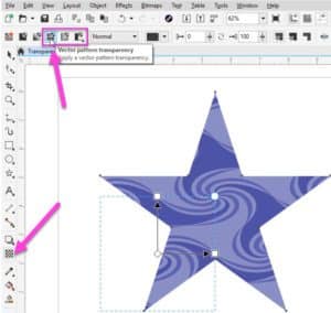
The result is a truly unique effect. Since it is a vector, you can scale it to any size, and you can also change the color by clicking on a swatch in the Color palette.

You can see more examples that were created using a Pattern transparency and the Pointillizer tool on pages 6-7 in the exercise file. Have fun creating your own unique effects with these tools!

Start your FREE 15-day trial and embark on a design journey with powerful tools for vector illustration, layout, photo editing, typography, and collaboration.

