
Learn how to create an interlaced effect to give the appearance that text and objects are intertwined or woven together. In this tutorial, CorelDRAW Master Ariel Garaza Diaz provides step-by-step instructions on how to create interlacing, not only on simple text but also on text and objects with gradient fills and contours.
Thanks for watching! We hope you found this tutorial helpful. You will find a written version of this tutorial below, and a printable PDF copy to download on the Download Resources tab above.
Start your FREE 15-day trial and embark on a design journey with powerful tools for vector illustration, layout, photo editing, typography, and collaboration.
Download these free resources:
Written tutorial (PDF, 980 KB)
CorelDRAW Graphics Suite resources
Quick Start Guide (PDF, 2 MB)
Keyboard Shortcuts (PDF, 3.5 MB)
CorelDRAW and Corel PHOTO-PAINT user guides
For CorelDRAW Graphics Suite subscription and perpetual licenses (2018 to 2024), languages include English, Português do brasil, 简体中文, 繁體中文, Čeština, Deutsch, Español, Français, Italiano, 日本語, Polski, Русский
CorelDRAW Community
CorelDRAW learning center
Facebook
X (formerly Twitter)
YouTube
What’s new in CorelDRAW Graphics Suite
Working with text
Adding effects
 CorelDRAW Graphics Suite
 Ultimate Vector Bundle Vol. 1
 CorelDRAW Standard 2021
 Ultimate Vector Bundle Vol. 2
 Corel Vector
Create an interlaced effect
Follow the steps below to create an interlaced effect on objects and text, giving the appearance that they are being weaved through each other.
Click on any of the images below to view full-size.
Simple interlaced effect on text
For the first example we will start with two simple letters that are overlapped. Please note that results will be different depending on the typeface you are using, the sequence of text and the proportion chosen. Individual creativity will result in beautifully unique outcomes.

An important step is the visual adjustment of the elements. Although both letters are the same size, when you change their position it may seem as though one is larger than another. Use the Pick tool to move and resize the letters until you have the look you want. Also, note that if there are too few or too many intersections the effect may not be as expected.
It is not necessary to convert the text to curves, but if we leave the letters as text, we will not see the shaping tools in the Property Bar. If you choose to leave the letters as text, you can access the shaping tools under the Object menu and achieve the same results.
Before you begin, make sure you have your Objects docker open (Window > Dockers > Objects).
If you wish to convert the text to curves, select both letters, right-click on them and choose Convert to Curves (or use keyboard shortcut Ctrl + Q).
- Select both letters with the Pick tool.
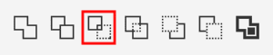
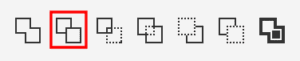
- Click on the Intersect button on the Property Bar (or go to Object > Shaping > Intersect).
- This creates a third curve where the two letters overlap.
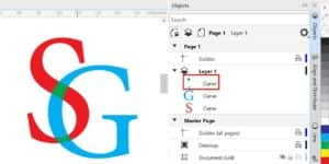
- In the Objects docker, drag the new curve object to the top of the layer (or use Shift + PgUp).
- To make the new curve easier to see, change the color by clicking on a swatch in the Color palette (we used green in this example).
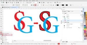
Now we have two letters that overlap at two curves at the points of intersection. However, the intersection is a single composite object, and we need the intersection objects to be separate.
- Right-click on the intersection object and choose Break Curve Apart (or use Ctrl + K).
- Now you will see in the Objects docker two green curves, which are the intersections.
The easiest way to create the interlaced effect is to change the color of the intersection objects.
- Select the top intersection curve and click on the red color swatch in the Color palette to match the color of the first letter.
- Then select the bottom intersection curve and change it to the same color as the second letter.
This creates the sense of “cross-linking” of the letters and works best if the fill is uniform.

Interlaced effect with a gradient
If the text or object has a gradient fill, there are a few extra steps required to create the interlaced effect. Start with the same steps as the previous example:
- Select both letters with the Pick tool.
- Click on the Intersect button on the Property Bar.
- In the Objects docker, drag the new curve object to the top of the layer.
- Right-click on the intersection object and choose Break Curve Apart.
Now you will see that the two intersection objects have their own gradient fill, which does not give us the interlaced effect we want.

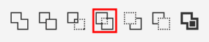
The goal is to have the upper part of the S pass over the G, and the lower part of the G pass over the S. To create the top intersection point we will need to use the Trim command.
- Select the top intersection curve (the object that will do the trimming).
- Hold down the Shift key and select the G (the object that is to be trimmed).
- Click on the Trim button in the Property Bar (or go to Object > Shaping > Trim).
If we move the letter G to the side, you can see how it has been trimmed by the top intersection curve.

- Select the top intersection curve and press Delete and we have created the interlaced effect on the top intersection.
- To create the interlaced effect on the bottom intersection, simply select the bottom intersection curve and press Delete.
And here is our result:

Interlaced effect with contours
Once we have learned to create the appearance of interlaced text, we can go one step further and apply some effects. In this example, we will apply a similar effect using a contour or outline.
We will start with the original letters and select the Contour tool which can be found in the Effects tool group on the left toolbar.
- On the Property Bar, set the contour type to Outside Contour.
- You can also set the color and thickness here.
- Click and drag with the Contour tool to create the outline.
Repeat the process with the second letter. In the Objects docker you will see two groups, each containing the letter and its contour.
- Right-click on each contour group and select Break Contour Apart (Ctrl + K).
- Select both contours and click on the Intersect button on the Property Bar.
- Select the new intersection object and change the color, then move it to the top of the layer.
- Right-click on the intersection object and select Break Curve Apart (Ctrl + K).
- Select the bottom intersection curve and press Delete.
Now we need to create the interlaced effect on the top intersection and there are 2 ways to do this:
METHOD 1: Use the Trim command
Select the top intersection curve, hold down the Shift key and select the G.
Click on the Trim button on the Property Bar.
Now select the top intersection curve, hold down the Shift key and select the contour around the G.
Again, click on the Trim button on the Property Bar.
Delete the top intersection curve object to see the interlaced letters.
METHOD 2: Use the Simplify command
- Select the top intersection curve, hold down the Shift key and select the G and its contour.
- Click on the Simplify button on the Property Bar.
- Delete the top intersection curve object to see the interlaced letters.

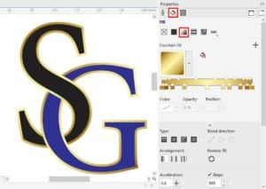
Once the interlaced effect is complete, you can apply a new fill to the letters and the contours.
- To apply a uniform fill, simply select the object(s) and then click on a swatch in the Color palette.
- To apply a fountain fill, press F11 to open the Edit Fill dialog box or go to the Fill section on the Properties docker.
Interlaced effect with separation/offset
Now that you know how to apply the interlaced effect to a contour, there are other creative options you can explore. In this example we will create a modern-looking logo by using contours to create a separation.
Start with two overlapping letters, each with a contour applied. Follow the steps as before to break apart the contours and create the intersection curve objects:
- Right-click on each contour group and select Break Contour Apart (Ctrl + K).
- Select both contours and click on the Intersect button on the Property Bar.
- Select the new intersection object and change the color, then move it to the top of the layer.
- Right-click on the intersection object and select Break Curve Apart (Ctrl + K).
- Select the bottom intersection curve and press Delete.
- Select the top intersection curve, hold down the Shift key and select the G.
- Click on the Trim button on the Property Bar.
- Select the top intersection curve and press Delete.
- Now select both contours and press Delete.
The result is an offset between the letters at the top intersection point.

NOTE: you could also create the offset in the bottom intersection point by using the bottom intersection curve object to trim the S.
If we add two circles around it, at a distance similar to the thickness of a letter, and combine them, we can integrate them as a unit.

Applying colors or effects will achieve very attractive results. In this case, we have applied gradient fills, extrusion and interactive shadow, but only as an example. But even the simple version, without effects and with uniform colors, has greater visual impact, in addition to the charm of simplicity.


Interlaced effect on text and objects
This technique can also be applied to texts and objects, not just to two characters. In this example we are using a wavy line that weaves between the text. There are two ways we will demonstrate to create a freehand wavy line and symmetrical wavy line.
Method 1:
- Activate the 2-point Line tool.
- Click at multiple points along the length of the text to create a jagged line.
- Activate the Smooth tool (in the Shape tool group).
- Click on each node to round it, adjusting the Rate value in the Property Bar if needed.

For a wavy line that is perfectly symmetrical, use the following method instead.
Method 2:
- Use the Freehand or 2-point Line tool to draw a horizontal straight line.
- Activate the Shape tool (F10).
- Select the last node on the line and press the + key on the numeric keypad to add a node in the center.
- Pressing the + key again generates other equidistant distance nodes, and so on until you have the desired number of nodes.
In this example we are using the same number of nodes as number of letters.

- Double-click on the Shape tool on the toolbar to select all the nodes.
- Click on the Convert to Curves button, then the Symmetrical Node button on the Property Bar.
- Click on a blank area of the page to deselect all the nodes.
- With the Shape tool, select the first node, hold down the Ctrl key and select alternate nodes across the length of the line.
- Click on one of the selected nodes and drag upward to give a wavy appearance.

On the Outline tab of the Properties docker, you can adjust the thickness and color so that it can interact with the selected text.
In order to use the line to generate an intersecting shape, go to Object > Convert Outline to Object. While this step is not essential (the same effect can be achieved with lines), turning them into objects will allow us a better fit.
Now we will interlace the line through the text. You can use a single line or duplicate it (Ctrl + D) to create multiple lines.

- Select the text and the line.
- Click on the Intersect button on the Property Bar.
- Select the new intersection object and change the color, then move it to the top of the layer.
- Right-click on the intersection object and select Break Curve Apart (Ctrl + K).
Now you can edit each of the intersection curve objects individually:
- Delete the intersection curve to give the appearance of the line passing OVER the text.
- Change the color of the intersection curve to the same color as the text, to give the appearance of the line passing UNDER the text.

If using a single line, you may need to adjust the path slightly so that it weaves through the openings in the letters, as you see below.


There are endless possible combinations, these are just a few simple examples. We invite you to create your own versions, combining different forms and text, to get amazing results and share them with us in our Graphic Design gallery.
Start your FREE 15-day trial and embark on a design journey with powerful tools for vector illustration, layout, photo editing, typography, and collaboration.