
In this tutorial, you’ll learn how to make a simple poster in CorelDRAW. The design is relatively simple, but we will cover the basic elements such as background, graphic objects, text and several effects. After learning how to use these tools and techniques you’ll be ready to make a poster and add your own creative touches.
Thanks for watching! We hope you found this tutorial helpful. You will find a written version of this tutorial below, and a printable PDF copy to download on the Download resources tab above.
In this tutorial, you’ll learn how to make a simple poster in CorelDRAW. The design is relatively simple, but we will cover the basic elements such as background, graphic objects, text and several effects. After learning how to use these tools and techniques you’ll be ready to make a poster and add your own creative touches.
Thanks for watching! We hope you found this tutorial helpful. You will find a written version of this tutorial below, and a printable PDF copy to download on the Download Resources tab above.
Start your FREE 15-day trial and embark on a design journey with powerful tools for vector illustration, layout, photo editing, typography, and collaboration.
Download these free resources:
Written tutorial for Windows (PDF, 2 MB)
Written tutorial for Mac (PDF, 2 MB)
CorelDRAW Graphics Suite resources
Quick Start Guide (PDF, 2 MB)
Keyboard Shortcuts (PDF, 3.5 MB)
CorelDRAW and Corel PHOTO-PAINT user guides
For CorelDRAW Graphics Suite subscription and perpetual licenses (2018 to 2024), languages include English, Português do brasil, 简体中文, 繁體中文, Čeština, Deutsch, Español, Français, Italiano, 日本語, Polski, Русский
CorelDRAW Community
CorelDRAW learning center
Facebook
X (formerly Twitter)
YouTube
What’s new in CorelDRAW Graphics Suite
Marketing and branding projects
Creative design projects
 CorelDRAW Graphics Suite
 Ultimate Vector Bundle Vol. 1
 CorelDRAW Standard 2021
 Ultimate Vector Bundle Vol. 2
 Corel Vector
How to make a poster in CorelDRAW
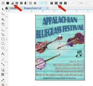
For this tutorial, we are creating a sample poster for a bluegrass music festival. The design is relatively simple but the tools and techniques we’ll be using can help get you started on your own poster design.
Setting up your document
We are using a standard poster size, but you can use your own custom dimensions if you need to design your poster for a specific size.
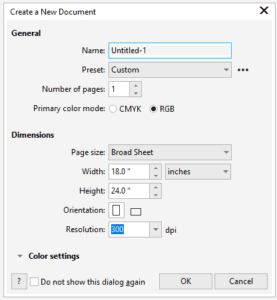
- Go to File > New to start a new file in CorelDRAW.
- In the New Document window, select the Broad Sheet preset for Page size, which is a standard poster size of 18” x 24”.
- Keep the Orientation set to Portrait and Resolution set to 300 dpi.
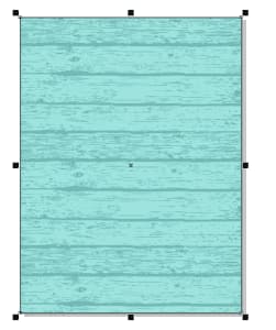
Adding a background
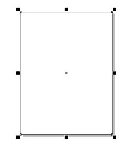
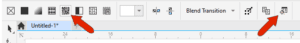
For our poster background, we’re use a wooden bitmap pattern. First, double-click the Rectangle tool to add a page frame.
Click the Interactive Fill tool, and on the Property bar, choose the Bitmap pattern fill option. Your most recently used pattern is applied by default, and since this is not the fill we want to use, we need to click the Edit Fill icon to open the Edit Fill window.
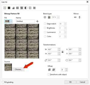
In the Edit Fill window, you can click on the Fill dropdown to see the library of available fills. If the fill you want needs to be imported, click on the Choose button in the Source section and browse to the location on your computer where you have it stored. Select the file and click Import to bring it into the Edit Fill window, then click OK to apply the fill to the rectangle.
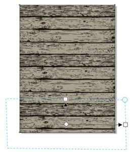
After importing the image and with the Interactive Fill tool still active, there will be control handles on the applied fill. You can use these handles to stretch the fill horizontally and/or vertically and position the pattern as you wish.
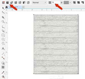
The texture of our wood pattern fill is a bit strong for a background, so we will add a transparency effect. Click on the Transparency tool and on the Property bar choose the Uniform Transparency option and adjust the Transparency slide to about 70%.
We also want to add a color to the background. Double-click the Rectangle tool again to add another frame around the page and then click on a color swatch on the Color palette to fill the frame. In this example we choose a light blue color.
NOTE: Eventually we are going to change this solid color to a gradient fill, but this will be done later, after the other poster elements have been added.
Adding design elements
We have some clipart images of musical instruments to add to the poster, but first we want to define a PowerClip frame so that the images will be clipped to the poster borders. Right-click on the current frame and choose Frame Type > Create Empty PowerClip Frame.
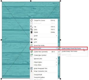
To learn more about clipping, watch our full tutorial Clipping Objects with PowerClip.
Now we can import the images. Click the Import icon, browse to the location on your computer where the images are stored, select them, and click Import. You can import one image at a time, or all at once.
Use the Pick tool to move the first image inside the frame. As you are dragging the image into the PowerClip frame area, you will notice that the frame area changes color and there are tips along the top.
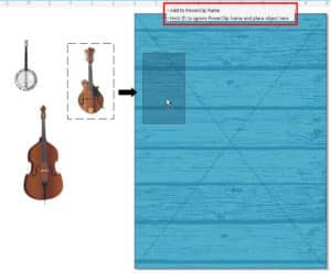
To add more images to the PowerClip frame, you need to hold down the W key as you drag them into the frame.
To adjust the images, double-click on the PowerClip frame to edit it. With the Pick tool you can rotate, resize, and reposition the images as you wish.
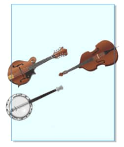
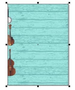
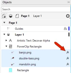
Once you are happy with the size and placement of the images, click on the Finish button in the top left corner to exit editing mode. In the Objects docker, we can see that the three instruments are now inside the PowerClip frame. And any parts of the images that were outside of the PowerClip frame are clipped, although the original images remain intact inside the PowerClip frame.
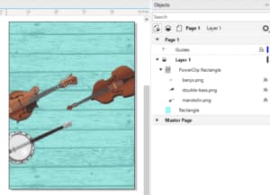
The last design element to add is the production company logo, which is saved as a PNG file. Import it and use the Pick tool to adjust the size and position. Because we are placing it entirely inside the frame of the poster, it doesn’t need to be added to the PowerClip frame.

Adding text
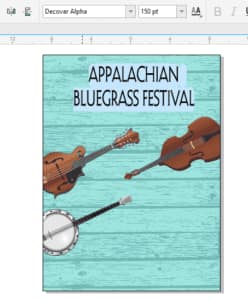
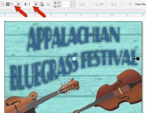
We are starting with the festival name first, and we want it to be a large heading at the top of our poster. Click on the Text tool and start typing your text. Once you have entered your text, you can use the formatting options on the Property bar to adjust the size, alignment, and font style.
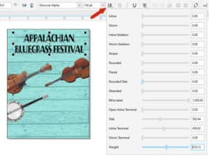
For our poster design, we chose to center-justify the text and use the Decovar Alpha font, which happens to be a variable font. We also increased the font size to fit the page.
With a variable font, you can click on the Variable Fonts icon on the Property bar to open the list of variable font properties, and adjust the various properties to get the look you want.
To learn more about variable fonts, watch our full tutorial Working with Variable Fonts.
With the text still selected, click on a color swatch on the Color palette to change the color of the text.
Next, we want to add a curve to this title text. Activate the Envelope tool (which can be found in the Effect tools flyout group on the left toolbar) and adjust the nodes to curve the bottom of the letters.

We also wanted to add a shadow effect to the title. The Shadow tool can be found in the same Effect tools flyout as the Envelope tool. Once you have activated the Shadow tool, drag out from the center of the text to create a flat shadow. On the Property bar you can adjust the Shadow Opacity and Shadow Feathering settings to your liking.
Now we’ll add some text in the lower right corner to list the festival details. These details are already saved in a text file that we can import right into our design file. Click on Import, browse to the location where the text file is saved, select it, and click Import. It will be brought into the file as Paragraph text, without any formatting.
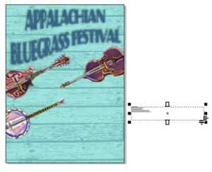
Because there is more editing flexibility with Artistic text, right-click the text and choose Convert To Artistic Text. As with the title text, you can use the formatting options on the Property bar to change the size, font style and alignment of the text, and move it into place with the Pick tool.

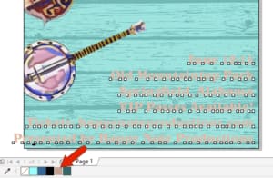
We want the font color to match a shade from the mandolin graphic. Select the Color Eyedropper tool and use it to sample the color you want. On the Property bar, click Add To Palette and the color will be added to the Document palette along the bottom of the interface.
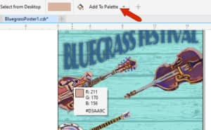
With the text is still selected, click on the newly added color swatch in the Document palette to apply this color to the text.
Our poster text is just about complete, but we want the “Presented by” line at the bottom to look different than the rest of the text. First, we need to separate that line from the text object by using the keyboard command Ctrl + K (or go to Object > Break Artistic Text Apart).
Now that it is a separate line, you can change the font style, size, color, and other properties independently. You can also explore the stylistic set options for this particular font: double-click on it to select the entire line, and then click on the small black triangle to view and select an option, such as Small Caps.
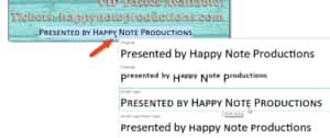
When finished formatting the text, it can be centered on the page using Object > Align and Distribute > Center to Page Horizontally).
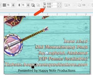
We also wanted to add a shadow effect to the other five lines of text. Hold down the Shift key and select each of them, then use the Shadow tool as before. This time, we also adjusted the Shadow Offset values slightly.
Adding effects
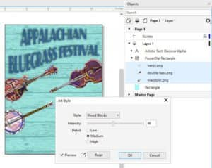
Now that we have all our text and design elements in place, we can spice up our poster by adding special effects to some of the elements, such as the musical instruments. In the Objects docker, hold down the Shift key and select the three instruments. Then go to Effects > Creative > Art Style. You can choose from a variety of different effects in the Style dropdown list. Make sure Preview is checked to see what each style would look like on your design. For each style, you can also adjust the Intensity and Detail settings. Once you are happy with the style settings, click OK. In this example we are using the Wood Blocks style with medium Detail and medium Intensity.
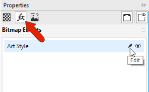
In the Objects docker, each of these objects now has an FX icon beside it, which you can click to toggle the effect off and on.
If you want to change the effect, keep the objects selected and open the Properties docker (Window > Dockers > Properties). Click on the FX tab and then click the Edit icon to edit the effect.
To learn more about effects, watch our full tutorials How to Apply Art Style Effects and How to Apply Non-destructive Effects.
As mentioned near the beginning, one final effect to add is a gradient to the light blue fill of the background. Select the correct rectangle in the Objects docker, activate the Interactive Fill tool, and on the Property bar choose the Fountain Fill option and set the type to Elliptical fountain fill.
To bring the eye toward the instruments, keep white at the center of the ellipse and adjust the handles to get the gradient you want.

And now our poster is done and ready to be printed. This was just a simple example using some basic elements: background, design elements, text, and effects. But this is just the tip of the iceberg – there is no limit to the creative touches you can bring to your own posters now that you know how to use these tools.

Start your FREE 15-day trial and embark on a design journey with powerful tools for vector illustration, layout, photo editing, typography, and collaboration.

Comments (2)
Reader Interactions
Comments
Good contribution
Wow this is awesome
but what if u want to create a poster with an image of human?